
How A Multi-Billion Dollar Listed Company Hasn't Changed Its Website Design Since 1996
If it ain't broke, don't fix it!


"If you have any comments about our WEB page, you can write us at the address shown above."
This line sits at the bottom of the website for one of the world's most valuable companies.
Well, many sophisticated web designers are willing to leave plenty of comments about the Berkshire Hathaway website design. This has been an on-and-off topic of debate for many years.
How does a company with partial ownership in mega-corporations like Coca-Cola, American Express, Bank of America and Apple use the same web interface it started using in 1996?
The answer demonstrates the power of being unassuming and devoid of unnecessary bells and whistles while fulfilling your purpose.
What is Berkshire Hathaway?
Berkshire Hathaway is an American conglomerate holding company originally established in 1934. In simple terms, it's a company that owns other companies operating in different industries under one roof.
Berkshire Hathaway didn't start as a holding company but as a textile manufacturing business. Hathaway was quite successful for over a century and merged with several other textile entities in the process. Yet, the First World War brought about a downturn in the industry.
1962 was the most pivotal year for Berkshire as a certain 'Sage of Omaha' entered the picture: Warren Buffett (now chairman and owner). While the textile industry was dying, Buffett started purchasing the stock, eventually acquiring the business under his investment company.
He managed to do this in 1965 and began incorporating investment entities, most notably the Government Employees Insurance Company (GEICO), which is still under Berkshire. As expected, Berkshire rinsed and repeated the cycle of buying companies in the insurance and other industries like retail, natural gas, confectionery, and railroads.
Funny enough, in 2010, Buffett said buying Berkshire Hathaway was the biggest investment mistake of his career. Yet, here we are today with Berkshire Hathaway being one of the best-performing stocks of all time.

Despite this milestone, the one area that's baffled investors and people who like the company is their old-fashioned and 90s-esque website.
The Berkshire Hathaway website design: intended as a joke?
The first-ever website in the world came into the spotlight in 1991, aptly named the 'World Wide Web.'. While Berkshire Hathaway was already well-established then, the earliest record of their website was in 1996, which looked like this:

The only 'major upgrade' to this site came in 1999 when the one-column bulleted list was swapped for a two-column list. 27 years later, the website looks like this:

Even the average web designer or developer can quickly point out the many aesthetic flaws:
- Terrible information architecture
- Bad typography
- Bad colour usage
- Lack of branding
- No navigational elements
- SEO issues
- (and the list goes on)
In a nutshell, the site is way too old-fashioned for this modern age and less retro-inspiring than those coming of the same era from the likes of Yahoo, eBay, and NASA.
So, the natural question is, why? It's, of course, not a question of affordability (not with total assets close to a trillion dollars).
So, then what? Ultimately, despite the 90s aesthetics, the site technically does its job for its audience, which is primarily shareholders.
These people are mainly interested in earnings reports and the occasional light-hearted letters from Buffett or his 'partner-in-crime' Charlie Munger (vice chair). Many other websites will cover everything else of a more sophisticated nature.
Berkshire Hathaway is a holding company, not your average client-facing company selling products or services. Therefore, actually, Berkshire doesn't even need a site. Its subsidiaries already have their websites designed to appeal to and attract their audience.
Admirers of Berkshire as a holding company are looking for information (also already available in other places). So, they will not click away from Berkshire just because 'their website doesn't look great.'
Thus, having a stripped-down approach to providing the bare minimum is perfect. This philosophy is embodied in everything that Berkshire Hathaway represents.
What can we learn from Berkshire Hathaway's philosophies?
The values held by Berkshire Hathaway all stem from its leader, Warren Buffett. The 'Oracle of Omaha' is known as perhaps the most frugal multi-billionaire in the world:
- Lives in the same house that was bought in 1958.
- Eats cheap breakfast from places like Mcdonald's and fast food like hamburgers
Used a Nokia flip phone long after smartphones existed
- Loves coupons
- Works in the same office building or headquarters since joining Berkshire in the 60s
Therefore, it is no surprise that Hathaway has such a simplistic design. Even their minimalist, Serif-based dark-blue logo has remained unchanged since 1939. Yet, for some reason, the typeface is clean, readable and memorable (or sort of?).

Another demonstration of Buffett's super simplicity is that Berkshire has remained with the same 25-26 staff for many years. To some, it might be baffling how such a small team handles such a mammoth company.
As with the website, most of what Berkshire does is through their subsidiaries (which, in total, have over 300 000 employees). Simply put, their staff doesn't do much other than communication, capital allocation, and reporting.
It's way easier to manage 25 people than 300 000. While some may consider this as 'billionaire capitalism,' the fact remains: simplicity always works best.
The same goes for Berkshire's site. Although it is 'ugly by modern standards, it's very light, functions quite well (better than many sites today) and offers the desired information.
As Leonardo da Vinci once said, "simplicity is the ultimate sophistication."
About the Creator
Langa Ntuli
- fascinated by the financial markets & TradingView charts. Freelance writer @upwork (www.upwork.com/freelancers/langan)
Medium account: medium.com/@lihle_ntuli
Also a humble music nerd, football fan, knowledge hoarder, peace/love extremist.
Keep reading
More stories from Langa Ntuli and writers in Trader and other communities.
"Stride in Style: Discover the ALDO Men's Albeck Oxford"
In the realm of men's footwear, finding the perfect balance between style, comfort, and versatility can often feel like an elusive quest. Yet, amidst the sea of options, there emerges a beacon of excellence that embodies these qualities seamless: the ALDO Men's Albeck Oxford. As a distinguished member of ALDO's esteemed lineup, the Albeck Oxford stands as a testament to the brand's commitment to crafting footwear that not only exudes sophistication but also delivers unparalleled comfort and durability.
By Kim Long Nguyệt Ngữ2 days ago in Trader
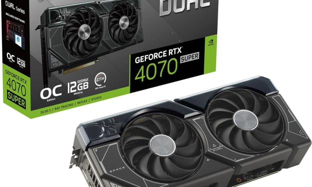
THE GRAPHICS CARD WILL MEET ALL YOUR DEMANDS ON YOUR PC
In the dynamic realm of computing, few components command as much attention and admiration as the graphics card. These technological powerhouses, often referred to simply as GPUs (Graphics Processing Units), serve as the beating heart of visual processing in modern computers, enabling everything from immersive gaming experiences to complex visual simulations and professional content creation. Among the latest contenders in this arena stands the ASUS Dual GeForce RTX 4070 Super OC Edition Graphics Card, a formidable specimen boasting cutting-edge features and unrivaled performance.
By Kim Long Nguyệt Ngữ4 days ago in Trader
How the Harvest Mouse Came to Suisun Bay
A long, long time ago there was a family of harvest mice. Mice are common, but these were unique – born to those who had lived in the salty, marshy bay for many generations, these mice ate and drank from the sea as well as the land and rivers. For generations, there were only the southern families, scattered along the marshes of Corte Madera and in the San Francisco Bay (U.S. Fish & Wildlife, 2013). One family, however, would undergo strife and conflict before reaching a whole new world. What became of them after is another tale entirely – but this is how their story begins.
By Taylor Inman6 days ago in Fiction


Comments
There are no comments for this story
Be the first to respond and start the conversation.