
The Cover Image Problem Nobody Talks About
What I learned after publishing dozens of blog posts and newsletters

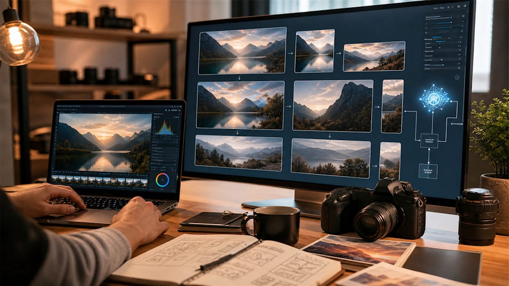
Last month I finished writing an article much faster than usual.
The outline came together quickly. The draft flowed naturally. Editing only took a few minutes. By the time I reached the final paragraph, I thought the piece was basically done.
It wasn't.
I spent nearly another hour trying to find a cover image.
Not writing.
Not researching.
Not editing.
Just looking for a visual that felt right.
The strange thing is that this happens all the time. Most creators don't struggle because they run out of ideas. They struggle because of the small tasks that appear between finishing the work and actually publishing it.
And images are often one of the biggest offenders.
The Draft Is Done, But The Post Isn't
Anyone who publishes regularly knows this feeling.
The article is complete.
The title works.
The structure is clear.
The conclusion says exactly what you wanted to say.
Then you look at the empty cover image section.
Suddenly the momentum disappears.
The photo you planned to use feels boring.
The screenshot is blurry.
The image looks fine on your laptop but weak when viewed in a social feed.
The crop doesn't fit the platform.
The colors don't match the mood of the article.
None of these problems are huge on their own. Together, they can delay publishing longer than the writing itself.
What makes this frustrating is that it happens when you're already mentally finished with the project.
The words are ready.
You just want to hit publish.
Most Creators Already Have The Image They Need
For a long time I assumed every article required a completely new visual.
Now I'm not so sure.
More often than not, I already have something that is close enough.
A screenshot.
An old thumbnail.
A workspace photo.
A product image.
A rough AI-generated visual.
A random photo sitting in my camera roll.
The problem usually isn't the lack of an image.
The problem is that the image isn't quite ready.
Maybe it needs better clarity.
Maybe it needs a different crop.
Maybe it needs more empty space for a headline.
Maybe it simply needs to fit a different format.
Once I started thinking this way, image preparation felt much less overwhelming.
Publishing Consistency Depends On Small Decisions
People often talk about consistency as a motivation problem.
I don't think that's entirely true.
Many creators stop publishing because the process becomes heavier than expected.
Writing the article takes energy.
Editing takes energy.
Promoting it takes energy.
If every image also becomes a mini design project, the workload grows quickly.
That's why I started paying more attention to tools that reduce friction rather than tools that promise perfect results.
Sometimes the goal isn't creating the most beautiful image possible.
Sometimes the goal is simply creating an image that is good enough to support the story.
That distinction matters.
Different Platforms Need Different Visuals
One lesson I learned the hard way is that a single image rarely works everywhere.
A blog cover has different requirements than a social preview.
A newsletter header has different requirements than a LinkedIn post.
An image that looks elegant inside an article can completely disappear when viewed in a fast-moving feed.
For blog posts, I usually want breathing room.
Space around the subject.
A cleaner composition.
Somewhere for the title to sit naturally.
For social media, I often need stronger contrast and a more obvious focal point.
The image has to communicate its message almost instantly.
The challenge isn't creating entirely different visuals.
The challenge is adapting one visual for multiple contexts.
The Tools I Actually Use
My workflow today is surprisingly simple.
For quick layouts and resizing, I often use Canva.
For basic design adjustments, Adobe Express works well.
When I need image enhancement, restoration, or more substantial editing, I usually reach for AI image editing tools. Lately, I've been using AIEnhancer for this part of the workflow because it lets me improve an existing image instead of rebuilding one from scratch. The process feels closer to editing than generating, which fits the way I usually work as a writer.
Recently I experimented with AIEnhancer.
What I found useful wasn't the technology itself. It was the ability to improve an existing asset instead of starting over from scratch.
A blurry screenshot could become readable.
A weak thumbnail could become sharper.
An image with the wrong dimensions could be adapted for a new platform.
That approach feels much closer to how creators actually work.
Most of us aren't building visuals from zero every day.
We're refining what already exists.
Good Prompts Feel Like Editorial Notes
One thing I've noticed when using AI editing tools is that practical prompts outperform dramatic ones.
Instead of writing:
"Create a stunning cinematic masterpiece."
I get better results with instructions like:
"Keep the laptop and notebook visible. Clean the background. Create a warm editorial style cover. Leave space for a blog title. Preserve the natural workspace feeling."
Those prompts sound less exciting.
But they solve real publishing problems.
The goal isn't making every image look expensive.
The goal is making the image fit the article.
Readers Notice Consistency More Than Perfection
Most readers will never analyze your cover image.
They won't study the lighting.
They won't compare resolutions.
They won't think about editing workflows.
What they do notice is consistency.
Clear covers.
Readable screenshots.
Images that feel connected to the article.
When those things are present, the entire archive feels more trustworthy.
The work feels intentional.
The creator feels reliable.
That's a subtle advantage, but over time it matters.
The Real Shortcut
After publishing dozens of articles, I've become less interested in productivity hacks.
Most of them promise dramatic improvements and deliver very little.
The best improvements are usually boring.
A cleaner workflow.
A faster editing process.
One less obstacle between finishing the work and sharing it.
Better visuals don't make a weak article strong.
Great writing still matters most.
But reducing friction around publishing helps good ideas reach readers more consistently.
For me, that's the real shortcut.
Not a shortcut around quality.
A shortcut around unnecessary delays.
And sometimes that's exactly what's needed to keep creating every week.
About the Creator
Violet
Exploring how AI reshapes memory and creativity.
Enjoyed the story? Support the Creator.
Subscribe for free to receive all their stories in your feed.
Comments
There are no comments for this story
Be the first to respond and start the conversation.