

When you are revamping your home or giving it a simple facelift, pink walls are of course not at all on your list of paint colors. The shade is often seen in a light that represents little girl themes or dollhouses, but architecture proves otherwise. The color adds so much character to any area.
“Soft and powdery shades make a great but not so obvious match with typically masculine colors like navy,steel gray,and moss green,”says architect Dominica Buck.
It has an instant effect that takes you on an uplifting plane that connects with feeling positive and feminine. An added bonus to this would be the lighting effects. It is proven that any light that bounces off pink, leaves skin with a soft, perfect finish. This makes for a quick, slight sun tan! That explains the overnight love for the hue that has climbed the trend charts. Millennial Pink has become a big symbol in the world of fashion and design.
Designer Thomas O’Brien has used Benjamin Moore’s Tissue Pink in his company’s offices. He seems to have spoken along the same lines as Buck, describing “pink” to be a great matching power to darker colors. It was a good option to choose a shade that would allow our offices to appear in a relaxing manner. Pink can create energy or softness and it can also give a warm effect to a space, it all depends on the shade.
When determining your shade of choice, you might want to consider your space in terms of the effect you want to achieve and how striking you want it to be. Shades that are darker don’t need to be bold. “Pink is so outstanding, so, I'll rely on a selection of shades and then spice things up by adding more shades to it to create a mudlike effect that appears natural,” O’Brien says. “The moment it moves toward exaggerated hot pink or being too soft, then it creates a nursery theme and is not at all elegant.”
The taboo exists greatly that pink is an all feminine shade, designer Caleb Anderson insists however that pink is not limited and has has several other characteristics. “It may be seen as a masculine color too, it has also touched on history,” he says. “Its role in design, is one that is of an intriguing sophistication.”
Have you started planning on reviving your home with a touch of pink but remain two minded? We have brought you the best ideas from design expertise that will show you exactly how to give your project a soft, powdery finish.
Space: The Living Room
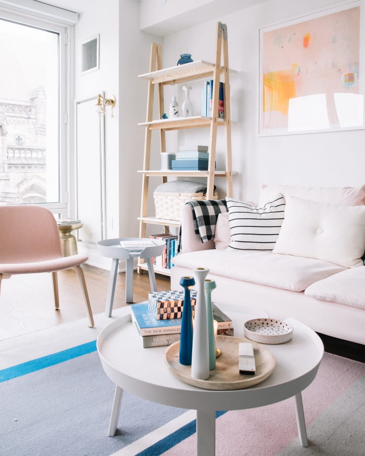
Contrast “pink” with bold hues to create that complimenting finish. The blue shades and dark colored carpet will mix with the softness of the pink to create a fusing that will seem to be a matching combination.
Space: The “Pink” Outdoors

Create an air of “femimasculinity” by combining shades of green with pink. Who said that women are only allowed to use and wear pink? Not at all, “pink” has changed the views of many and is now bridging the gap between femininity and masculinity.
Space : The Bathroom
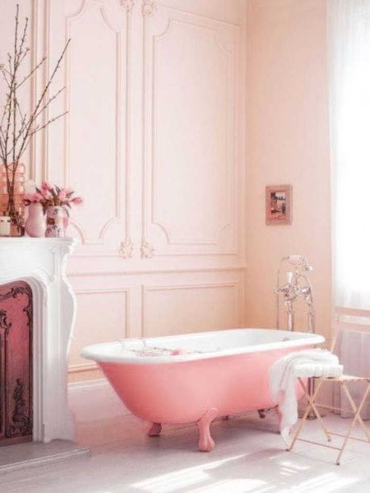
Achieve a soft look by using different shades of pink and adding more shades to reveal a natural look. This look can be achieved by using shades of pink and then adding more over the already painted pink walls to create a soft, solid background. Notice how the darker shade of bath tub compliments the powdery like wall.
The Space: Vintage Living Space

Metallics are an absolute craze when it comes to toning it with pinks especially to create a warm atmosphere. A warm, soothing glow is created and the mirror finishes the look off with a vintage touch.
About the Creator
A Full Guide to Convert EML to MSG on Windows PC
Different email clients stores emails messages in different format an you need to convert these emails from one format to another type of file format for some reasons. This article explain the best methods to batch convert EML to MSG with attachments. It is a common work which is done for the purpose of switching email clients, archiving and storage or scanning for malware.
By Adam Gilchrista day ago in Lifehack
TICK TOCK
11.59. Even though the glass had shattered, Lorna could still see that her watch ticked over. One minute until midnight. Her watch was the only thing she had that she could carry. The only thing to remember her parents by. A birthday present from last year, the year she turned seventeen.
By Elizabeth Butler2 days ago in Fiction


Comments
There are no comments for this story
Be the first to respond and start the conversation.