A Quick Guide to Pairing Fonts
Understanding Typographic Hierarchy and Selecting Typefaces

Understanding how to use different fonts and typefaces together is an instrumental part of any design. Whether you’re interested in learning more about design as a hobby or profession or you’re interested in learning more about design to help better your business, hopefully this guide will give you some ideas on how you can utilise type more effectively.
To first get acquainted with the language of typography, I’ve put together this video below. It helps to talk through the basic language and differentiate between terms that are commonly mixed up, such as readability and legibility, and sans-serif and serif. It’s not instrumental to have watched it before you continue with this guide, but it might help in giving you a clearer overview of typography as an art.
Let’s Talk About Hierarchy
Hierarchy, or visual hierarchy, is used within design to help guide and direct the reader’s eye to the most important information. It is used to create an idea of where to begin reading, where to read next, and so on, using different levels of emphasis. The overall goal is to increase the legibility and readability of the type.
So, how can we create hierarchy in design? The best way to use hierarchy in design is to utilise contrast. Using contrast is a great way to differentiate between the different levels of your design. Keep in mind that it’s important to use just enough contrast: small changes will not be powerful or effective enough and will just add noise to your design, but too much contrast could disrupt your communication.
The main themes that we will be exploring throughout this guide are contrast and balance. The secret to creating good font pairings that work cohesively in their communication is to create enough contrast whilst maintaining a suitable balance. This is something I talk about in more detail within the video guide at the bottom of this article.
Tips for Pairing Fonts
Remember to use hierarchy. This is an ideal time to utilise hierarchy and create different levels within your design: titles, subtitles, body type, for example.
Don’t let your pairings clash. Avoid using similar fonts together. For example, two sans-serif fonts that are both tall, chunky and thin. Using similar typefaces reduces your legibility and makes it harder for the reader to understand the design.
Avoid too much contrast. Find a balance between having too much contrast and not enough. It can be important to use your judgement when it comes to creating enough contrast but, when creating contrast with size, using the golden ratio as a starting point can be useful. Simply multiply or divide the point size of your type by 1.618 and round it to the nearest whole number to create differentiations in your sizing.

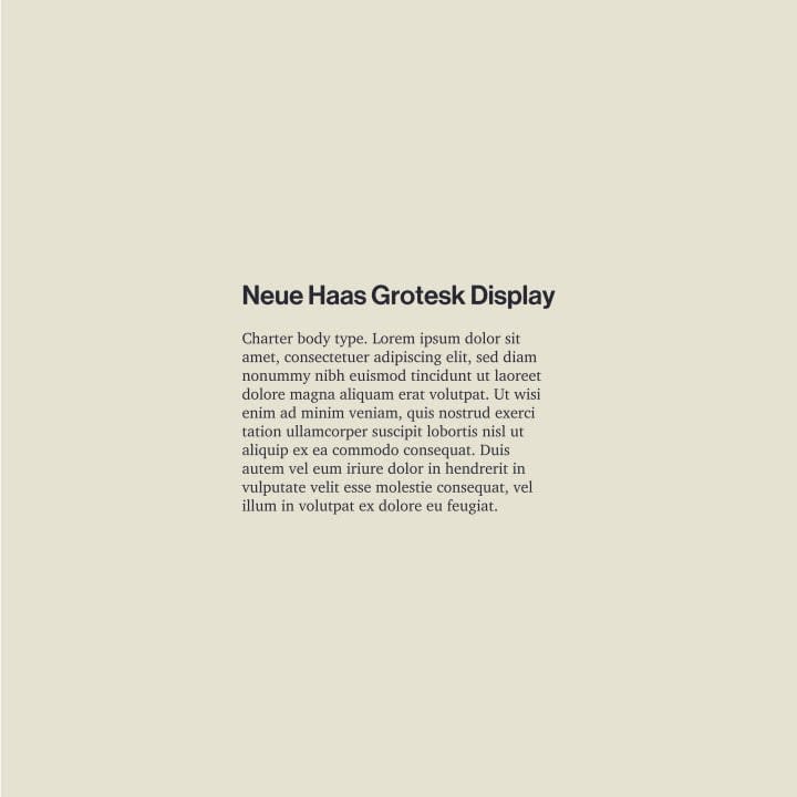
Mix up sans-serif and serif. Most of the time, serif typefaces and fonts work best as a body type. This offers a good amount of contrast and creates a clear hierarchy. Maybe this is the ultimate type pairing.
Less is more. Keep it minimal and stick to using just 1-2 typefaces or fonts to ensure that you aren’t overcomplicating your design.

For three-font combos, use one typeface and two fonts for the heading and then use a contrasting typeface for your body type.
To see these tips in action and for some further discussion on how you can create great font pairings, I’ve put together this video which discusses the points in more depth and with some more visual examples:
Where Can I Find Typefaces?
Around the web, there are plenty of places that you can source typefaces for your next project. Some of my favourites include Adobe Typekit (which is included in the Creative Cloud membership) and Google Fonts (which is a great website for free typefaces and ones that are web-compatible). Some of my other favourites include MyFonts and Fonts.com, as well as Creative Market which can be a great source of bespoke typefaces.
Find Font/Typeface Inspiration
Fonts In Use and You Work For Them are both great platforms which allow you to browse through fonts in use, finding inspiration and examining how other designers utilise typography.
Thanks for reading, if you've got this far. You can find more of me around the web on YouTube, Instagram and Twitter.


Comments
Vala Flynn is not accepting comments at the moment
Want to show your support? Send them a one-off tip.