
Website Navigation: Tips & Best Practices For Businesses
Are you aware of what online consumers are saying regarding website user experience? Here are some important stats you should know!

Are you aware of what online consumers are saying regarding website user experience? Here are some important stats you should know!
- 88% of users say they are less likely to return to a website after a poor user experience.
- 94% of customers wish for easy navigation when they visit a website.
- Another study reveals that 94% of a site’s negative feedback is related to design.
A great way to enhance the experience of a site is to build exceptional navigation. When your Web Application Development Company, you will also be automatically improving your SEO performance.
Good site navigation ensures that your visitors effortlessly find what they are looking for, and makes it easy for search engines to crawl as well. It results in more conversions and higher search visibility.
But how do you actually build awesome navigation for your small business website? There are so many tips on the internet that it can be overwhelming for novices and webmasters alike.
In this blog, we will be looking into some of the most practical and best website navigation tips and best practices for small businesses.
But before that,
What Exactly Is Website Navigation?
Website navigation can also be termed internal link architecture. They are the links within your business site connecting your pages. Its main function is to aid users in easily finding what they are searching for on your site.
Having good website navigation will rank your site higher on search results as search engines use your site navigation to find out and index new pages.
The links on your site will assist the search engines in understanding the target page’s content and context and also the relationships between pages.
The Core Objective Of Website Navigation
Your users should always be your central focus while building your site navigation. To satisfy your users, you will have to make navigation easy. Then, you can implement strategies to optimize your site for SEO without letting it hurt the user experience.
According to statistics, it takes only 50 milliseconds for a web visitor to form an opinion about your site. If your site gives a bad first impression, users are most likely to leave your site and may never return back.
Thus, small business owners should aim to build a modern website navigation design that creates positive first impressions and great UX. A great website experience occurs when a user spends less time on your site while getting all their needs met. It will happen if you focus on building a site taking into account your customers’ preferences and what they find most beneficial.
Top Website Navigation Tips And Best Practices For Small Business
As promised, here are the top website navigation tips and best practices your small business can start implementing today. They will help your business to boost traffic, enhance engagement, and increase conversions and sales.
1. Have A Well-Planned Strategy
You need to have a plan while building a website. So before jumping right in, find out which features and pages are required for your website and plan out their hierarchy. Features including the About us page, Home page, blog section, review section, FAQs, and so on are all crucial for a business website.
While at it, you should also find out which of these pages are most valuable for your customers. Creating a sitemap will make things more transparent and easier for you.
Your sitemap should include a list of all the essential website pages and sub-categories contained within them. It should also point out the most important pages and pages that are less significant.
Below is an example of a diagram-style sitemap. However, you can choose whatever format you feel comfortable using.

Image Source: Moqups
Consider using the user adoption platform while training your team. It can help you to design interactive guides without coding knowledge, effectively engage your users across different touchpoints, and allow you to measure the effectiveness of your user engagement with their advanced analytics.
2. Design Unique And Consistent Primary Navigation
Focus on designing primary navigation that is not only unique but also consistent throughout the website. Consistent design helps accessibility, allowing users to navigate a site more quickly.
Navigation becomes more straightforward when it doesn’t necessitate users to learn new functionality when they visit new pages or sections.
When you visit a well-designed website, you can easily identify the main menu as it is typically positioned at the top of the page in the middle or aligned to the right or left of the page.
You can also spot the main menu by its uniqueness or contrast against all other things on the page.
Take a look at this example below:
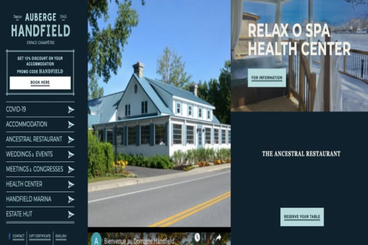
Image Source: Aubergehandfield
The primary navigation design of Auberge Handfield Country Inn looks excellent.
Their left-hand menu design stands out with its use of custom font and the overall size distribution. And aren’t the bold typography and strokes arresting? Their high contrast against the navy blue side panel has been smartly applied.
3. Focus On Responsive Navigation
Not having a responsive website will land your business in big trouble. If you consider the stats and facts,
- Nearly 60% of all internet access is attributed to smartphones.
- 94% of web visitors judge sites on responsive design.
- Also, the Google search engine prioritizes responsive sites.
When you create a responsive design, your business site will look great on any device. And a part of the responsive design practice includes creating a compact navigation style, which can be achieved by creating the hamburger menu.
The hamburger menu is the answer to improve website navigation on smartphones without using too much space. It can be neatly positioned in the top right or left-hand corner.
The example below is of Bad Assembly’s hamburger menu design. Their functional design stands out and appears carefully designed. Moreover, the navigation is consistent with their visual approach.
When you click the stacked hamburger icon, the hidden menus are displayed on full-screen websites.
Another way to create responsive navigation is to build sidebar navigation as done by the denim brand Edwin Europe. This trend is becoming increasingly popular, thanks to its usability.
When you use the sidebar menu, the items will be highlighted all throughout the internal website pages as users navigate them.
Sidebar menus are a great option for mobile-responsive sites owing to their scalability and ease of use on any device, including smartphones.
4. Consider The Sticky Menu
Sticky menu, floating menu, or fixed menu – they are one and the same.
It is the type of menu that stays fixed even when browsers scroll down your website, hence the name.
The sticky menu comes really handy when you have long-scrolling pages. It saves your visitors from having to painstakingly scroll all the way back up just to access another page.
While working with a fixed navigation menu, consider auto-resizing your navigation bars, especially if your navigation menu is big. It will ensure that your menu doesn’t occupy too much space.
If you visit the Fandango Media Group website, you will find that they have implemented auto-resizing for their fixed navigation style menu. Though it hasn’t shrunk much, you feel the transformation when scrolling.
You can also choose to add a Back to Top button. It can help consumers save time.
However, your choice of navigation style will depend on the design and layout of your site. So consider them while creating the most convenient navigation style for your website. You can also consider moving your business to popular and established e-commerce platforms like ShopifyPlus. The platform allows you to design custom navigation so that you can prioritize products and “collections” and increase conversions.
5. Add Call-To-Action Buttons
All websites, irrespective of industry, goal, and design, ask visitors to take a certain action. In marketing, CTAs can turn visitors into leads for the sales team. For that reason, you want a strong CTA that can convince people to act.
It has been found that CTAs that have strong, personalized messages can boost conversion rates by 202%.
Some great strategies to apply while creating CTAs for your website include:
- Using personalized call-to-action
- Invoking a sense of urgency
- Incorporating value propositions
- Using action-oriented words
- Ensuring the right size and shape
- Standing out by using contrasting colors
In the example below, Adobe applies remarkable psychology of colors. The designers have used blue color over a black background, making the call to action alluring and resonant with the voice of the brand.
Note that the color you apply will depend on the website’s design. Test several colors before settling for a color that can bring you more conversions.
As a small business, you will also want to increase your email subscribers.
You can have a look at the CTA of the shoe company Rothy to get some inspiration for increasing email subscribers.
The brand creates a sense of exclusivity in their CTA by saying, “find out first,” encouraging more sign-ups.
As customers want to be among the first to know about new sales, products, or news, creating exclusivity is a smart move to increase email sign-ups or sales, for that matter.
Wrapping-Up
Offering a great user experience should be the goal of every business that wants to succeed. Having stellar business website navigation is a sure-fire way to increase UX.
Follow these five crucial website navigation tips mentioned in this blog to design a site with easy navigation and keep your users engaged while increasing conversions and sales.
You can also use these website navigation tips to increase your email subscribers, social media following, and so on by including a CTA button.
Plus, remember that good website navigation can improve your SEO performance as it makes it easy for search engines to crawl your site.
About the Creator
Keep reading
More stories from Shubhankar Gupta and writers in Journal and other communities.
12 Most Important Steps To Develop A Successful LinkedIn Marketing Strategy [2021]
There are millions of customers on this platform who check for each business. Hence, every business needs to involve itself in LinkedIn marketing and get an effective LinkedIn marketing strategy. When LinkedIn marketing is executed with the utmost care and methodological, it creates brand awareness, and businesses can have a long-term professional relationship and help in lead generation.
By Shubhankar Gupta3 years ago in Journal
Another Factor That Separates Sages From Masters
Read to the End to Help "Change The World" with our Earth Week Impact Launch Initiative! --- In my article The 8 Stages to a Quality Career, I detailed each of the steps one must go through to advance to the highest levels in any Industry.
By Cody Dakota Wooten, C.B.C.8 days ago in Journal
SORCERY OF THORNS: A REVIEW
"The library wants to fight back." STORYTELLING RANK: INCREDIBLE! 4.5 of 5 stars for overall enjoyment Magic, sorcery, witchcraft, supernatural powers and abilities: they're the bread and butter of fantasy writing. We've created scales and rankings to identify magic systems in novels because there are so many that exist (my personal favorite ranking is Brandon Sanderson's ranking of hard magic versus soft magic). And yet, Margaret Rogerson's novel Sorcery of Thorns still gives to magic a new take.
By Monique Hardt4 days ago in Journal
We'z Walking on a Path Ruled By Numbers
This road has felt endless, yet limited; every step tracked. Inching away along this path, I feel trapped. Confined. Left to this narrow passage that may one day amount to something greater. Time is not a concept. Only distance. From start to finish, I laugh and cry and attempt to convince myself that this is worth it. I cannot stray. I must keep going. Every step etched, is a step taken, is measured as more than before. I cannot even recall how I got here. Maybe I don’t even really exist. Just another tick marking off a perceived presence. Of what though? I am just another line drawn. Nothing more, nothing less.
By Oneg In The Arctic3 days ago in Fiction


Comments
There are no comments for this story
Be the first to respond and start the conversation.