
Wayfinding Signage: How to Improve Navigation in Large Spaces
Designing Effective Wayfinding Signage for Large Spaces

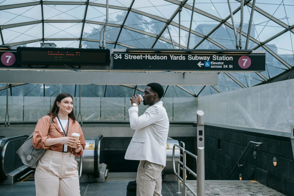
Have you ever wandered through a hospital, mall, or office building feeling completely lost? You’re not alone. Large spaces can be confusing, especially if they lack clear signage to guide visitors. That’s where wayfinding signage comes in.
An effective wayfinding system doesn’t just tell people where to go—it enhances their entire experience, reduces frustration, and even improves efficiency. Whether it’s helping patients find their way in a hospital or guiding shoppers through a mall, well-designed wayfinding signage is crucial. In this article, we’ll explore the key elements of wayfinding design and how to create signage that truly works.
What Is Wayfinding Signage and Why Is It Important?
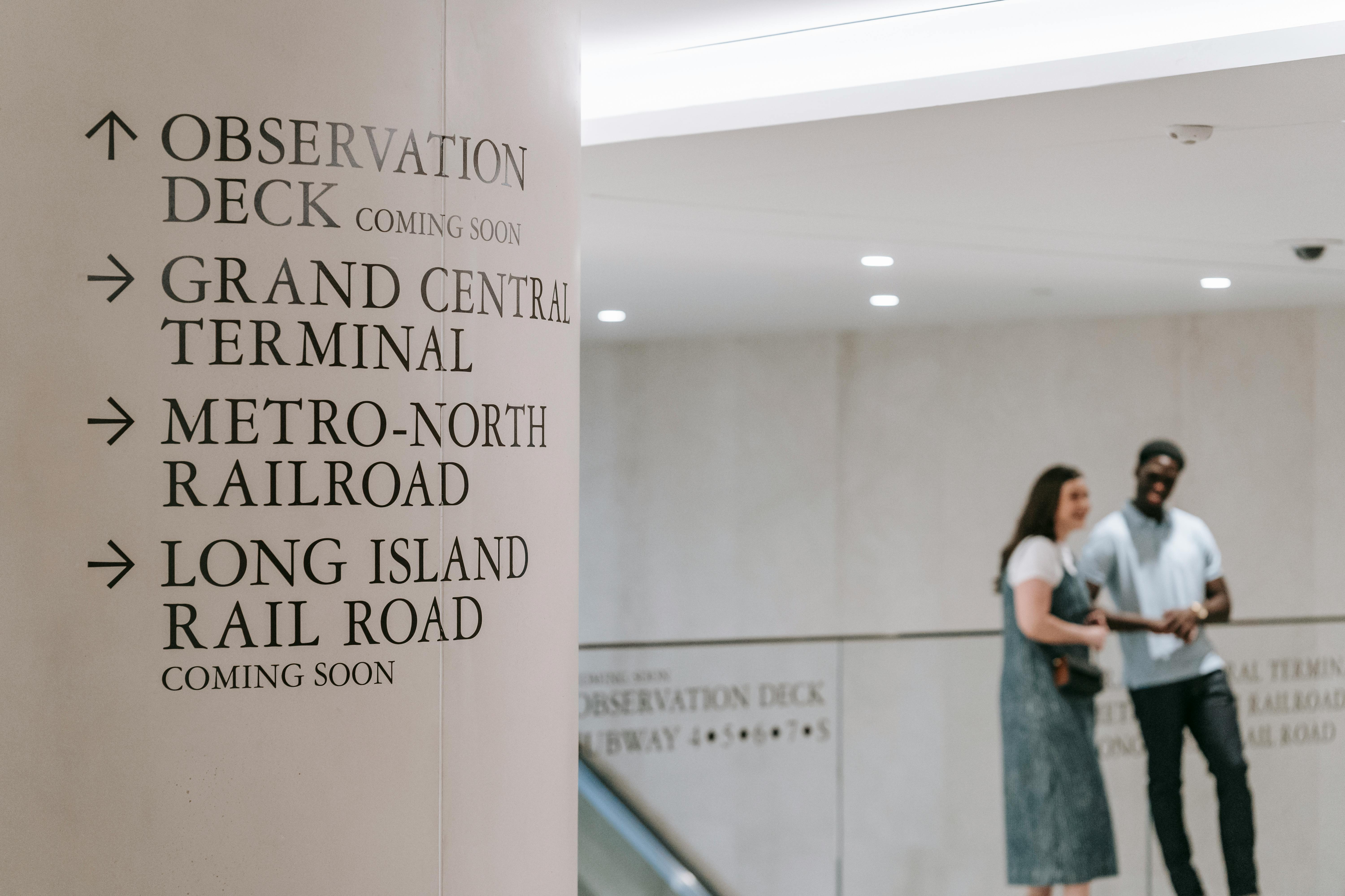
Wayfinding signage is a system of visual cues—like signs, maps, and symbols, that help people navigate a space. It plays a critical role in:
- Reducing confusion – Clear signage ensures people find their destination without stress.
- Enhancing user experience – Whether in an airport or a corporate office, intuitive signage improves flow and efficiency.
- Boosting accessibility – ADA-compliant signs make spaces more inclusive for people with disabilities.
- Reinforcing branding – Signage that aligns with a company’s aesthetics can strengthen brand identity.
From hospitals and campuses to retail spaces and corporate offices, effective wayfinding signage is essential for smooth navigation.
Key Elements of an Effective Wayfinding System
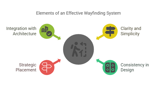
A great wayfinding system isn’t just about placing signs everywhere—it requires thoughtful planning and execution. Here are some key elements to consider:
1. Clarity and Simplicity
Wayfinding signs should be easy to read at a glance. Avoid cluttered designs, and use concise wording. The best signage communicates information quickly and effortlessly.
2. Consistency in Design
Consistency in typography, color schemes, and symbols in design across all signage elements makes navigation intuitive. For example, hospitals often use specific colors for different departments (blue for cardiology, green for general medicine) to create instant recognition.
3. Strategic Placement
A sign is only useful if it’s in the right location. Signs should be positioned where people naturally look when they need direction—near entrances, intersections, elevators, and rest areas.
4. Integration with Architecture
Wayfinding signage should blend seamlessly with the environment. Signs that feel like a natural part of the space, rather than an afterthought, create a smoother navigation experience.
Best Practices for Designing Clear and Functional Wayfinding Signage
Creating an effective wayfinding system requires more than just slapping signs on walls. Here are some best practices to follow:
Use Universally Recognized Symbols
Icons and symbols transcend language barriers, making signage easier to understand for diverse audiences. Think of airport restroom signs—no words needed, yet instantly recognizable.
Make It ADA-Compliant
Accessibility matters. Use braille, tactile lettering, and high-contrast colors to ensure signage is readable for individuals with visual impairments.
Balance Aesthetics and Functionality
A beautiful sign is useless if it’s hard to read. The key is to balance design with functionality. Simple fonts, high-contrast colors, and proper lighting can improve readability.
Consider Multilingual or Digital Signage
In multicultural spaces like airports and shopping centers, multilingual signage improves accessibility. Digital signage can be updated in real-time to provide directions, event schedules, or emergency alerts.
How to Improve Navigation in Hospitals, Offices, and Large Facilities
Different environments have unique wayfinding challenges. Let’s look at how signage can be optimized for various spaces:
1. Hospitals

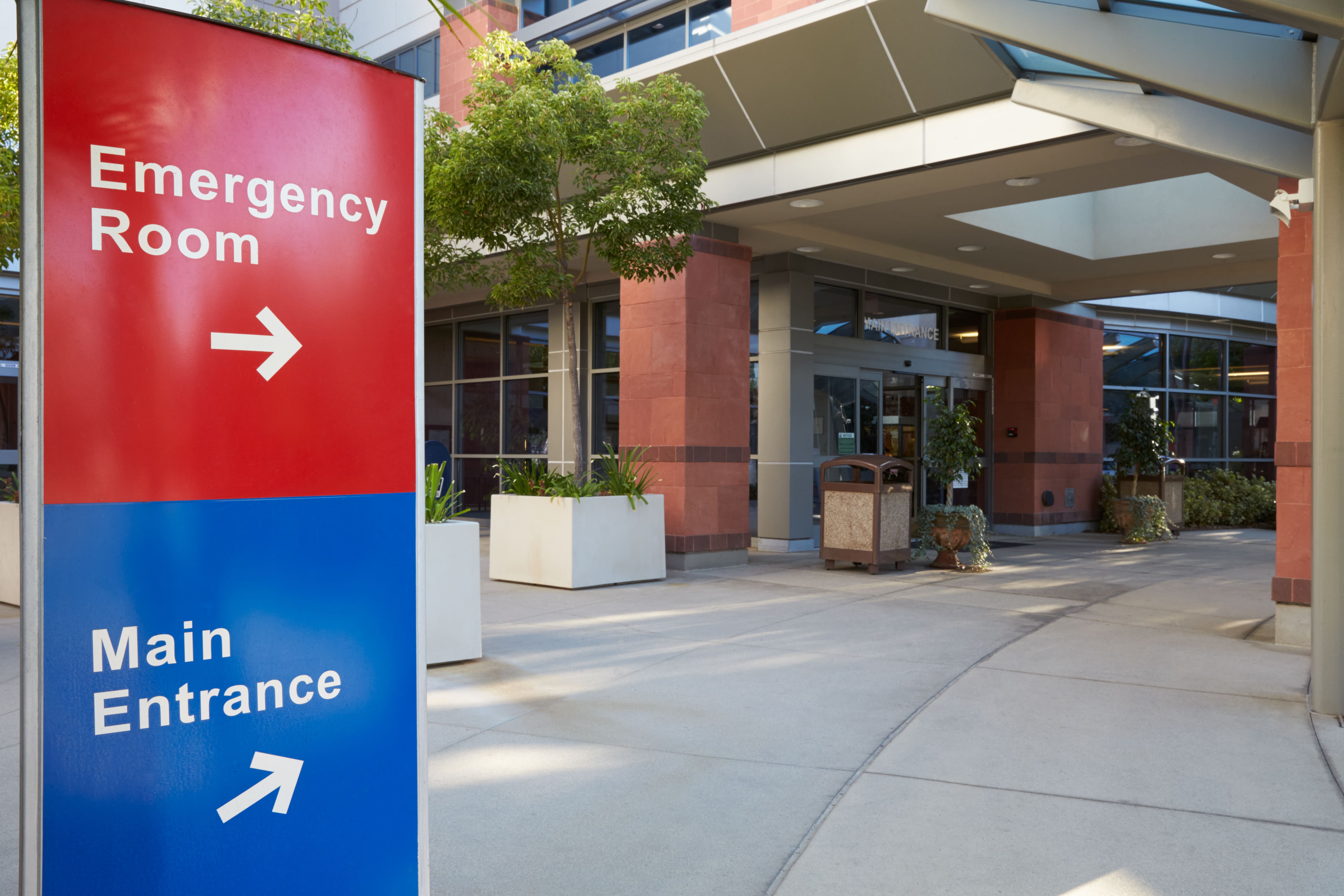
Hospitals are often large and stressful environments. Effective wayfinding reduces anxiety for patients and visitors.
- Color-coded departments – Using distinct colors for different wings improves recognition.
- Floor and wall graphics – Arrows on floors and walls help guide movement.
- Interactive digital kiosks – Touchscreen maps provide real-time navigation.
2. Corporate Offices

Office spaces should be easy to navigate for employees and visitors alike.
- Clear lobby directories – A well-placed directory at the entrance helps visitors orient themselves.
- Departmental signage – Marking conference rooms and departments improves workflow.
- Emergency exit signs – Well-lit exit signs enhance safety compliance.
3. Shopping Malls & Retail Spaces
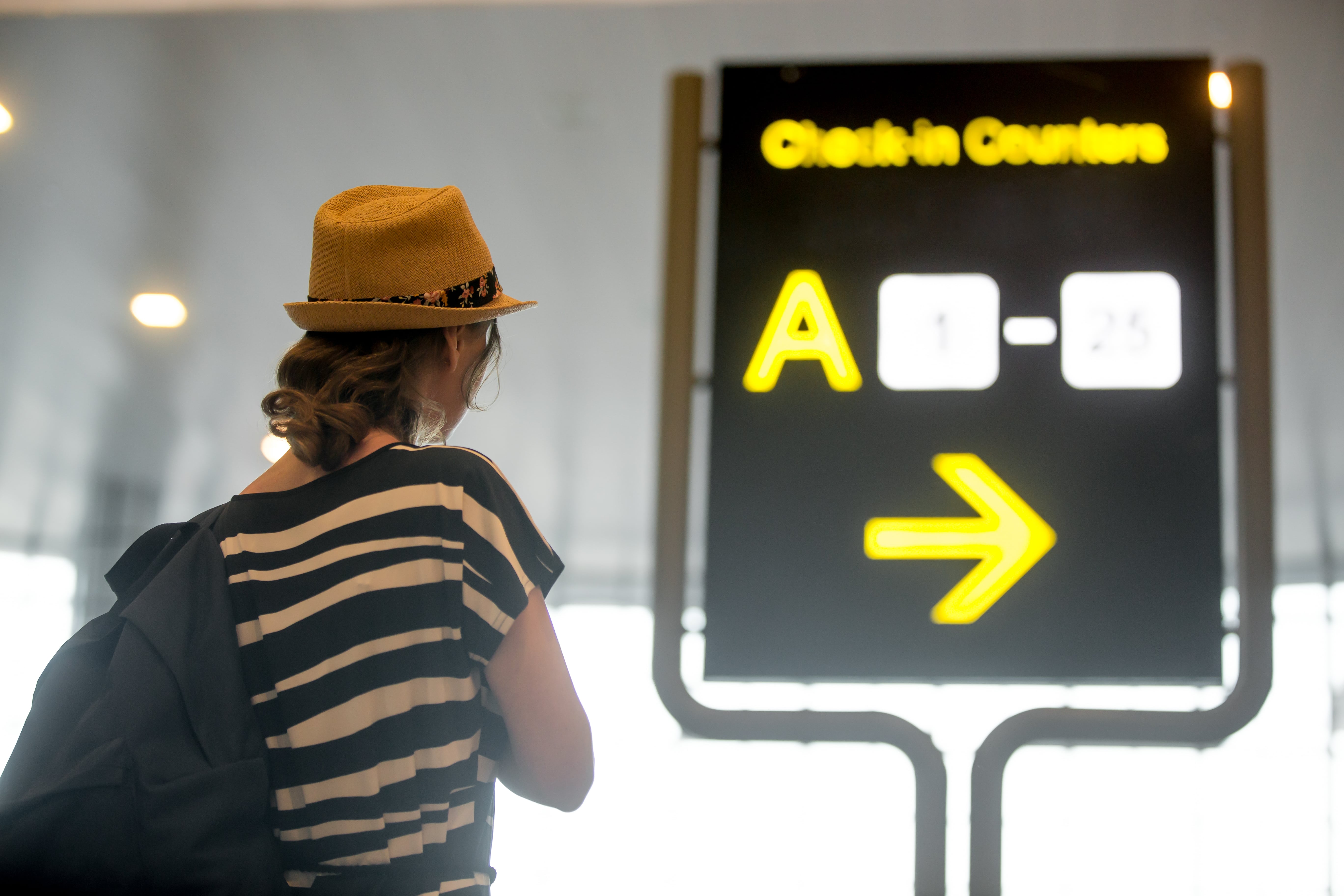
In retail environments, clear wayfinding enhances customer experience and increases sales.
- Store directories – Interactive or printed maps at key locations make finding stores easy.
- Hanging directional signs – Overhead signs help shoppers navigate without breaking their flow.
- Parking signage – Clearly labeled parking zones prevent frustration.
4. University Campuses
Campuses are vast, with new students and visitors frequently arriving.
- Campus maps – Large, detailed maps at entrances help people plan their route.
- Building identification signs – Numbered or named buildings should have clear signage at multiple entry points.
- Event-specific signs – Temporary signage for conferences, open houses, or sports events improves visitor experience.
The Role of Digital Signage in Modern Wayfinding Systems
Technology is transforming wayfinding. Here’s how digital solutions are enhancing navigation:
- Interactive kiosks – Touchscreens allow users to search for locations, get directions, and even print maps.
- Augmented Reality (AR) apps – Apps that overlay digital directions onto real-world environments make navigation seamless.
- Real-time updates – Digital signs can adjust directions based on construction, events, or traffic patterns.
Digital wayfinding is especially valuable in high-traffic spaces like airports, hospitals, and large shopping centers.
Common Mistakes to Avoid in Wayfinding Signage Design
Even the best intentions can go wrong. Here are some common mistakes to avoid:
- Overloading signs with too much information – People need quick, clear directions, not long paragraphs.
- Poor color contrast – Light gray text on a white background? That’s a readability disaster.
- Bad placement – If people can’t see the sign when they need it, it’s useless.
- Ignoring maintenance – Broken or faded signs lead to confusion and frustration.
Future Trends in Wayfinding Signage and Smart Navigation Solutions
Looking ahead, wayfinding is becoming smarter and more interactive. Some exciting trends include:
- Sustainable materials – Eco-friendly signage using recycled materials and energy-efficient lighting.
- AI-powered wayfinding – Smart navigation systems that learn user behavior and provide real-time guidance.
- Seamless integration with mobile apps – Smartphone-based navigation linked to wayfinding signs for a smoother experience.
Final Thoughts
Wayfinding signage isn’t just about pointing people in the right direction—it’s about creating a seamless, stress-free experience. Whether designing for hospitals, offices, malls, or campuses, the key is clarity, consistency, and usability.
By following best practices, avoiding common mistakes, and embracing new technology, businesses and public spaces can significantly improve navigation for everyone.
So next time you step into a large building and easily find your way, take a moment to appreciate the signage that made it possible! 😊
Ready to enhance navigation in your space? Invest in smart, effective wayfinding signage today and create a seamless experience for visitors. Contact us now to get started! 🚀
About the Creator
BlinkSigns
BlinkSigns offers custom signage designed to elevate brands while prioritizing sustainability. Our expertise lies in eco-friendly materials and cutting-edge designs for long-lasting, impactful signs.
Enjoyed the story? Support the Creator.
Subscribe for free to receive all their stories in your feed.
Comments
There are no comments for this story
Be the first to respond and start the conversation.