
The Functional Art:Introduction & Chapter 1 Response
By: Maya Abrams


This week's reading for my 'Introduction to Infographics and Data Visualization' class were the Introduction and 1st chapter to Alberto Cairo's The Fuctional Art. The book's introduction explains four major themes concerning using infographics correctly. Some of these themes include proclamations like how 'The brain doesn't process info that comes through the eyes, but creates mental images that allow us to reason actions that facilitate survival' or that 'Graphics, charts, and maps aren't just tools to be seen, but to be read and scrutinized.' The two chapters also explain the foundations to using infographics as an operating work of art by using their visuals to communicate the systematic facts found in another intellectual's research. The main reason many publications, authors, and scientists, and specialists in academia use infographics to visualize their theories consists of the basic fact that visuals with a satisfactory summarization facilitate the mind better learn a new idea or theory. Cairo includes a chart in The Functional Art's first chapter depicting the process of an image transitioning to basic, uninterpreted info into knowledge into wisdom, relating how data visualization is a crucial method to speed up this process in tandem with the data's original results. The most intersting tidbit I received from the reading is when Cairo explained towards the end of the first chapter that, "the role of an info architecht is to anticipaate the process and generate order before people's brains try to do it on their own." Basically, info designers use their work to accelerate the brain's decoding of factual information, rather than letting the reader decode it based off their personal opinion. It helps provide an objective opinion, if used correctly, to the research without having to fight through using objective language.
3rd Generation iPod Nano (Rights to Apple) Seeing that each reading should help me identify with either an infographic that stuck out in my mind previously or a story relating to data visualization, I actually noticed a small tidbit to include with the chapter's details that came from Cairo's own pages. In the reading he explains that not only technology facilitates everyday life, but also helps society implicate memories without even realizing. He used an mp3 player as an example that seems simply like a source for a person's everyday playlist, but it actually symbolizes much more than daily streams of the same song. Cairo reiterates that technology is simply an extension of ourselves, and data visualizations should be taken just as seriously. A personal example of how technology proceeds much of my identity is the fact that I use technology to either write, record, or create the foundations for my music. Like the author mentioned, I spent most of the childhood either listening to the same 100-200 songs on the way to school or cheer practice, or would save my Christmas/birthday money to purchase music I'd wanted for a months on end. My slim, hot pink iPod nano was first peak I got of what a world filled with musical memories would look like. Now I use technology like my Macbook, iPhone, and Beats to either stream music or create music of my own, and it's pretty mindblowing to realize that without these small machines and a little bit of internet connection none of that would be possible. My biggest joy in the entire world would disappear, if technology had never been developed, whether that be as recent as a wireless computer or as introductory as a phonograph.
Infographic Illustrating a Regional Map of the 2018 Grammy Nominees
from the Western United States (Rights to the Grammys)
As a response to Cairo's fair point that data visualizations should be an extension of oneself, I took a mental note to ensure that every small exercise/project completed in class would have something to do with music in way, shape, or form. Examples of my completed work so far are creating a promotion flyer for a concert, creating an infographic about the analytic demographics of the Grammy's Album of the Year award, and measuring the most frequent vocal ranges among recording artists. Whether a person specializes in data visualization profession or is just developing their creative skills like me, collecting data for subjects that matter to the creator helps make it even more beautiful and informative. If I could help imprint a fact or musical technique in a classmates' mind through one of my larger projects later on in the semester, that would mean so much to know I'm helping sproud informational awareness in an environment I initially believed to be just for learning. Although much of data visualization corrleates around illustrating factual experiements/data, a deisgner's main task is to make the data beautiful and welcoming for readers to enlighten their minds. In a world where everyone is constantly putting one another down or trying to prove how one demographic is more ignorant than the other, a pretty picture with harmless informants is very crucial and necessary at the moment. Data visualization could actually become a very productive peace-maker, if used correctly and authentically.
About the Creator
Maya Abrams
DTX/MIA | a sophomore in college who just likes to display her thoughts & ideas for others to view/discuss. that's all i got for now.
Twitter: _mayadania
Instagram: _mayaabrams
Keep reading
More stories from Maya Abrams and writers in Journal and other communities.
How Charts Lie: Introduction and Chapter 1 Response
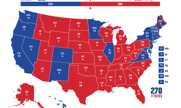
This semester I decided to take a class titled 'Introduction to Infographics and Data Visualization,' which specializes in interpreting and creating infographics to accompany educational projects or articles. The first reading for the class is titled How Charts Lie by Alberto Cairo, and the main idea of the book is explaining how political, public, and general figures either intentionally or unintentionally misread charted graphics for their personal gain. The book's introduction begins with several graphics illustrated from the 2016 Presidential Election, including this controversial image of the Electoral College votes. The key reason for bringing up the election concerned the fact that President Trump and his colleagues tend to falsify the actual results from the election, using misleading charts to convince the American people that they won by a landslide. In reality they actually lost the popular vote to Hillary Clinton, and only won the election via the electoral college where the states with the higher number of representatives voted in his favor. Cairo further explains throughout the remainder of the introduction into the first chapter how it's immensely important that people in such a technical world have a clear sense of graphicacy (graphic literacy), meaning that they can correctly interpret the thousands of charts found around news media daily. Another notion Cairo mentions to help facilitate chart interpretation is making sure that the artists make regional proportions correct to their statistics; this means that if a city, like Miami, FL, has a population of 2.7 million people, while a city, like Los Angeles, CA, has a population of 10 million people, the graphic depicting LA should be nearly four times the size of Miami's representative graphic.
By Maya Abrams4 years ago in Education
Whispering Woods Challenge Winners
Congratulations to Morgan Christy Rickards for their winning Whispering Woods story, Guardian at the Gate. Morgan has been a Vocal creator since February 2021, and this is their first time placing in Challenge — well done, starting with a win! Guardian at the Gate draws evocatively from Welsh tales of the Cantre'r Gwaelod, a lost sunken kingdom between the forest and the sea. Heledd’s dangerous adventure pulls her towards the water but her spirit is anchored in the woods: Morgan’s writing is atmospheric and exciting.
By Vocal Curation Team7 days ago in Resources


Comments
There are no comments for this story
Be the first to respond and start the conversation.