
Review a Vehicle Design with the Doors Open
The ordinary unloading view can reveal what a polished closed-door preview leaves out.

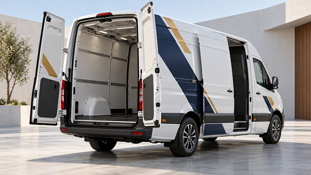
A vehicle design usually arrives for approval with every door neatly closed. The side panel is uninterrupted. The rear message sits across a clean rectangle. Nothing covers the company name.
Then the vehicle goes to work.
A sliding door moves across the side. Rear doors swing out. Equipment is unloaded beside the body. A design that was easy to understand in the presentation now appears in several smaller pieces, some of them hidden and some facing a different direction.
That does not make the design automatically wrong. It does mean that a closed-door preview answers only part of the question. Before approving the artwork, it is worth reviewing the vehicle in the ordinary states that matter to its actual use.
Start with how the vehicle is used
The useful question is not whether every word can remain visible from every possible angle. That would be an unrealistic brief. Ask instead where a person is likely to encounter the vehicle and what the business wants that person to understand.
A van parked outside a customer's building may be seen from the pavement while the crew unloads. A vehicle at an event may spend time with its rear doors open. Another might normally be parked with the side facing a wall. These are different situations, and the layout priorities can differ with them.
Write down the few situations that actually matter. Include the usual viewing direction, the likely door state and the single most important message. Avoid turning an imagined perfect viewing angle into a universal requirement.
This is a planning exercise, not a claim that a particular arrangement will generate a predictable number of enquiries. The goal is to identify an avoidable communication problem before production.
Review the same design in more than one state
Use the same vehicle specification and artwork version for each comparison. A different wheelbase, window arrangement or door configuration can change the available surface. An attractive mock-up on a vaguely similar van may conceal the very interruption you are trying to examine.
Ask for a closed view and the relevant open view. Depending on the actual vehicle, that might include a sliding side door, one rear door open or both rear doors open. Mark those views as visual studies rather than manufacturing instructions.
Keep the viewing direction reasonably comparable. If one image is a close-up in bright light and another is a distant oblique view, it becomes harder to tell whether a difference comes from the door position or from the presentation itself.
Look first at the main name and service description. Then check supporting information. A decorative line that no longer joins perfectly may matter less than a contact detail that disappears halfway through.
Look for fragments that change the meaning
Imagine a fictional business with a short service phrase spread across two rear doors. With both doors closed, the phrase is clear. With one door open, only the second half remains visible. That fragment might be meaningless, or it might suggest a different service.
The first response need not be to repeat everything everywhere. Consider whether the phrase can sit on a more stable surface, whether each important word can remain intact, or whether the hierarchy needs to change. These are design options to discuss, not instructions to apply blindly to every vehicle.
Pay attention to the brand name as well. If a door position splits a name into an unfamiliar fragment, a nearby stable brand mark may help identification. Whether there is suitable space for that mark depends on the actual body and technical constraints.
This is a made-up review scenario. It is not a reported defect in a customer's vehicle or a before-and-after case study.
Separate recognition from contact information
A passer-by may need to recognise the business without being able to copy a complete address at that moment. Another person, standing nearby, may want to find the website. Decide which task each part of the vehicle is intended to support.
A short name, a service description and a contact route can compete for the same limited space. If the brief gives everything equal emphasis, the open-door review becomes a debate about whichever item happened to disappear. Establishing priorities beforehand makes that discussion more useful.
Check the accuracy of contact details separately from their visibility. A complete but incorrect address is still incorrect. Read the final artwork against the confirmed source, and test the actual destination rather than assuming that a visually tidy address must work.
Do not put private contact information into public mock-ups merely to make them feel realistic. Use the business details approved for publication when the real design is ready.
Understand who approves what
HOTIM's vehicle-design service describes consultation, concept development and graphic design for businesses in Hessen and Mainz, Germany. It distinguishes that work from technical checking, production and installation by a separately appointed specialist business.
HOTIM is part of our business network. Its public description is relevant here because an open-door review can raise both communication questions and technical questions, which need different decisions.
Approving the appearance does not establish that a particular film layout, edge treatment or moving-panel arrangement is technically suitable. The executing specialist needs to assess the actual vehicle and the proposed implementation. A concept image cannot supply that assessment.
Keep the two decisions visible in the handover: which graphic version has been approved, and which technical points still need confirmation. That is more useful than a general message saying that everything looks good.
Make the review easy to act on
For each important vehicle state, record a small number of concrete observations:
Which vehicle and artwork version are being reviewed?
Which doors are open, and from which direction is the vehicle shown?
Can the viewer identify the business and understand the main service?
Does a moving panel hide or split an essential element?
Is the issue about wording, placement or technical feasibility?
Who needs to answer it before the next version is approved?
Write observations before solutions. “The website address is partly covered in the side-door-open view” gives the designer a problem to solve. “Make the logo bigger” may change the composition without addressing that problem at all.
After a revision, repeat the relevant comparison using the new artwork version. Keep superseded previews clearly separated so that an old image is not accidentally treated as the approved file.
Agree on an acceptable working view
Some interruptions are inevitable when a vehicle opens. The practical aim is to know which ones are acceptable and which interfere with the message that matters in a common situation.
A short review can finish with a clear decision: the main business identification remains understandable in the usual unloading view; one supporting detail is visible only when the doors are closed; the final placement still requires the executing specialist's technical confirmation. That is an example of a decision format, not a universal acceptance standard.
The most useful preview is therefore not always the most polished one. It is the one that shows the vehicle doing something ordinary, with the doors in the positions its work actually requires.
About the Creator
Vladyslav Yanchenko
Marketer at Salestudia in Idstein, Germany. I write about websites, SEO, digital marketing and e-commerce, plus how people choose services and products.
Enjoyed the story? Support the Creator.
Subscribe for free to receive all their stories in your feed.
Comments
There are no comments for this story
Be the first to respond and start the conversation.