
How to Design the Perfect Sign for Your Business
A sign is how customers identify your business, making sure that the design is just right could be the difference between making a sale or not.


It goes without saying, when you’re running a business, people need to know that you’re there before they can buy from you. In the digital world, that means paying attention to your SEO. In the real world, it means having effective signage, which even in an online world still holds its place as a valuable marketing investment.
To help you get started, professional sign makers; Judson Signs, provide their insight and expertise on how your business can design the perfect sign to attract customers, far and wide.
Cover the practicalities first
Remember the design motto that form follows function. Start by checking out what laws will apply to your sign. For example, you’ll need to think about planning permissions for your business sign. You’ll probably also need to think about the Equality Act 2020 and local regulations. Last but definitely not least, you’ll need to think about the practicalities of your location. In particular, if you want a lit sign, then you’ll need a source of power.
It’s advisable to think about the location for your sign first. This will probably have a strong influence over the practical considerations. Ideally, you want your sign to be at the “decision point”. In other words, you want your customer to see the sign, register it and then react to it by walking straight into your business. Placing a sign before or after this point is setting yourself up for missed opportunities.
Keep longevity in mind
A sign isn’t necessarily going to be the most expensive purchase your business could make. It is, however, still likely to be an investment piece. It’s therefore advisable to design it on that basis. Timeless designs may not be quite as eye-catching as “on-trend” ones. They will, however, provide reliable service for a lot longer.
Similarly, it generally helps to have consistency across your branding. If part of your brand identity is continually ringing in the changes, then your best bet may be to go for a very neutral sign. Then create a display around the sign and change that up regularly.
Start your design with size and shape
As a general rule, bigger is better. It gives you more visual real estate to play with. In principle, your choice of shape is only limited by your imagination (and your local council’s rules). In practice, offbeat shapes tend to have clear disadvantages. Firstly, they’re generally more expensive. Secondly, they tend to date very quickly. Thirdly, it can be hard to design content around their limitations.
This means that sticking with regular portrait and landscape formats is likely to be your best option. If your space can support either then try designing a sign in both formats and seeing which you prefer. Portrait formats tend to throw the main subject into focus whereas landscape formats tend to put the main subject in context.
Some businesses may want to keep in mind that signs in portrait format are more ‘Instagrammable’. This is because Instagram is primarily designed for use on mobile devices. These are generally used in portrait mode so that’s what Instagram favours.
Keep legibility front and centre
Signs ought to be functional decor. To be functional, they need to be legible. Legibility depends on two main factors. These are structure and contrast.
Aesthetically, structure means ensuring that the various elements of your sign are distributed appropriately. Generally, you want them to be evenly distributed over your sign rather than all clumped together. You also want there to be a suitable level of blank space (or negative space). Even though your sign is prime visual real estate, you need to resist the temptation to overfill it.
Functionally, structure means deciding what you need on your sign. Technically, if there is space left over, you can fill it with extra elements you’d like to have on your sign. In practice, however, it often makes more sense just to make the key elements bigger. Remember, in the UK, even the days can get very dark, especially in autumn and winter.
Contrast means exactly what it says. Make sure that your elements stand out clearly against their background. You need them to be sharp enough to be read quickly even in the worst of conditions.
About the Creator
Malcolm Judson
Malcolm Judson is the Managing Director at Judsons Signs, specialists in sign making for schools and commercial and retail spaces. Judsons Signs manage the entire sign making process, from design and manufacturing to installation.
Keep reading
More stories from Malcolm Judson and writers in Journal and other communities.
Digital Signage Vs Static Signage: Which Is Best For Your Business?
Every business will need signage of some sort, whether it is to show the location of their business, advertise their services or help people with navigating their way around the business. The types of signs that are available are incredibly varied, so there is plenty for you to choose from.
By Malcolm Judson29 days ago in Journal
Muses & Musings
Welcome to my new series, a weekly blog on what’s inspiring me. I spent much of last week in bed with a stomach bug. I’ll spare you the details of that—but in addition to the grotesque physical symptoms, I had some fever dreams I won’t soon forget. Imagine my surprise to see Vocal’s newest challenge: Write a fiction story about a recurring dream or nightmare.
By Davina Zinn McKee7 days ago in Journal
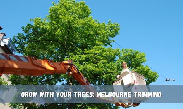
Grow with Your Trees: Melbourne Trimming
Melbourne’s beloved trees: the beautiful and grand, or the ubiquitous and familiar, are a constant presence in our suburban landscapes. However, there is little doubt that even the most aristocratic gum, or the richest jacaranda requires a little assistance now and then. That is where tree trimming Melbourne steps in to ensure that trees adorning property owners’ yards have undergone thorough pruning services and are healthy to support such beautifying additions. This life-sustaining service extends far beyond the surface; it’s supporting the well-being and vibrancy of your plants for them to thrive for longer With friends like these, who needs a lawn? In this article, read on to learn more about the advantages of tree pruning, Melbourne seasonal recommendations for pruning and the signs showing that trees demand pruning. We will also arm you with the relevant information on how to hire a suitable tree trimming service in Melbourne, which is dedicated to the health and improvement of the trees so that you can provide for your green oasis for years to come.
By Marie Pintor3 days ago in Journal


Comments
There are no comments for this story
Be the first to respond and start the conversation.