
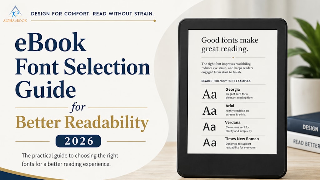
eBook Font Selection Guide for Better Readability 2026
Identify the importance of ebook fonts in increasing the readability of ebooks. Determine how the ebook format improves the reading experience of ebooks.

The increased adoption of online content consumption has enabled authors and publishers with a unique opportunity to attract target readers. However, it should be pleasant and easy to read an ebook. But because of poor typography, most people give up on reading ebooks halfway.
It does not matter if the ebook content is exciting. It will require you to have proper font types if you are going to publish your book online. According to the Nielsen Norman Group, it is easier to scan digital content than to read carefully.
Therefore, typography plays a significant role in ebook formatting. Choosing the right typography ensures your ebook appears professional, is highly readable, and provides a better user experience.
This blog explains the importance of ebook fonts for better readability in 2026.
Why Is It Necessary to Consider eBook Fonts for 2026
Fonts do not only make the content visually appealing. Fonts significantly impact readability, making it easier to retain knowledge and comprehend new material. In contrast, choosing the wrong fonts might result in:
- Low reader retention.
- Impression of incompetence.
- Eye Strain
- Fatigue faster
- Low comprehensibility
However, choosing the right typography and using it correctly guarantees better readability and a better user experience. Professional publishers know that typography is essential for digital publishing when creating an ebook.
Understanding Digital Book Typography
Ebook typography refers to the arrangement of text elements within an ebook. Thus, typography includes the following aspects:
- Text contrast
- Margins
- Text alignment
- Paragraph spacing
- Font type
- Font size
- Lines’ spacing
Unlike in regular books, ebook typography should be flexible because readers can switch devices for reading. There might be a need to read ebooks in different screen modes. Good typography in digital books and manuscript formatting for an ebook helps keep readers engaged by eliminating formatting issues.
Fonts To Be Used In eBooks For Better Readability In 2026
There are plenty of fonts used in digital publications, but not all of them fit every ebook properly. Some fonts are widely used in ebooks successfully:
Georgia
The font was developed for screens. It makes the text easy to understand and read. This font is best suited for:
- Professional publications
- Novels
- Long fiction texts
Arial
This font is suitable when the content is not aimed at entertainment. It is easily readable and appropriate for any purpose. The Arial font is the best choice for:
- Educational content
- Technical articles
- Business eBooks
Verdana
Verdana was designed specifically for on-screen readability. Thus, it is convenient to read the text on mobile devices as well. This Verdana font is best suited for:
- Mobile devices
- Online publications
- Informative ebooks
Times New Roman
It is an old-fashioned font, but it is still easy to read. The Times New Roman font will be an ideal choice for:
- Professional documentation
- Research papers
- Academic ebooks
Open Sans
This open sans font has gained popularity recently. It looks perfect and is suitable for long readings. This font is the best choice for:
- Modern digital books
- Interactive eBooks
- Marketing ebooks
Serif vs Sans Serif Font
The debate over the better option for working with ebooks never stops. People have their preferences. What factors should one consider when looking for the best ebook font?
Serif Font Style
In serif fonts, there are some additional lines called serifs at the end of each character. A variety of popular Serif fonts include Times New Roman, Garamond, and Georgia.
- Advantages of the Serif Font Style Include: Its traditional font style is suitable for long reading.
Sans Serif Font Style
It is a simple font because it lacks serifs. Example fonts include: Open Sans, Verdana, and Arial.
- Sans-serif fonts are simple to read on smaller screens and mobile devices.
Usually, sans-serif fonts are better suited to mobile devices. Meanwhile, serif fonts are more convenient for longer readings on large screens.
Finding The Best Font Size For eBook Readability
Sometimes font choice depends on the ebook size. If the text is too small or too large, the ebook becomes difficult to read. The correct size should depend on the device. There are optimal values that include:
- Primarily, between 18-20 pt for headings.
- Between 11-14 pt for the body text.
The font should always be adjustable across devices, since many ebook platforms offer this feature.
Alignment and Spacing Are Important Factors
While the font type and size are necessary for creating readable eBooks, one should not ignore proper font spacing and alignment. They play an important part in readability.
Line Spacing
Spaced lines are much better when compared to those with tight spacing because readers do not have to spend more effort when reading.
- Ideally, 1.4 to 1.6 line spacing
Paragraph Spacing
Using long paragraphs may scare the reader; therefore, you need to split them into smaller ones and leave some spaces in between.
Alignment
Left-aligned text is preferable in ebook typography because it is familiar to many readers, while justified text can create gaps, especially on phones.
How Good Typography Makes EBooks More Enjoyable
Good typography can create a professional-looking, appealing ebook. There are various signs of improper typography that readers are likely to notice, which might decrease the credibility of the publisher or author.
Professional ebook typography involves maintaining consistency throughout a publication, confirming that each image, paragraph, header, and other element is in its proper place. Professional ebook formatting improves the following factors:
- Font readability
- Accessibility of the text
- Hierarchy of visual elements
- Navigation inside the ebook
Proper typography helps to create an interactive and enjoyable ebook. One can easily navigate through a publication and find the necessary information.
Typical Typography Errors That Reduce Content Quality
Many ebook creators pay little attention to typography when concentrating on creating a valuable ebook. As a result, many common font mistakes appear, lowering the content quality.
Multiple Decorative Fonts
Sometimes creative fonts look good but are not appropriate for ebooks.
Using Too Many Fonts
While using many font types, one risks confusing, chaotic typography. As readability is the priority, there should not be many fonts in an ebook. Therefore, authors can use:
- One font type for body text.
- One font type for headers.
Ignoring Mobile Devices
Many ebook readers prefer reading ebooks using smartphones. Some fonts that look good on desktop computers might not look good on smartphones.
Using Poor Text and Background Contrast
Some creative authors like to use fancy fonts and light grey color to make the publication more interesting. This process decreases readability. The text should have proper contrast with the background.
Using Overcrowded Layout
It is uncomfortable when the layout contains lots of text with no blank spaces. Such a layout makes the content difficult to perceive.
EBook Text Formatting Tips For 2026
Today, ebooks are becoming increasingly interactive, which means ebook typography will change as well. The following tips are considered best practices for ebook typography.
Create Adaptive Layout
EBooks should adapt to many kinds of devices:
- Desktop devices
- Kindles
- Tablets
- Smartphones
Make It Simple
Simplicity is always preferred in digital reading. The font choice should be based on the content’s nature.
Create Accessible Publications
Accessible fonts help people with reading difficulties.
Have Visual Consistency
Consistent font sizes, headings, and spacing make an ebook look more professional.
Preview eBooks Before Publication
Always check how the eBook looks on different devices before publishing.
Future Of The eBook Typography
Digital publishing is gaining traction day by day. E-book typography will also gain popularity as more e-books feature more interactive functionality. The ebook font trends will include the following:
- Dark-mode friendly typography.
- AI-assisted readability optimization
- Adaptive font types
- Personalized text display
- Accessibility features
Though even when using the latest technologies, readability should not be neglected.
Readers might enjoy visually attractive ebooks, but they will remain engaged only when the text is comfortable and easy to understand.
Deliver a Unique Reading Experience to Your Readers by Using Proper eBook Formatting
Selecting a good font is an essential aspect of writing an ebook because it can negatively impact the reader’s experience if not chosen carefully. Besides, the ebook font influences readability and professionalism. Using a good font and ebook text formatting increases readability, maintains a good impression, and keeps readers interested until the last page.
Finding readable fonts and creating a professional ebook format is worth the time, as publishers, businesses, and independent authors will benefit from creating good-looking ebooks. As a result, ebooks have become more user-friendly.
About the Creator
Darren Meeks
Alpha eBook we provide high-quality, high eBook conversion services to publishers and authors worldwide. We specialize in flowable and fixed layout (ePub and Mobi) compatible with all major devices. Visit our website for more information.
Enjoyed the story? Support the Creator.
Subscribe for free to receive all their stories in your feed.
Comments
There are no comments for this story
Be the first to respond and start the conversation.