
Dark Mode vs. Light Mode: Designing for User Preference
Dark Mode vs. Light Mode

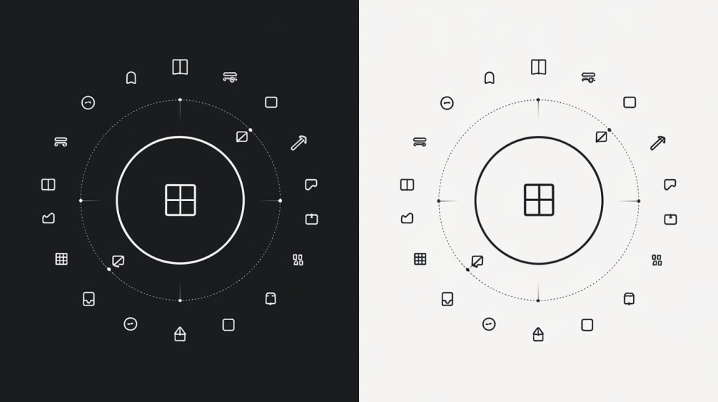
Dark mode and light mode have become a staple in modern user interface (UI) design. As users interact with apps and websites more than ever, having the option to switch between dark and light themes gives them control over their viewing experience. But how do designers cater to both without compromising usability?
In this article, we'll explore the differences between dark mode and light mode, the benefits of each, and how to design for user preference effectively.
The Rise of Dark Mode
Dark mode has surged in popularity over the last few years. Initially favored by developers, it has now been embraced by mainstream apps, websites, and operating systems. Why the sudden love for dark themes? Dark mode offers reduced eye strain, especially in low-light environments, and can also save battery life on OLED screens.
When to Use Dark Mode
Dark mode is ideal for apps or websites that users engage with for extended periods, such as coding platforms, reading apps, or entertainment services. It’s also a popular choice for apps used at night or in low-light conditions, as it reduces the harsh brightness of a white screen.
Light Mode’s Appeal
While dark mode is getting a lot of attention, light mode remains the default for most platforms. The clean and bright design makes content easy to read in well-lit environments, such as offices or outdoors. Light mode tends to give off a more professional, open, and user-friendly vibe, which is why it continues to be a dominant design choice.
Designing for Both: Challenges and Considerations
When creating a product that supports both dark and light modes, it’s essential to ensure that the design remains functional and visually appealing in both settings. Here’s how to do it:
1. Consistent Visual Hierarchy
Whether in dark or light mode, your design should maintain a consistent visual hierarchy. This means making sure that important elements like buttons, text, and navigation menus stand out clearly. Poor contrast can make these elements hard to see in dark mode, while too much brightness can be overwhelming in light mode.
2. Color Considerations
Choosing colors for both modes can be tricky. In dark mode, lighter colors are often used for text and icons to contrast against the dark background. In light mode, darker colors are used for text on lighter backgrounds. Be mindful of color contrast to ensure legibility and accessibility across both modes.
3. Pay Attention to User Preference
A growing trend in UI design is the ability to cater to user preferences. Users can switch between dark and light modes based on their surroundings or personal preferences. If you offer UI services, it's vital to implement seamless toggling between modes, ensuring the transition doesn't feel jarring.
4. Test Across Multiple Devices
Whether you’re designing a website or an app, your product will be used on various devices, from smartphones to desktops. Make sure to test your dark and light modes across different devices and screen types to ensure a consistent experience.
Advantages of Dark Mode
1. Reduced Eye Strain
Dark mode is easier on the eyes in low-light environments, helping reduce strain during nighttime use or in dimly lit rooms.
2. Battery Life Savings
For OLED and AMOLED displays, dark mode can help conserve battery life. These screens only light up the colored pixels, so a darker screen uses less power than a bright, white one.
3. Focus on Content
Dark mode often helps users focus better on content, as the darker background can make text and visuals pop.
Advantages of Light Mode
1. Readability in Bright Environments
In well-lit environments, light mode offers better readability and prevents the glare often caused by darker interfaces.
2. Professional and Clean Aesthetic
Many users associate light mode with professionalism and clarity. It’s a safe and familiar design that tends to work well for business platforms, news websites, and educational resources.
User Choice: The Key to Success
Ultimately, the best approach to designing for dark and light mode is to allow users to choose. Some users prefer dark mode for night use, while others stick with light mode for clarity during the day. Offering both options helps cater to a broader audience and improves the overall user experience.
To achieve this, designers should ensure that the UI adapts seamlessly to user settings. Whether users are manually switching modes or their system is set to toggle between them based on the time of day, the experience should be smooth and intuitive.
Conclusion
Dark mode and light mode both have their distinct advantages, and neither is better than the other—it all comes down to user preference. Designing for both ensures your product caters to everyone, whether they're working in bright sunlight or in a dimly lit room. With thoughtful color choices, consistency in visual hierarchy, and attention to user experience, you can create a UI that looks great and functions flawlessly, regardless of the mode your users prefer.
By incorporating a design that supports both modes, especially if you're offering UI services, you can create a more versatile and user-friendly product that stands out in today’s competitive market.
About the Creator
Enjoyed the story? Support the Creator.
Subscribe for free to receive all their stories in your feed.
Comments
There are no comments for this story
Be the first to respond and start the conversation.