
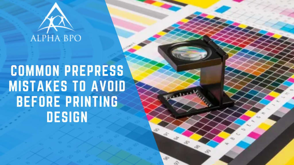
Common Prepress Mistakes to Avoid Before Printing Design
Read the blog to find common prepress mistakes and avoid them for flawless printing. Get error-free designs and the best results with expert prepress services.

If you want to bring your artwork into the physical world, prepress design must be done right. Whether it's for a new product, product line extension, or sales and marketing materials, prepress is where things can get complicated.
Without an experienced prepress service provider, bringing your vision to market can be tough due to the lack of expertise in adjusting and fitting your prepress designs into the templates provided by the printer.
To avoid delays and cost increases, it's important to ensure you have print ready design files before sending them to the press. This blog post will help you spot and correct common prepress mistakes that might hamper the process.
Let's help you bring your designs to life efficiently and effectively.
1. Blurry Images:
High Resolution is Key!
Using low resolution images can result in prints that appear blurry and pixelated. To ensure sharp and clear prints, it is crucial to use high-resolution images with a minimum resolution of 300 DPI (dots per inch). High resolution images have more detail and provide better print quality.
Before printing presses, check the resolution of your images and make sure they meet the required standards. When you use high resolution images, you can avoid the disappointment of blurry prints and ensure that your prepress designs look professional and visually appealing.
2. Pre-Press Proofreading Errors:
Check Before Final Printing!
One of the most common mistakes in final printing is overlooking errors in the design before sending it for printing. Typos, grammatical mistakes, or design inconsistencies can significantly impact the quality and professionalism of your prints. To avoid these errors, it is essential to thoroughly proofread your designs. Take the time to review all the text, headlines, captions, and contact information to ensure they are accurate and free from any mistakes.
Consider having a prepress specialist review your design to get a new perspective and catch any errors you might have missed. Invest your time in careful pre-press proofing and see that your print materials are error-free and make a positive impression on your audience.
3. Size Mismatch:
Match Design with Package Dimensions!
Designing your materials without considering the dimensions of your packaging can lead to a size mismatch and create problems during the printing process. Always ensure that your design accurately reflects the size and shape of your packaging.
Double-check the dimensions and communicate effectively with your packaging prepress designer to make sure everyone is on the same page.
4. Legible Text:
Prioritize Readability!
Text that is difficult to read can make your print materials ineffective and unappealing. To ensure maximum readability, it is important to choose appropriate fonts, sizes, and spacing. Select clear and legible fonts, and avoid using decorative or overly stylized fonts, especially for body text.
Consider the size of your text and confirm it is large enough to be easily read. Proper spacing between letters, lines, and paragraphs also contributes to readability.
5. Barcode Issues:
Clarity and Accuracy Matters!
Barcodes are essential for product identification and efficient scanning. However, using incorrectly formatted or low-quality barcode images can result in scanning errors and delays at the point of sale. It is important to ensure that your barcode images are clear, accurate, and easily scannable.
Use high-resolution barcode images in a vector file format, as this helps maintain clarity and sharpness when printed. Additionally, ensure that the barcode is 100% black to provide optimal contrast and readability. Pay attention to barcode quality to smooth transactions and improve the overall look of your print materials.
6. Inconsistent Colors:
Calibrate for Consistency!
Inconsistent color calibration can lead to unpredictable and unsatisfactory print results. To avoid this mistake, it is important to calibrate your monitor and use color profiles that are right for your printing process.
Calibrating your monitor makes it certain that the colors you see on your screen are as close as possible to the final printed result. Plus, using color profiles specific to your printer and paper type helps maintain consistency across print jobs.
7. Bleed Problems:
Allow no Room for Error!
Forgetting to include proper bleed in your design can result in unwanted white borders or cut-off elements during trimming. Bleed is the extension of your design elements beyond the trim edge to account for slight shifts that may occur during printing and trimming.
Make sure that all important elements, such as backgrounds or images, extend at least 3mm beyond the trim edge. This provides a buffer zone and ensures that your design appears seamlessly and professionally trimmed, without any white edges or missing content.
8. Font Confusion:
Stick to a Few Best Ones!
Using too many different fonts in your design can make it appear cluttered and unprofessional. To ensure a cohesive and visually pleasing design, it is important to stick to a limited number of fonts.
Select fonts that complement each other and reflect the tone and style of your brand. Typically, using two to three fonts is sufficient to create visual interest without overwhelming the design.
9. Image Distortion:
Preserve Proportions!
Distorting images by stretching or squishing them to fit your design can result in unattractive and distorted visuals. To avoid this mistake, always maintain the original aspect ratio of your images when resizing or cropping them.
It ensures that the proportions of the image remain intact and that it appears as intended. If you need to adjust the size, use proportional scaling to maintain the image's integrity.
10. Alignment Mishaps:
Keep Elements Neat!
Misaligned elements can make your prints appear unprofessional and messy. To ensure a clean and organized design, keeping your elements neatly aligned is important. Use grids, guides, and alignment tools in your design software to ensure that text, images, and other design elements are consistently aligned throughout your materials.
Pay attention to the spacing between elements and create a sense of visual balance. Keeping your elements neat and aligned allows you to create prints that look polished and visually appealing.
11. Paper and Ink Selection:
Choose Wisely!
Choosing the wrong paper stock or ink type can significantly impact the final print product quality. When selecting paper, consider factors such as the purpose of your printed materials, the desired finish (glossy, matte, etc.), and the durability required.
Similarly, choose the appropriate ink type (pigment or dye-based) based on the paper and the longevity you want for your prints. Select the right combination of paper and ink and check that your prints achieve the desired look and durability.
12. File Format Errors:
Prepare Print Ready Files!
Submitting files in the wrong format or without proper specifications can lead to printing issues and delays. Save your files for printing in the correct format, such as PDF, and ensure that they meet the printer's guidelines for resolution, color mode, bleed, and trim. With print ready files, you can streamline the printing process, minimize errors, and achieve accurate reproduction of your designs.
Prepress Tips for Sharp, High-Quality Prints:
A professional prepress services provider ensures that your prints look their best by keeping these key tips in mind during the prepress process:
- They avoid using logos and photos intended for websites.
- Utilize EPS or AI logo files provided by your designer.
- Source original files instead of compressed photos from emails.
- Present your prepress design file in the CMYK color mode.
- Only include high-resolution images, preferably 300 DPI or higher.
- Double-check that your design file accurately reflects the package size.
- Confirm all text is legible and will print clearly.
- Provide a vector image of your barcode, making sure it is black.
Get Expert Guidance and Avoid Prepress Mistakes!
To ensure that your designs are successfully printed, filled, and ready to be displayed, it is essential to prioritize the readiness of your design and digital prepress files. This is where the decision to outsource prepress services plays an important role.
By partnering with specialized prepress professionals, you benefit from their expertise in meticulously preparing your digital files for printing. These experts focus on every detail, from color accuracy to layout precision, ensuring your vision is perfectly translated onto the printed material without errors.
About the Creator
Alpha BPO
Alpha BPO offers IT solutions, business solutions, and outsourcing solutions to small, medium and large scale enterprises and organizations in the USA.
Visit our website: https://www.alphabpo.com/
Enjoyed the story? Support the Creator.
Subscribe for free to receive all their stories in your feed. You could also pledge your support or give them a one-off tip, letting them know you appreciate their work.
About Writing
Most people talk about things that bother them as a way to vent their emotions, another way is through writing. As I sit writing in my car, I ponder how much writing, in itself, has helped me become the person I am today. I have endless amounts of pages filled with poems, stories, and sometimes random blurbs. Writing is a window into your soul. The simple action of writing has benefited me; by helping me to achieve a better memory, helping me to learn and grow intellectually, and helping me to communicate my emotions.
By Sarah Wilcox6 days ago in Journal
Reasons Why Solar Power is a Smart Choice for You
Solar power, a renewable and sustainable energy source, has seen a significant rise in popularity in recent years. With growing concerns over climate change and increasing energy costs, more people are turning to solar power as a viable alternative. Here are some compelling reasons why solar power is excellent for you:
By Bluebird Solar7 days ago in Journal
The Solstice in Bad Gumption
‘How do we go about it?’ The group of three men and one boy shifted from foot to foot around a bonfire spluttering sparks in the bone chilling drizzle, a few hefty stones sitting amid the flames. They were thinking about all the time it took to get it going in this weather. Someone sniffed, someone coughed. They all felt cold and uneasy standing at the edge of the fields sprawling in front of them in the dusk, with their backs to the dripping birches surrounding the cemetery.
By Katarzyna Popielabout 21 hours ago in Fiction


Comments
There are no comments for this story
Be the first to respond and start the conversation.