
Bad Data Visualization Examples - Don't make these mistakes!
Bad data visualization examples
Data analysis is now possible for professionals with limited or no technical skill sets. However, while it has broadened data visualization's scope, it has also given birth to many challenges. This article elaborates some of the critical bad data visualization examples you should look out for and ensure your reports do not have them.
You must strike the correct chord between data points and presentation to avoid data visualisation problems. Data analysts frequently make mistakes such as using too many colours, creating inappropriate charts, and showing too much information in one graph. As a result, a decision maker's life will become more difficult rather than easier! Dashboard charts and graphs are designed to provide you a clear and precise picture of the underlying data. Furthermore, a chart loaded with too much information is likely to puzzle your viewers. Analysts may go too far with the design, losing sight of the defined data analysis standards and misusing charts and graphs, resulting in the most common data visualisation errors.
Critical Bad Data Visualization Examples
Not following conventional axis
We use infographics for presenting critical data because of its impact. If your analyst does not follow the conventional method of starting an axis at 0 or tweak the intervals between the y-coordinates, it will misconstrue the information. For instance, if your sales bar’s Y-axis doesn’t start at 0, you will hardly get an accurate picture by looking at its height.
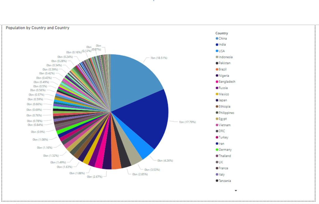
Not using the correct visuals
Most of the BI tools are loaded with visuals. Power BI even has a marketplace, from where you can download more visuals. To make your reports impressive, your data analyst may be tempted to experiment with them. While there's no harm in it, the BI analyst should also know the suitable usage before implementing any chart. For instance, one of the most common and critical Bad Data Visualization examples is using a pie-chart where the total isn't coming up to 100 or for more than five metrics.
Avoiding titles & data labels
Titles and data labels make visuals clear without a chance of ambiguity. Looking at the report, viewers exactly know what they're looking at and which visuals they need to focus on. Without titles, they'll keep hunting through the reports to find what they need. And without visuals, they’ll fail to understand your graphs and charts.
It is therefore insufficient to simply implement data labels; they must be readable. If labels are included in the visuals, for example, employing contrast colours can help. Consider what impact it would have on viewers if your retention rate was displayed as 8 instead of 80 when you presented it.
Overpowering colors and images
Colors and images are required for storytelling. But, overpowering dashboards to impress stakeholders with too many colors or unnecessary images can confuse them. So, use striking colors only to highlight information and keep them in sync with your viewers’ culture. Keep your dashboards simple, using crisp text, meaningful pictures, and standardized colors.
Too much information in one visual
One of the common bad data visualization examples is information clutter. Instead of putting in too much information in one chart, ask your data analyst to divide the data into different charts. When placed correctly with necessary details, filters and visuals will give a better picture than one chart trying to share the entire business case.
To Conclude
Those were some of the most common bad data visualization examples, which you can avoid easily. Along with your objectives and audience, if you keep these simple tips in mind, your dashboards will be more compelling and impactful.
About the Creator
Keep reading
More stories from SRanalytics and writers in Journal and other communities.
How bright is the future of data visualization in the next 10 years?
Over the years, data visualization has become more proficient and adept in analyzing data. It's no more restricted to big organizations or IT professionals. It’s now available for non-tech consumers. Thus, also encouraging SMEs to imbibe a data-driven culture. So, if you look at the future of data visualization, it's pretty promising. Data visualization is a graphical representation of cleaned, analyzed, and structured data from different sources. Modeling it graphically using charts and graphs. Organizing and presenting it in a visual format to help the decision-makers come to a conclusion.
By SRanalytics3 years ago in Journal
Religious Freedom Granted in 1978
What traditions are you most thankful for and why? Rupi Kaur's Gratitude Writing Prompts 1. Enormous Gratitude for the return of religious freedom for American Indians in 1978. The same year I got into recovery. That year I could smudge, go into the sweat lodge, attend full-moon ceremony, pipe ceremony, wiping of tears ceremony, and others.
By Denise E Lindquist6 days ago in Writers


Comments
There are no comments for this story
Be the first to respond and start the conversation.