
Paint by Numbers, Kitsch, and Digital Art Optimization
How have digital tools transformed paint by numbers through color optimization, custom imagery, and more sophisticated painting techniques?

In this interview, Scott Douglas Jacobsen and Rick Rosner discuss the history, aesthetics, and technological evolution of paint by numbers. Rosner reflects on its 1950s craft boom, kitsch appeal, mid-century design, and modern custom kits generated from photographs. He explores color optimization, image segmentation, computational tradeoffs, and the limits of automated conversion, while explaining how blending, value adjustments, and manual corrections can transform numbered canvases into more conventional paintings with greater realism, nuance, and coherence.
Scott Douglas Jacobsen: What are some of your newer thoughts or reflections on the idea of paint by numbers? Why is the phrase not "numbers by paint"?
Rick Rosner: Well, because you paint according to whatever number is in the space. "Numbers by paint" would mean taking a painting and then numbering the spaces, which would just fuck up the painting.
Paint by numbers became a huge craze in the 1950s. Before the internet and modern video games, people spent more of their leisure time on crafts and hobbies like these. A lot of the mass-produced craft stuff was pretty crude by today's standards, although some of it is collectible now.
Cracker Jack prizes were also better when I was a kid, or at least they seemed better. Some older Cracker Jack prizes were actual little toys, including metal and plastic objects. Today, the prize is basically a sticker that can unlock games online. Cracker Jack still contains peanuts, though, so I was wrong about peanuts having disappeared from it.
Paint-by-numbers sets were part of that broader mid-century craft culture. There were also crushed-gravel mosaic kits. Craft Master, for instance, sold "Mosette" sets using crushed gravel. You would get a design divided into regions, apply the materials according to the pattern, and end up with a decorative picture.
Some of those old craft pieces and unused kits have become collectible because they are vintage, particularly examples associated with mid-century design. A lot of mid-century popular design drew on Atomic Age and Space Age imagery, with stylized geometric forms, boomerangs, starbursts, and other futuristic motifs. There was also plenty of American decorative art that borrowed stereotyped or exoticized East Asian imagery, including pagodas and junks.
The quality of the resulting craft art could be pretty low, although people obviously enjoyed making it. Paint-by-numbers kits were not exclusively for kids, either. The original 1950s craze was heavily marketed to adults as a way for ordinary people to experience painting. The kits came in different sizes and levels of difficulty and included numbered areas corresponding to particular paint colours.
You might paint a horse, a landscape, a famous landmark, or some other conventional subject. Unless you developed some additional painting skills, such as blending adjacent colours or altering the prescribed design, the finished result could have that unmistakable paint-by-numbers appearance.
Now, more than 70 years after the original craze, computers and digital image processing have enabled much more detailed paint-by-numbers designs. You can buy fairly large canvases with dozens of colours, and some companies offer the same or similar designs in 24-, 36-, or 48-colour versions. More colours allow finer tonal gradations and smoother transitions.
Digital tools also make it possible to turn photographs and complex images into numbered templates much more easily than before. Some companies market these as custom paint-by-numbers kits.
Because you can work with dozens of colours, larger canvases, and digitally generated templates, the finished paintings can look much more sophisticated than many of the simpler mass-market kits from decades ago.
They can still be kitschy, though. A lot of the imagery is still super kitschy.
When you let people who are not art connoisseurs pick their own art, a lot of them naturally gravitate toward kitsch. It is more immediately satisfying. If you go on a cruise ship, most of them have an art gallery where they sell overpriced artwork. My wife and I like to look at it in a slightly snotty way because so much of the art has every possible color in it. To an untrained eye, it seems more artistic if every color of the rainbow appears somewhere in the picture. It just seems brighter, more colorful, and more uplifting.
Take Thomas Kinkade, for example. He was famous for creating sentimental, highly commercialized paintings that many critics regard as kitsch. Even in his nighttime or snowy scenes, especially his paintings of old-fashioned villages, there are little flashes of every imaginable color. There may be one dominant color, but you still see nearly every other color somewhere in the painting.
With paint by numbers, you often end up with something kitschy, but modern kits can still produce a good-looking result. My wife did a paint-by-numbers painting of a little fluffy white dog, maybe a Bichon Frise or some kind of terrier mix, sticking its head out of a cluster of brightly colored flowers. I started messing with it by blending some of the transitions between colors so the boundaries would not look so abrupt.
She got annoyed with me, so I backed off, and she finished it exactly according to the instructions. It actually turned out really well. It is a nice piece of art. The quality of the finished painting is good enough to overcome much of the kitsch, making it satisfying without being too over-the-top.
Another thing you can do now is upload a photograph, or just about any image, to a company that makes custom paint-by-numbers kits. For roughly the same price as a standard kit, they will convert it into a numbered canvas and determine which paint colors to include.
That reminds me of the traveling salesman problem, which is a classic optimization problem in computer science. Imagine a traveling salesperson who has to visit a set of cities exactly once while minimizing the total travel distance. Finding the mathematically shortest route becomes computationally expensive as the number of cities increases because the number of possible routes grows factorially. In practice, you usually do not need the absolute optimal solution. A solution that is very close is often good enough.
Paint by numbers reminds me of that because generating one involves several optimization problems. When software analyzes an image, it has to decide how to divide it into a manageable number of color regions while preserving the appearance of the original. One optimization problem is determining the shapes and boundaries of those regions. Another is selecting a limited palette of paint colors that best approximates the original image. The goal is to produce a paint-by-numbers kit that, once completed, still looks recognizably like the photograph or artwork from which it was created.
It turns out that when you send them a photograph, the conversion process can make some interesting choices. I uploaded a photo of Carole and Isabella from Isabella's graduation. I do not know how much human intervention is involved, or exactly what kind of optimization they use. Maybe the system has been designed to make human faces more visually legible.
The canvas they sent back gave Isabella noticeably red lips and gave Carol red lips too. Yet if you look at the original photograph, Carol's lips are not especially red. They are fairly pale and close to the surrounding skin tone of her face.
That makes me wonder whether there is some additional processing involved, either in the algorithm or through human review. Maybe somebody looks at the result and thinks, "Let's make the lips red so the face reads more clearly." Or maybe it is simply an artifact of the color-selection algorithm. I do not know.
But when I compare this canvas, which is almost finished, with other paint-by-numbers canvases, it seems as though the source images or the conversions have been adjusted to make the subjects more visually legible. In some cases, they may simply start with images that already have very clear shapes, contrasts, and colors.
There are all sorts of optimization problems involved, which I find interesting. Some of this would have been much more difficult or expensive in the past because the computational tools were less capable and less accessible. There may also have been improvements in printing and manufacturing that make it inexpensive to produce individualized numbered canvases.
The fact that you can now send almost any photograph to a company and get back a reasonably convincing custom paint-by-numbers kit is indicative of where the technology is.
There is also a way to use these kits if you want the finished product to look more like a conventional painting. You start with a clear photograph and have it converted into a paint-by-numbers canvas. Then you do a first pass by following the numbered regions.
After that, you enlarge the original photograph on a computer and use it as a reference while correcting the painting. The paint-by-numbers conversion inevitably loses some detail and introduces errors in color matching because it reduces a continuous photographic image to a limited number of discrete regions and paint colors.
If the kit contains, say, 48 paint colors, the software has to approximate the much larger range of colors present in the original photograph. It may assign the same paint color to two regions that actually look quite different in the photograph. At that point, you can go back in and correct the colors yourself.
I have spent a lot of time around art classes as an art model, and I have known Lance Richlin for decades. You pick up various painting techniques along the way. You can use things like blending, softening edges, adjusting values, and modifying colors to turn the result into more of a conventional painting rather than something that still obviously looks like paint by numbers.
Jacobsen: Thank you very much for the opportunity and your time, Rick.
Scott Douglas Jacobsen is a blogger on Vocal with more than 200 publications on the platform. He is the Founder and Publisher of In-Sight Publishing (ISBN: 978–1–0692343; 978–1–0673505) and Editor-in-Chief of In-Sight: Interviews (ISSN: 2369–6885). He writes for International Policy Digest (ISSN: 2332–9416), The Humanist (Print: ISSN, 0018–7399; Online: ISSN, 2163–3576), Basic Income Earth Network (UK Registered Charity 1177066), Humanist Perspectives (ISSN: 1719–6337), A Further Inquiry (SubStack), Vocal, Medium, The Good Men Project, The New Enlightenment Project, The Washington Outsider, rabble.ca, and other media. His bibliography index can be found via the Jacobsen Bank at In-Sight Publishing, comprising more than 10,000 articles, interviews, and republications across more than 200 outlets. He has served in national and international leadership roles within humanist and media organizations, held several academic fellowships, and currently serves on several boards. He is a member in good standing in numerous media organizations, including the Canadian Association of Journalists, PEN Canada (CRA: 88916 2541 RR0001), Reporters Without Borders (SIREN: 343 684 221/SIRET: 343 684 221 00041/EIN: 20–0708028), and others.
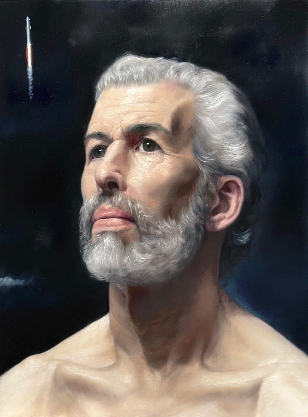
Image Credit: Lance Richlin.
About the Creator
Scott Douglas Jacobsen
Scott Douglas Jacobsen is the publisher of In-Sight Publishing (ISBN: 978-1-0692343) and Editor-in-Chief of In-Sight: Interviews (ISSN: 2369-6885). He is a member in good standing of numerous media organizations.
Enjoyed the story? Support the Creator.
Subscribe for free to receive all their stories in your feed.
Comments
There are no comments for this story
Be the first to respond and start the conversation.