
A Beginner's Guide to Creating High-bit Pixel Art Character Designs
Getting Started with Hi-Bit Pixel Art

What is Hi-Bit pixel art?
Today these constraints do not apply. This is because modern computers and video game consoles can handle terabytes of data in an instant. The result of this is the evolution of pixel art into more of a stylistic choice rather than a requirement to meet performance.
The lack of bounds now means that sprites- typically used to refer to pixel art images used as assets in games- can be larger, have more colour and represent more information at once. Over time, a separation has grown between the old style of pixel art, and the more modern free form style, adequately referred to as Traditional Pixel Art and Hi-Bit Pixel Art, in that order.
Design for pixel art today is inspired greatly by video games from the Super Nintendo Entertainment System (SNES). This may be for many reasons, but to me, the greatest of them seems to be the feelings of nostalgia invoked in people who grew up playing these games in the nineties.
This means that even though we have the ability to absolutely throw all the rules out the window, the appeal of pixel art lies in its ability to connect to an audience that grew up consuming media that was pixelated for the most part.
As an artist looking to use pixel art to design characters and assets for an upcoming project, this amount of freedom may lead to stylistic conflict, often stuck between maintaining the limitations set in the SNES era, or treating pixel art like any other modern form of digital art, without constraints. Questions like:
- How many pixels can we use?
- How many colours are we going to use?
- How will shading be done?
- Are we going for realism or caricature?
- Do we need outlines for our sprites?
May come up.
My Rules for Hi-Bit Pixel Art
Generally, a lack of rules may stump even accomplished artists. As such, for Hi-Bit pixel art, I like to go for a reasonable midpoint. I am able to do this by setting myself a few ground rules:
- No Sprites or Character Art Can be Larger than 100 Pixels
This is a rule that indie and solo developers and artists should try to follow, especially for animated pixel art designs. Large pixel art sizes can be difficult to animate within reasonable timeframes, especially as a one or two-person team. Setting realistic sizes for your sprites will save you time in animating characters as well as in redrawing characters and assets in future. 100 pixels is a lot of space for any character sprites even for the most ambitious artists.
- Less is More
It is important to represent as much information as simply as possible. If you feel that a character is not working, it may be because of over-rendering. Over-rendering simply means using too many colours and shapes in an object to the point that the details subtract from the overall image. Elements like shadows, lights, highlights, dirt, scratches and tears can be powerful visual queues to further a story through your art provided that they are used within reason.
- Exaggeration Gets the Point Across
The limited number of pixel is restricting as far as posing and animation is concerned. Instead of scaling up the sprite, why not add some exaggeration to get the point across? Zoom out the sprite to its actual on-screen size to see if the pose/action gets the point across.
- Maintain Visual Consistency
At a large sprite size, it is difficult to maintain the same level of attention to detail throughout the sprite. It is easier to make mistakes like inconsistent lighting techniques, inconsistent colour schemes( unless you are using a palette) and anatomical errors when creating characters. Be patient, take breaks and flip your canvas often to view your art from a different perspective. This will allow you to see your mistakes early and maintain consistency.
How to Design Hi-Bit Pixel art Characters.
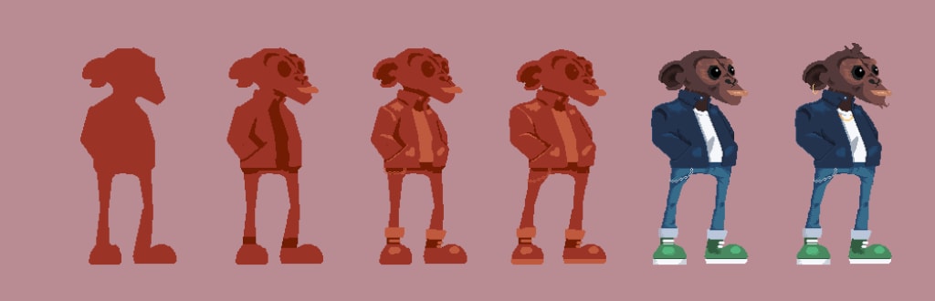
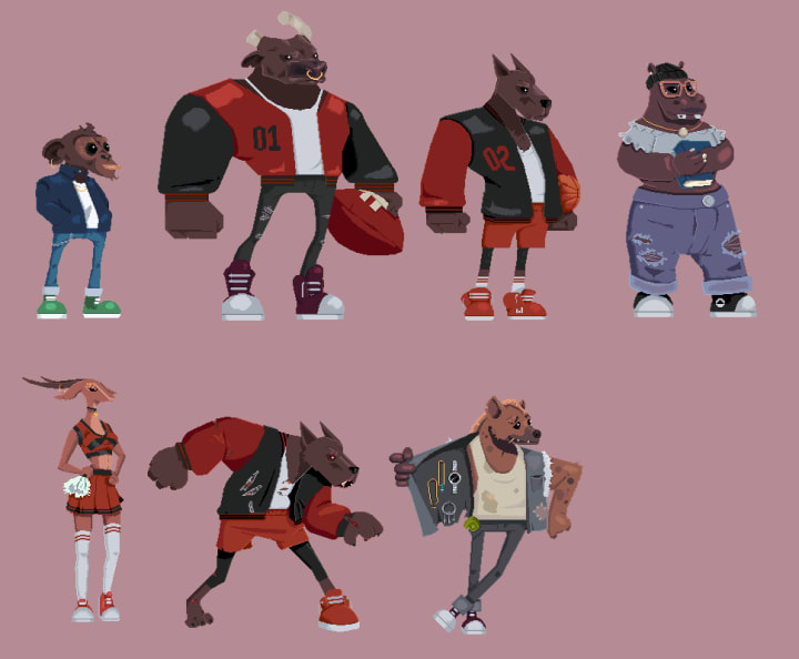
Now that we have a few rules for Hi-Bit pixel art design, let's see how we can create an original character using the rules we have set for ourselves to guide our decisions while drawing. I am currently working on a game with animals as my characters. I would like the animals to be cute, and to have colours that contrast and pop. I would like to communicate information through the colours of their clothes, their species, their personalities, etc.
1. Picking the Right Reference
References for art are like revision before an exam. They guide the artistic choice, concepts, colours, and bounds for the work we do. This is an easy one because here, my references define themselves. Pictures of animals in zoos from the internet, or your phone gallery, would be a good place to start. More importantly, art that would have the same themes or styles will help me picture my vision more clearly. For example, my reference board would include games like Ratchet & Clank and Crash Bandicoot, popular movies like Zootopia, Life of Pets, and Madagascar. All these sources conform to a stylised, animal-themed world with multiple characters and ideas for design.
2. Creating a Strong, Identifiable Silhouette
Every good design begins with finding a simple, strong silhouette for your character. This would involve nailing down the details about your character. Are they human? Are they male or female? Strong or weak? Intelligent? What's their role? This should help inform the choices you make, choices like the character's proportions, their base shapes and their accessories.
For the example below my base description was:
"A neutral character, who should be likable and able to be expressive to react positively/negatively to player actions. The character will be running, jumping, and sliding, so will need to be fit and lean. Needs to be stylized and cute, but should look like they are in high school. "
With this, I have outlined the stature, mood, and composition of our character. With that done, I can start blocking out the silhouette for this character.
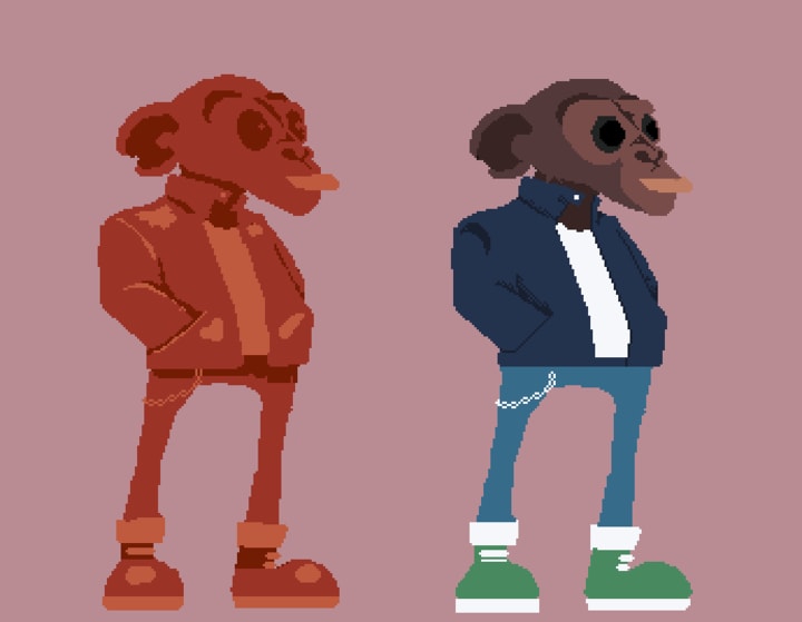
This part is a lot like sculpting. I always start with a colour farthest from what I believe the final character will be. This is to remain focused on the shape of the character. This may take some time as you find the primary shapes that determine your character's appearance and style. I find it useful to lean into happy mistakes, which might lead to pleasant and surprising outcomes.
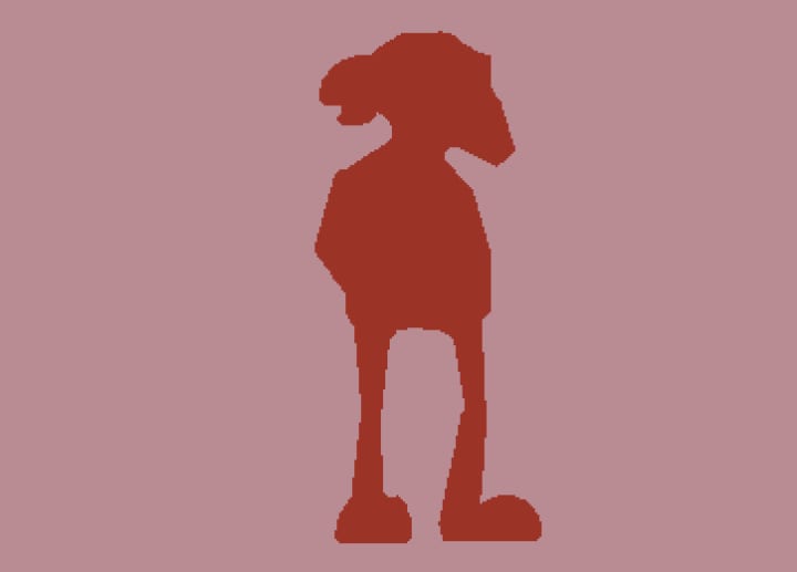
You know you have done enough when you can see that the silhouette represents appropriate proportions for your character. The character proportions, in this case, do not conform to normal human anatomy. This character has oversized feet and a really big head, but still feels natural, which is a good balance when trying to draw cartoons and caricatures.
In this case, I tried to use the character's mouth, head shape, and ears to make their silhouette unique. You will find that this may not be the final shape for your silhouette. Even though this is what I have started with, I later felt that it was too stiff, lacking the strength and confidence I hoped to display in this character.
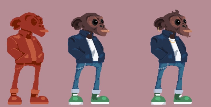
3. Defining Volume by shifting Value
The Volume of a character determines what its shape would have been if it was represented in 3d. The task here is to use value to represent the form of 2d shape in 3d, by defining how that object interacts with light and shadows. For example:
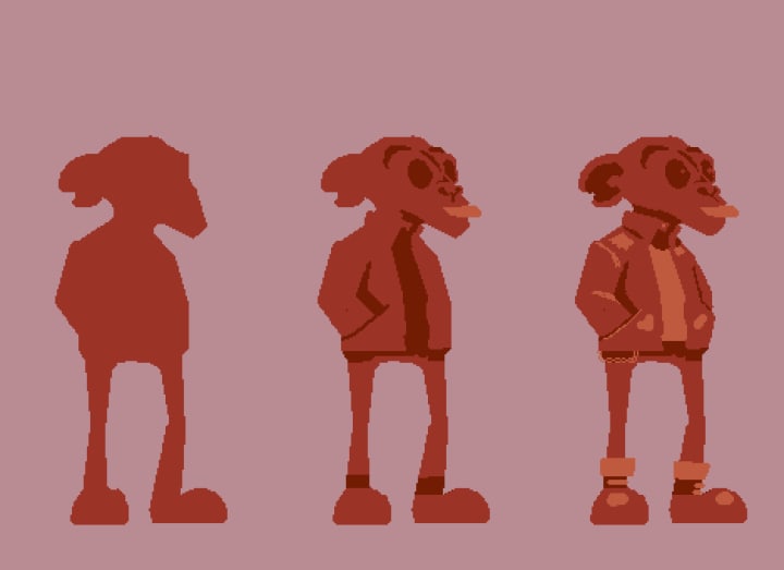
The example above has taken the silhouette we worked on in the previous section and converted it into a volumetric object that we can believe has more than one dimension. This means that we can tell what points of our character are closer or further, rounder or flatter to us. At this point, a re-evaluation of character proportions is appropriate. We can also start thinking about the character's outfit. Are they wearing a leather jacket or a t-shirt? This decision can be informed by the character brief you set before starting this drawing.
This will help us view our character from a more detailed perspective and to see if the pose defined in the silhouette will still hold further into the drawing.
The values I have chosen to use to define my volume are the colours that occur before and after my current colour on my palette. As such, I ensure to use a colour that is central in the colour range for the palette I am using. If you are already using the darkest/ lightest colour, feel free to create a new swatch from your colour picker in your software of choice.
I find working in monochrome prevents me from prematurely making the decision of what colours to use before the final form has been defined.
4. Colour
Colour can be a complicated topic, however, it can be simplified greatly by making use of online palette creation platforms like Adobe Color, Coolors and Cowspec to mention but a few. Additionally, Aseprite, which I use (and recommend), comes with a set of palettes that can be useful for beginner pixel artists.
Understanding colour and how it interacts with natural light can be a great skill to improve your pixel art. The ability to identify colours that are complementary in a palette can help drive your decisions for what characters can possibly look like. For example, skin can be complicated to represent at higher resolutions, but for pixel art, this can be simplified down to just two colours. Hi-Bit pixel art aims to bridge the two styles, where we use a limited number of colours to represent our neutral, highlight and shadow values. Some styles may add two more values for creases and rim light.
Starting by defining neutral values will inform the rest of the colours. For example:
The image above shows that 4 colours have been used for the face. They may not be accurate to reality, but they are close enough that they get the message across. The lip is a prominent feature for this character that I decided to add in the earlier step, as such It works for it to be large and bright, without it necessarily drawing too much attention.
Ensure colours for each section are contrasting enough that it is easy to immediately tell the differences between each visual landmark in the design. Your character's shoes should be immediately distinguishable from your character's legs at first glance.
5. Detail using Highlights and Shadow
At this stage, we are more or less done with the drawing, however, to attain a higher level of detail in our drawings, we can add detail to the clothing and character's face, based on how those different surfaces interact with the light.
The first step to proper detailing is to decide where your light is coming from. A light source will help maintain consistent shadows at all times. While it is not necessary to have a visible source of light in your drawing, marking what the light's direction is on your canvas can act as a reminder to help you stay consistent.
Next, using shadows and high lights, we can define the darker and lighter parts of our drawing to really emphasise the sense of depth. Shadows can be done in many ways and really deserve a discussion of their own. However in the example below I have chosen to use dithering to show that sense of fading light and shadow, in curved surfaces.
Using bright colours such as yellows and greens, defining accessories for your characters can really add to their personalities and their individuality. Chains and earing can show confidence and swagger in a character. This can also be done through their choice of hairstyles, including facial hair.
Conclusion
In this discussion we have covered:
- What Hi-Bit Pixel art is.
- Rules That constraint the size and detail of the art.
- The process for creating your first Hi-Bit pixel art character.
The beauty of following this process is it allows for consistency even on different characters, which can be repeated over and over. throughout a project, regardless of what style you have chosen to work in.
To see a short timelapse of The process for creating your first Hi-Bit pixel art character, watch this video:
Thanks for reading!
by Neville Kitala.
You can support me by following me on :
About the Creator
Keep reading
More stories from Neville Kitala and writers in Gamers and other communities.
Struggling to Animate Your Pixel Art Characters?
Pixel art animation is a well-covered topic that has many decent tutorials that everyone can use to educate themselves on how to become a better animator. However, animating characters that exceed a resolution of 32 bits can be challenging to the pixel art noob. This is why I am writing this guide, to allow everyone to make the most of their pixel art animation.
By Neville Kitala2 years ago in Gamers
The Impact of Technology on Sports
Innovation massively affects sports throughout recent many years. From the utilization of refined hardware to the execution of cutting edge programming, innovation has reformed the manner in which we play, watch and examine sports.
By Eleanor Angel2 days ago in Gamers
TICK TOCK
11.59. Even though the glass had shattered, Lorna could still see that her watch ticked over. One minute until midnight. Her watch was the only thing she had that she could carry. The only thing to remember her parents by. A birthday present from last year, the year she turned seventeen.
By Elizabeth Butler4 days ago in Fiction


Comments
There are no comments for this story
Be the first to respond and start the conversation.