
My Honest Experience Testing AI Thumbnail Generators — Including the Parts That Didn't Work
Deep dive into the AI thumbnail generator

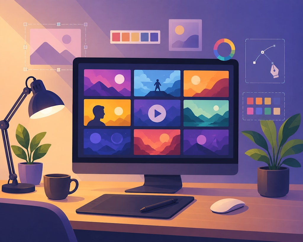
It is 1:00 AM, and I am staring at a blank canvas on my screen. I have spent the last forty minutes shifting a text box three pixels to the left, then three pixels to the right, trying to decide if a bright yellow font clashes too much with the background gradient. My video is fully edited, exported, and ready to go, yet I am stuck on the single image that acts as the gateway to all my hard work. If you have ever uploaded a video only to watch its click-through rate (CTR) languish in the low single digits, you know this quiet frustration. The visual first impression is often the hardest, most tedious part of the entire creation pipeline.
In an effort to reclaim some of my creative energy and actually get to sleep on time, I decided to step back from manual composition and experiment with automation. Specifically, I wanted to see if integrating an AI thumbnail generator into my workflow could help bridge the gap between design theory and rapid execution.
Deep Dive into the Tech
The premise of an AI Thumbnail Generator is straightforward: it takes your video title, a brief prompt, or a raw screenshot, and attempts to translate those inputs into a high-impact, high-contrast visual composition. On a technical level, these tools analyze visual hierarchy and contrast ratios to ensure that key subjects stand out. They typically output at the standard video-sharing platform specifications—1280×720 pixels in a 16:9 aspect ratio, usually saved as a lightweight PNG or JPG under the standard 2MB file limit.
The core engineering behind these generators lies in how they calculate visual saliency. In graphic design, visual saliency refers to how easily an element catches a viewer's eye amidst competing clutter. According to data from the YouTube Creator Academy, over 90% of the platform's best-performing videos rely on custom-designed thumbnails rather than auto-generated frames[1]. Since visual attention in a feed is decided in just a second or two of fast scrolling, getting the layout right—without overcrowding the frame—is essential. The algorithms are programmed to respect "rule-of-thirds" guidelines, attempting to place human subjects or focal objects in areas that won't be obscured by platform UI elements, like the timestamp in the bottom-right corner.
The Raw Reality & "The Little Trap"
However, the reality of relying on automated tools is rarely seamless. My first real trial came when I was preparing a technical tutorial video about database indexing. I fed the generator a prompt requesting a clean, developer-focused aesthetic with high contrast and a prominent text placeholder.
The initial image generation took about 15 seconds, and on my 27-inch desktop monitor, the result looked surprisingly modern. It featured a dark, slate-gray backdrop with abstract glowing blue lines representing a network grid. But when I exported the PNG and ran a scaling test, the design fell apart.
At 120×68 pixels—the size many viewers see when browsing on a mobile device—the glowing blue lines turned into a blurry, low-contrast smear. To make matters worse, the model had tried to render a mock terminal window in the background, but the generated text was a series of distorted, illegible characters that looked less like code and more like a rendering glitch. The auto-placed title font also sat too close to the right edge, meaning the platform's timestamp would have covered half of the text.
Instead of discarding the image entirely, I used it as a rough blueprint. I imported the file into my graphic editor, cropped the main network graphic to occupy only the left two-thirds of the frame, and manually bumped the overall contrast to 1.35 in post-processing to improve visibility at smaller scales. Finally, I cleared the AI's garbled text altogether and overlaid a bold, highly readable sans-serif font in a clean, solid color. It took about fifteen minutes of manual adjustment, but it proved that these systems work best as a rough sketchpad rather than a final, push-button solution.
Testing Different Layouts
During this phase of trial and error, I found myself trying several different workflows to see how various engines handled the spatial arrangement of elements. At one point, I decided to run a few of my text prompts through Thumbs.ai to observe how its layout engine handled negative space compared to standard generative tools.
What I noticed across almost all platforms was a consistent need for human intervention. The machine can generate beautiful gradients and find interesting color combinations, but it does not understand context. It doesn’t know that a technical audience prefers understated, high-clarity designs, whereas a gaming audience might respond to saturated, hyper-expressive layouts.
Industry Insights & Designing for Cognitive Load
This disconnect highlights a broader reality of modern content creation. Visual research suggests that while our eyes are naturally drawn to highly saturated colors and expressive faces, visual fatigue is very real. If every thumbnail on a viewer's feed is screaming for attention with neon arrows and dramatic expressions, clean and minimalist designs often win the battle for visual saliency simply by being different.
Designing a thumbnail is not just about producing a pretty picture; it is about managing cognitive load. A successful graphic must communicate what the video is about and set accurate viewer expectations in a fraction of a second. If there is too much visual noise, the brain simply filters it out as spam.
Thoughtful Conclusion
Ultimately, my foray into automating this part of my channel's workflow taught me that technology is an assistant, not an author. AI tools can save you from staring at a blank canvas at midnight, providing a solid starting point with decent lighting and balanced color palettes. They can generate layouts in seconds that would otherwise take half an hour of searching for assets.
But the final, critical steps—checking mobile readability, ensuring brand alignment, and deciding what story the image actually tells—still require a human touch. The machine can arrange the pixels, but the creator must provide the intent.
About the Creator
AI User
Introduction and Evaluation of the New AI Tools
Enjoyed the story? Support the Creator.
Subscribe for free to receive all their stories in your feed.
Comments
There are no comments for this story
Be the first to respond and start the conversation.