
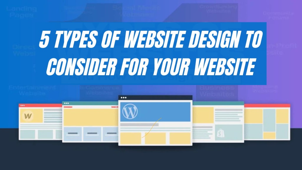
5 Types of Website Design to Consider for Your Website
Website Design

As your website is a virtual storefront for your business, thus should be well-designed. Website design is essential to create an impression on users to enhance user experience, but not limited to helping you reach your goals. A visually attractive and user-friendly website can keep users interested while a poorly designed website can make customers unsatisfied, confused and frustrated. Although there is not a single approach for selecting the perfect design for your website.In this blog post, we will discuss distinct website design types that you can consider for your online presence.
Most Popular Types for Your Website
Read further to look into different website designs, each carrying its advantages.
Minimalist Design
This approach to website design focuses on simplicity, clean lines and essential elements. Eliminating unnecessary elements and clutters creates a sense of calmness and clarity. With ample white lines and restrained colour palettes, minimalist websites make it seamless for visitors to explore.
However, its muted colour scheme does not mean blandness. Minimalist design focuses on key elements. To command attention without distraction, every element is given space to shine.
Rather than just being limited to visually appealing, minimalist design is highly functional as well. With fewer visual elements struggling for attention, users find the information they need without getting lost in spaces. This design also promotes faster loading times, which is crucial for maintaining user engagement.
For sophisticated, elegant and modern websites, these designs are particularly effective. Most luxury goods, fashion and technology industries use this design approach to create a sleek online presence.
Responsive Design
A responsive website can change its layout and content automatically to provide the best user experience. It ensures your website works great on different devices and screen sizes, from computers to smartphones.
Responsive design is devoted to flexibility. It depends on flexible grids, fluid layouts, and media queries to ensure the website elements rearrange themselves according to the user’s device. This approach removes the necessity for creating distinct mobile versions, thus offering a uniform experience for all users. With a single codebase for all gadgets, these websites are easier and more cost-effective.
Search engines also prioritize user-friendly websites in their rankings and thus responsive websites provide an advantage in search results.
Parallax Scrolling Design
This web design technique creates a sense of depth and attention by using layered backgrounds that move at different speeds. This effect creates the behaviour of parallax in photography and cinematography where objects closer to the viewer tend to move faster than those in the distance.
The background, here, is divided into different layers and each layer moves at a different speed. As the user scrolls down the website, it creates a 3D-like effect. It increases viewer engagement and encourages visitors to explore further. It is often used to focus on storytelling elements or highlight key messages.
In addition, parallax scrolling design allows creativity and can be utilised to highlight a brand’s identity or generate a specific environment. The design can be changed to fit the brand’s personality, whether it is classy or fun.
Remember, parallax scrolling can affect a website’s performance and accessibility if poorly implemented. Overuse or poor implementation can lead to a cluttered experience. So, it is essential to tailor the design for different devices for customers to have a smooth experience.
Single Page Design
A single-page design includes a single scrolling page that is long enough to hold all the information and content needed. This design is different from all others as it does not support a multi-page website.
Users can access the information by scrolling vertically through the website. They do not have to go to multiple pages to find the information. This uninterrupted flow provides a user-friendly experience for consumers, especially mobile users.
The website is divided into different sections to provide a seamless experience. Navigation is achieved by anchor links that smoothly scroll to different parts of the website. Moreover, as all the content is on one page, key messages, products or services are highlighted. It helps you present information clearly and concisely.
Compared to multi-page websites, single-page websites contain less content and have faster load times. This can contribute to improved user experience, particularly for those who are working with slower internet connections. Interestingly, with only one page to handle, single-page websites are quite easy to update and maintain. Thus, content can be easily added, removed or rearranged.
Adaptive Design
Adaptive design or adaptive web design mainly focuses on providing the best possible user experience. The website’s content, style and functionality are customised according to the user’s device, screen, and size. Rather than being reliant on media queries and fluid grids, unlike responsive design, it uses server-side and client-side techniques. This approach helps them to identify and adjust to the specific environment of the user.
Adaptive web design begins with a baseline experience that works on all devices. Other than that, it improves the website with more advanced features for browsers and devices that can support them.
Adaptive designs often include techniques that enhance performance and load times on different devices. This involves using smaller file sizes, reducing HTTP requests and prioritizing the content based on the capabilities of the device.
Adaptive design allows websites to adapt to new devices, screen sizes, and technologies, making it future-proof. Adaptive web design provides a flexible solution by focusing on device characteristics.
Conclusion
In summary, picking the right design for your website is crucial to match your target audience, goals, and brand. Different web design services offer unique advantages. A minimalist design offers simplicity and a clean look, while a responsive design ensures your site works well on all devices. Parallax designs add depth with animations, and single-page designs provide smooth, uninterrupted scrolling. Adaptive web design offers flexibility and enhances customer satisfaction.
Take your time to research and choose an effective web design company in Singapore that meets your needs. This careful selection will help you create a website that resonates with your audience and supports your objectives.
About the Creator
Morris Edwards
I am Morris Edwards and working as a Manager at Awebstar, a prominent web design and development company in Singapore, With expertise in digital marketing, SEO, mobile app development, logo designing, and social media marketing.
Enjoyed the story? Support the Creator.
Subscribe for free to receive all their stories in your feed. You could also pledge your support or give them a one-off tip, letting them know you appreciate their work.
Keep reading
More stories from writers in Education and other communities.
World of Finance: Understanding Its Dynamics and Significance
Finance, a cornerstone of economic systems, encompasses the management of money, investments, and financial instruments. This exploration aims to demystify the essence of finance, elucidate its paramount importance in global economies, and emphasize the role of assignment help in guiding students through the intricacies of finance coursework. Assignment Helper underscores the academic support available for students studying finance and the interconnectedness of assignment help within this domain.
By Nick Johnson4 days ago in Education
universe
The universe is a tapestry woven with threads of mystery, wonder, and astonishing phenomena. As we explore its vast expanse, we encounter marvels that challenge our understanding and expand our sense of what is possible. Here are some of the most amazing aspects of the universe that capture our imagination and spark our curiosity.
By ujjwal kafle3 days ago in Education


Comments (1)
Explore our blogging site for diverse content on travel, lifestyle, tech, and more. Join a community of passionate writers and readers! https://trendychapter.com/