
An Unforgivable Own Goal: Questionable Badge Redesigns in Football
There is simply no hiding that badges and logos have a huge significance. In business, they can act as the face of the operation, values, and inner workings of a company.
With sport, they conceal many crucial references, from history and tradition to ambition and – often – local geography. This is particularly true in the world of football.
When it comes to the beautiful game, a club’s crest is something supporters are extremely proud of. They wave branded scarves and flags, wear pin badges, and show off their team’s kit with a great sense of belonging in streets and stadiums alike. In short, a football badge unites fanbases under one shared symbol, and it is a powerful image that footy aficionados feel deeply connected with. This is why, when clubs decide it is time for a fresh makeover, redesigns can raise a few eyebrows.
As with everything, sudden changes require some time to digest and adapt to. But, in recent years, there have been several instances in which new football badges have sparked feisty and belligerent reactions. Here, we explore some of the most questionable badge redesigns that have put fans’ patience – and passion – to the test.
Leeds United
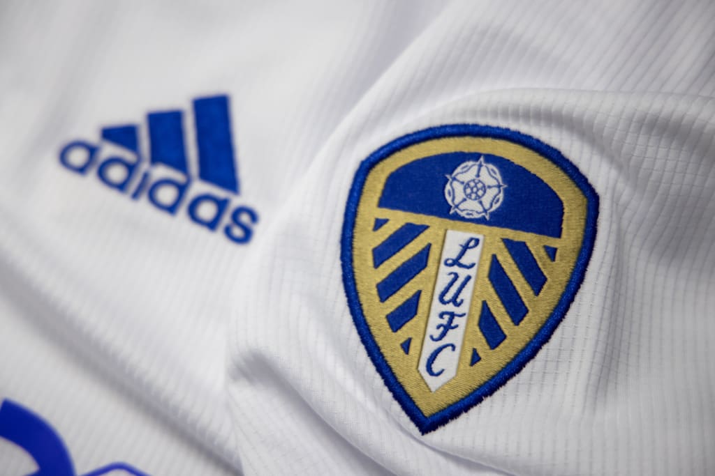
One of the most infamous badge changes to have received an inconvertible straight red card from supporters is the ‘wannabe’ Leeds United crest unveiled in January 2018. At the time, Leeds were playing in the Championship (second tier of English football), and they were gradually starting to push for a much-awaited promotion. The new badge was conceived as the start of a glorious chapter – as the rise from the ashes of a dormant giant.
The proposed design, which featured a person in a white shirt beating their chest with their right hand, overturned the look of the club’s traditional crest entirely. The new badge was meant to depict the ‘Leeds Salute’ that supporters perform when singing the club anthem at Ellan Road. What did Leeds fans think? They truly despised it from the outset.
Within hours of its release, over 35,000 signatures were added to a petition demanding the club drop the new badge. With fan comments comparing the new crest to a high-strength heartburn medication, and addressing it as “cheap”, “atrocious”, and “absolutely shocking”, it is fair to say that it did not conquer Leeds supporters’ hearts. Luckily, the badge never saw the light of day, and it never made it onto the club’s shirt.
Juventus
In July 2017, Turin-based football club Juventus officially adopted a new logo that certainly did not go unnoticed. The 36-times Italian champions replaced their historic black-and-white crest with a big stylised J. In the words of the club, the modern badge recalls the Scudetto (a symbol of victory), the team’s distinctive striped shirt, and – as mentioned – its initial.
The main aim of the badge change was to help the club grow its influence and presence as a business. In fact, as opposed to its traditional versions, the current design of the Juventus logo makes it easier for the club to sell merchandise and for people to wear the crest on a more casual daily basis.
However, Bianconeri fans were not amused – quite the contrary, in fact. Supporters queued up on social media to criticise the introduction of the minimalist logo, highlighting that the badge was “embarrassing” and “disrespectful” towards their club’s history. What’s more, the crest arose melancholic considerations, with fans commenting that marketing and money had been favoured over Juventus’ identity and tradition.
Cardiff City
Small tweaks may help the crest look snazzier and more modern, but hardcore fans may still have trouble getting used to them at first. Drastic changes to a football badge, instead, are simply a recipe for disaster. In this respect, in 2012, Cardiff City owners went perhaps one step too far.
In an attempt to expand the club’s international appeal, Cardiff City’s board of directors replaced the logo’s historic bluebird with a Welsh dragon. Not only that, but they gave the crest a lick of paint too, and the blue badge was turned red. The rebranding of the club left Cardiff fans, who are nicknamed ‘the Bluebirds’, visibly disappointed and infuriated. This even spurred supporters to arrange ‘emergency meetings’ and plan how to respond to the controversial rebranding.
Despite the general outrage across the fanbase, the new badge and home red kit were adopted for three years. The blue strip was finally reintroduced mid-season in 2015.
Atletico Madrid
As mentioned, football supporters have a close bond with their club’s badge, and the slightest change to the crest can cause unrest and discontent. In 2017, Spanish giants Atletico Madrid underwent a redesign, updating their traditional logo while moving to their new stadium – the Wanda Metropolitano.
What triggered negative reactions from the Rojiblancos fanbase was the way in which the crest altered the aesthetics of the bear and madroño tree. These are crucial and renowned symbols of the city of Madrid’s coat of arms, and the badge restyling seemed to disregard the tradition and history of both the club and the Spanish capital. What’s more, abandoning their former home, the Vicente Calderon, certainly did not do fans’ nostalgic sentiments any favours either.
This said, the old logo may make a return next season. Indeed, the well-loved badge is expected to feature on Atletico Madrid’s third kit.
Fiorentina
One of the most recent examples of an unwanted and unfavourably-received logo is the new Fiorentina badge. Presented in March 2022, the new crest is a simplified and more contemporary interpretation of la Viola’s purple badge and well-known red lily. Furthermore, it is shorter and more compact than its older counterpart. It will feature on Fiorentina’s shirt as soon as next season.
Again, the badge change has not been welcomed, and fans in Florence have not shied away from expressing their disapproval. Groups of supporters who attend home matches in the Curva Fiesole, in fact, have hung up dissenting banners across the city.
One of them, for instance, read “before changing the club’s history, make history!”. Another one underlined the value of Fiorentina’s old crest and that Italian football fans have the tradition of their badge at heart.
Norwich City
The latest English football club to announce a badge change is Premier League side Norwich City. It is the club’s first redesign in 50 years. The new crest will be adopted formally on 17th June, and it will be an integral part of the team’s 2022–23 kits. The old crest’s black outlines have been removed, whereas its lion, castle, and canary have been simplified to give the logo a more innovative style.
What did the fans have to say? In truth, the badge has received mixed responses. Some supporters appreciate its modernisation, but others do not understand the need for an updated crest. With very few and slight modifications, why change a logo that looked as pleasant and elegant as it did?
Ultimately, badges are important symbols, and undesired changes can spark unwelcoming reactions – especially in the world of football. Therefore, having a logo that best represents you and your business at all times can work wonders on the image you are wishing to portray.
About the Creator
Keep reading
More stories from Adam Johnson and writers in Cleats and other communities.
Brain Injuries in Sport: The Role Medical AI Can Play
It feels like barely a week goes by without a head injury in sport. And, with many of us experiencing a lockdown and all but elite sports cancelled, we’re engaging with football, rugby, and other televised sporting events more than ever to keep ourselves entertained. This laser-focus on high-profile head and brain injuries has led to a better public understanding of the issues, as well as more focus from the medical community on preventing the neurodegenerative after-effects.
By Adam Johnson3 years ago in Cleats
The game-changing Philadelphia pastry shops turning out heavenly sans gluten breads, baked goods, and treats
In the clamoring roads of Philadelphia, in the midst of the smell of newly heated bread and the hustle of city life, a tranquil unrest is occurring — one that is changing the manner in which we contemplate without gluten prepared merchandise. Lately, a developing number of pastry kitchens in the City of Caring Adoration have arisen as trailblazers in the specialty of without gluten baking, turning out heavenly breads, cakes, and sweets that rival their gluten-filled partners in taste and surface.
By Ananta Kumar Dhar7 days ago in Cleats


Comments
There are no comments for this story
Be the first to respond and start the conversation.