
What a 20x20 Booth Can Teach About Product Display at SEMA Show
A closer look at how Nakamichi’s SEMA Show 2024 booth used product walls, meeting space, branded counters, and open visitor flow inside a 20x20 layout.

What a 20x20 Booth Can Teach About Product Display at SEMA Show
Some 20x20 booths try to do too much. At SEMA Show, where visitors move past vehicles, tools, accessories, audio systems, and equipment displays all day, too many visual messages can make a booth harder to understand.
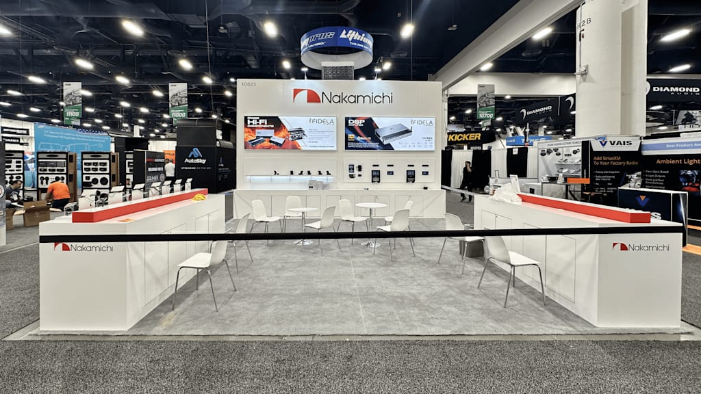
The Nakamichi booth at SEMA Show 2024 shows a more controlled approach. It does not rely on oversized structures or heavy decoration. Instead, it uses a clean back wall, product graphics, front counters, meeting tables, and open sightlines to make the booth easy to read from the aisle.
That is often what makes a 20x20 space work. The booth does not need to show everything at once. It needs to help visitors understand the brand, identify the product category, step inside without confusion, and have a place to ask questions.
A useful way to think about it is this: a 20x20 booth works best when the back wall explains the brand, the product zones stay organized, meeting space does not block movement, and front counters support quick conversations. The space is compact, but it still has enough room for product display, staff interaction, and buyer discussion.
The Back Wall Sets the First Reading
In a 20x20 booth, the back wall usually carries the first clear message. Visitors may see the booth from across the aisle, but they only give it a few seconds before deciding whether to slow down.
In this booth, the Nakamichi logo is placed high and centered. Product graphics sit below it. Smaller product displays and samples are arranged beneath the main graphic area. That creates a simple visual order: brand first, product category second, product details third.
This kind of hierarchy matters at SEMA Show. Automotive and equipment aisles are visually crowded. Many booths use large signs, tall structures, vehicle displays, banners, screens, and product shelves. If a booth does not give visitors a clear first reading, the message can get lost quickly.
Good booth graphics are not only about looking attractive. They help people understand what they are looking at before they talk to staff.
Product Display Needs a Clear System
Small products, electronics, audio components, accessories, and demo units can easily feel scattered if they are placed without a system. A 20x20 booth has enough room for product display, but not enough room for every product to compete equally.
The Nakamichi booth keeps most product information on the main wall. That makes the product story easier to follow. Visitors can look at the graphics, move closer to the display area, and then ask for details if they are interested.
This is a practical lesson for exhibitors. Product zones should not feel like storage shelves. They should help visitors compare, understand, and ask better questions.
For vehicle electronics, audio equipment, lighting products, accessories, and similar categories, the display system needs to answer three things quickly: what the product is, where it fits, and why a buyer should stop.
Meeting Space Should Not Close the Booth
The center of this booth includes small meeting tables and chairs. That makes sense for a product-focused SEMA booth. Many conversations at the show are not just about appearance. Visitors may want to ask about fit, compatibility, distribution, installation, pricing, or product differences.
The important detail is that the meeting area does not fully close the booth. The front remains open. Visitors can still see the product wall. Staff can hold short conversations without blocking the main path.
When people discuss SEMA Show booth planning, they often start with booth size. But the better question is how the booth behaves during the show. Can visitors step in easily? Can staff explain products without blocking others? Can a buyer sit down without cutting off the booth entrance?
A 20x20 booth can handle meeting space, but only when the furniture supports the visitor path instead of interrupting it.
Front Counters Create a Useful Edge
The front counters in this booth help define the booth boundary. They give the space a finished look from the aisle, but they do not turn the booth into a closed room.
That is a useful balance. Counters can support brochures, small products, quick conversations, storage, or staff positioning. They also create branded surfaces at eye level for people walking by.
For a 20x20 booth, front counters should be treated carefully. Too much counter space can make the booth feel blocked. Too little can leave staff with no practical working surface. In this example, the counters frame the booth without taking over the visitor area.
Lighting and Graphics Work Together
The booth uses a mostly white structure with strong product graphics and clean red accents. In a large venue, that type of contrast helps product panels stand out.
Lighting also matters. SEMA Show booths sit under busy hall lighting, and not every product display gets the same visibility from overhead fixtures. Product graphics, display shelves, and brand surfaces need enough light to stay readable from different angles.
This is especially important for electronics and equipment brands. Many products are small, technical, or detail-driven. If the lighting is weak or the graphics are too crowded, the booth may look complete in photos but feel unclear on the show floor.
The goal is not to make every surface bright. The goal is to guide the visitor’s eye from the logo to the product category, then to the display area and conversation zone.
Why This 20x20 Layout Works
This booth works because each part of the space has a clear job.
The back wall introduces the brand and product categories. The product display area keeps information organized. The center tables support buyer conversations. The front counters create a clean edge. The open entry keeps the booth approachable.
Nothing feels random. Nothing has to explain the entire brand by itself.
That is one of the strongest lessons from this type of booth. A 20x20 exhibit does not need to feel small when the layout is disciplined. It only feels small when too many functions fight for the same space.
Final Note
For SEMA exhibitors, a 20x20 booth can be a strong format when the product story is focused. It gives enough room for graphics, samples, meetings, counters, and staff movement, but it still forces the layout to stay clear.
The Nakamichi SEMA Show 2024 booth shows how that balance can work in practice: simple structure, readable product zones, useful meeting space, and an aisle-facing layout that does not make visitors guess where to start.
About the Creator
CircleExhibit
Circle Exhibit is a Las Vegas-based exhibit partner supporting trade show booth design, fabrication, logistics, installation, and dismantle for exhibitors across U.S. trade shows.
Enjoyed the story? Support the Creator.
Subscribe for free to receive all their stories in your feed.
Comments
There are no comments for this story
Be the first to respond and start the conversation.