
Brands Built for the World’s Stage Chapter 1
A study of global identity, culture, and influence

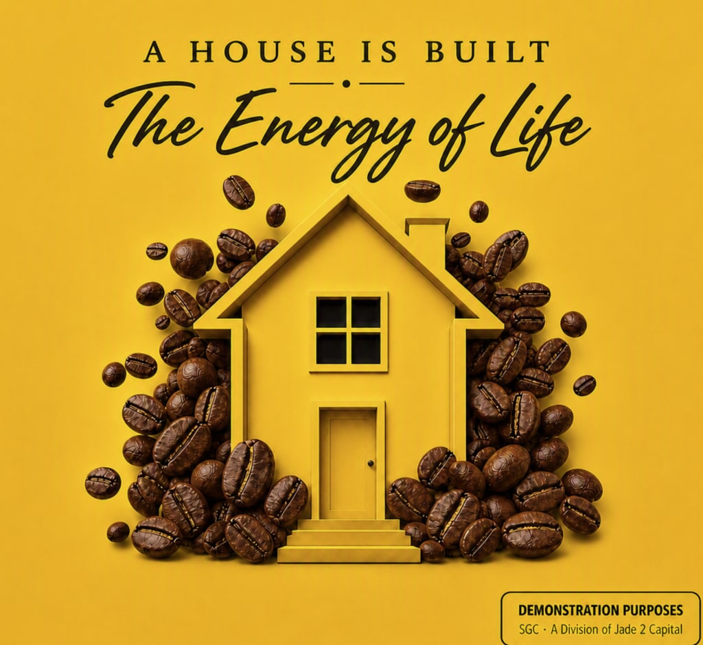
A House Is Built — A Lesson in Brand Consistency
Some brands build identity through signals rather than slogans. Over the years, the familiar yellow‑and‑red block has appeared beside phrases like “Your colors / your cup,” “Un café como ningún otro,” and “Está aquí.” These aren’t advertisements—they’re declarations. They form a united front, a system that knows exactly what it is and refuses to waver. Ask long‑time drinkers what the product means to them, and many describe an energy in the experience—something almost like the formation of life. It carries a history that resonates locally and globally, a rare achievement in a world of shifting rituals and tastes. Its ability to remain consistent while expanding its cultural footprint is not accidental; it’s the result of disciplined identity governance. A house is built through structure, and this one has spent nearly a century building a foundation people recognize instantly.
Recognition happens before reading. In a grocery store, you don’t search for the label—you search for the unmistakable block of color. The packaging has become a cultural symbol, a visual anchor that cuts through noise and stands out anywhere it appears. Founded in East Harlem in 1928 by a Spanish immigrant who developed an espresso‑style blend after living in Cuba and Puerto Rico, Café Bustelo became an emblem of cultural continuity. Exposure to Caribbean coffee culture shaped the flavor profile that would later become iconic. Today, the product sits under a major American food company, yet its cultural roots remain intact. People gravitate toward offerings that own their identity. This one does not borrow identity; it carries one.
Yellow is central to its visual power. It represents signal—the first color the eye notices, cutting through noise and demanding recognition. It represents clarity—illumination, visibility, awareness, the moment something becomes seen. It represents decision—the pause before action, the evaluation that shapes direction. And it represents energy and movement—momentum, activation, forward motion. Yellow is the sun, the force that fuels the world. Here, it functions as a declaration of identity: bold, visible, unmistakable. The color does not whisper; it announces. It is the cue that parts the noise, the moment identity becomes visible. This is why the packaging has remained consistent for decades—because the color itself is part of the architecture.
The feeling is equally powerful. From the moment the container opens, the aroma is unmistakable. It feels whole, unfiltered, present. It pulls you back to childhood—to mornings where life was simple and full of purpose. It feels like a bottled version of Spain—family, ritual, presence, and the warmth of a life lived intentionally. It evokes cultural memory, a reminder of kitchens filled with conversation, music, and the comfort of routine. This emotional resonance is not manufactured; it’s inherited through decades of consistency and cultural loyalty.
This product also belongs to a powerful brand cluster—names that serve as anchors for immigrant and diaspora communities. They share bold visibility, cultural loyalty, and heritage identity. They are brands that feel like home. You don’t look for the product—you look for the house. And inside that house, everything feels familiar. This cluster is built on recognition, memory, and cultural permanence. The yellow‑and‑red block fits naturally within that ecosystem.
Brands collapse when they dilute their identity. This one has never done that. Its core colors have remained consistent for decades. Its story has not been repackaged. When a brand keeps its structure, it keeps its audience. When a brand keeps its identity, it keeps its power. Great brands don’t need to shout. They are always seen. Great brands make their products more than products—they make them symbols.
“The Energy of Life” captures the history, the cultural meaning, and the global presence without needing to name the brand at all.
About the Creator
Jadrian Laflure
Contributor — SGC Division A Jade 2 Capital Company I write as Jadrian Laflure about identity, atmosphere, precision, and the architecture behind creative systems. This Vocal page serves as part of the SGC ecosystem within Jade 2 Capital.
Enjoyed the story? Support the Creator.
Subscribe for free to receive all their stories in your feed.
Comments
There are no comments for this story
Be the first to respond and start the conversation.