
Book Cover Design Tips That Actually Attract Readers
Design Tips

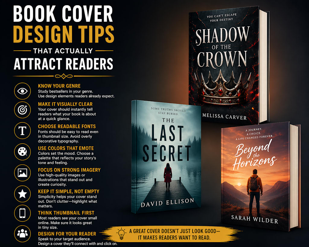
A book cover is more than just a visual element—it’s the first impression your book makes. In a crowded marketplace, readers often decide within seconds whether a book is worth exploring, and the cover plays a major role in that decision.
No matter how well-written your book is, a weak or confusing cover can limit its reach. On the other hand, a strong, well-designed cover can instantly capture attention and communicate value.
This guide breaks down practical, proven tips to help you design a book cover that truly attracts readers.
Why Book Cover Design Matters
Before a reader reads your title or description, they see your cover.
A compelling cover:
Creates curiosity
Signals professionalism
Reflects the genre and tone
Builds trust with readers
Think of your cover as a visual shortcut—it tells readers what kind of experience to expect.
Understand Your Genre First
One of the biggest mistakes authors make is ignoring genre expectations.
Each genre has its own visual language:
Romance – Soft colors, emotional imagery
Thriller – Dark tones, bold fonts, suspenseful visuals
Fantasy – Illustrations, dramatic lighting, symbolic elements
Non-fiction – Clean design, strong typography, clarity
Study top-selling books in your category and identify patterns. Your goal is not to copy, but to align with what readers already recognize.
Keep It Simple and Clear
Cluttered designs confuse readers.
A strong cover should:
Focus on one central idea
Avoid too many elements
Maintain visual balance
Be easy to understand at a glance
Simplicity improves readability, especially when your cover is viewed as a small thumbnail online.
Choose Fonts Carefully
Typography can make or break your cover.
Tips for better font use:
Use no more than 2–3 fonts
Ensure readability at small sizes
Match font style with genre
Avoid overly decorative fonts unless appropriate
Your title should always be the most visible element.
Make It Thumbnail-Friendly
Most readers will see your book as a small image on a screen.
Test your cover by shrinking it:
Can you still read the title?
Is the design still clear?
Does it stand out among others?
If not, simplify or adjust contrast.
Use Color Strategically
Color influences emotion and attention.
High contrast improves visibility
Warm colors grab attention
Dark tones create mystery or seriousness
Consistent color palettes look more professional
Avoid random color choices every color should support your book’s message.
Use High-Quality Images
Low-quality visuals immediately signal poor quality.
Make sure:
Images are high resolution
No pixelation or blurriness
Lighting and composition look natural
Stock images can work, but they should be used carefully and customized to avoid a generic look.
Balance Title, Author Name, and Visuals
Your cover has three main elements:
Title
Author name
Visual design
The title should dominate, followed by the visual, then the author name (unless you already have strong brand recognition).
Don’t Ignore the Back Cover (For Print Books)
If you're publishing a physical book, the back cover matters too.
Include:
A short, engaging description
Author bio
Barcode space
Consistent design with the front
A well-designed back cover reinforces professionalism.
Get Feedback Before Finalizing
Design is subjective, but feedback helps.
Share your cover with:
Target readers
Writing communities
Fellow authors
Ask simple questions:
What genre does this look like?
Would you click on this?
Is anything confusing?
Fresh perspectives often catch issues you might miss.
Consider Hiring a Professional Designer
While DIY tools are available, professional designers understand:
Market trends
Typography balance
Visual hierarchy
Genre expectations
If your budget allows, investing in a strong cover can significantly impact your book’s performance.
Common Book Cover Mistakes to Avoid
Overcrowded design
Hard-to-read fonts
Mismatched genre style
Poor color contrast
Low-quality images
Avoiding these mistakes can instantly improve your cover’s effectiveness.
Final Thoughts
A great book cover doesn’t happen by accident—it’s the result of thoughtful design choices and a clear understanding of your audience.
Your goal is simple:
Make readers stop, look, and feel curious enough to learn more.
When your cover communicates the right message at the right moment, it becomes one of your most powerful tools for attracting readers.
About the Creator
Prime Publishing Studio
We are one of the top-class agencies for all your publishing requirements. We have helped many authors become successful. Our highly qualified staff can provide a multitude of services that range from editing to book marketing.
Enjoyed the story? Support the Creator.
Subscribe for free to receive all their stories in your feed.
Comments
There are no comments for this story
Be the first to respond and start the conversation.