
Painting Never Let Me Go
Chapter 1 of Kazuo Ishiguro’s dystopian novel
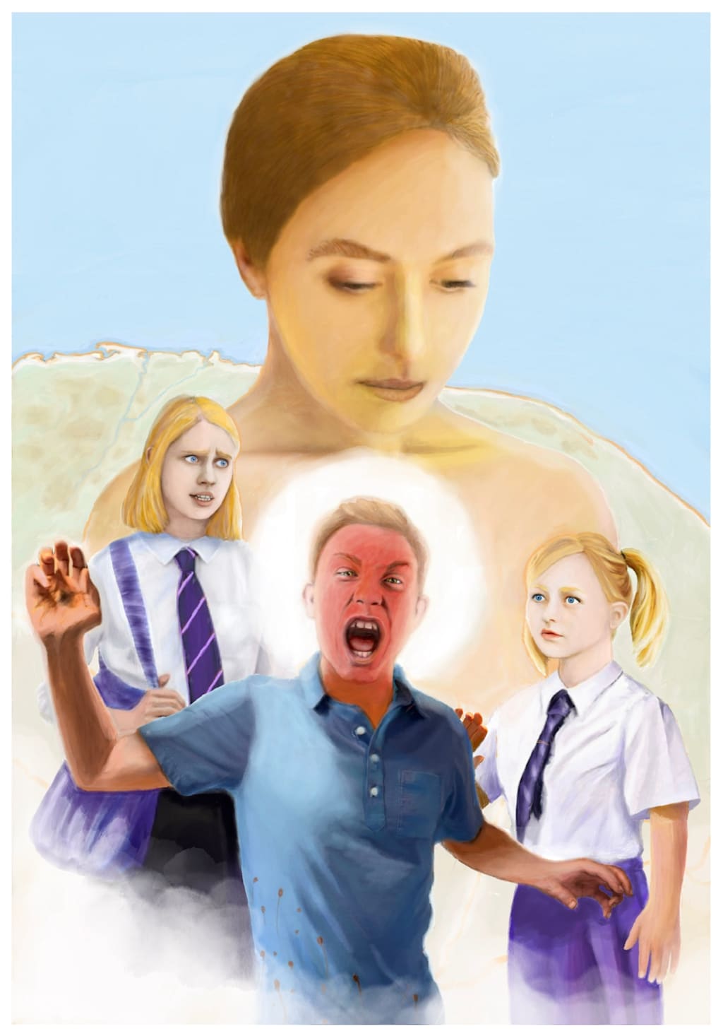
I entered the Folio Society’s annual illustration contest for the third year running in May. They announced their short list of 20 entries on July 16th and once again my entry did not make the cut. Naturally I’m disappointed. I spent literally hundreds of hours preparing initial workups, playing with a wide variety of visual strategies, and creating the final illustration.
Like I did in 2025 with Painting Rapunzel, I would like to share my thought and artistic process for this year’s contest and lessons learned with my friends on Vocal.
The prompt for this year was to read the first chapter of Never Let Me Go by Kazuo Ishiguro and then create an illustration capturing a portion of the novel’s opening. This was much more demanding than illustrating a scene from Rapunzel in 2025.
I felt intimidated from the very beginning, and that feeling stayed with me through out the process. Even after two months of sustained effort, I still felt like my final visual strategy was underwhelming.
This not to say that I had not created something beautiful, since I believe I did. But after spending thirty minutes admiring and readmiring the artworks that made the cut, I see clearly the gulf between the very best of them and mine. Several are visually stunning. When I reviewed the short list in 2025 I easily identified the one that eventually went on to win. But this year due to several remarkable entries, the choice is much more difficult. I do not envy the judges their task.
The good news is that this has not sapped my confidence. In the months since I submitted my entry my visual skill set has continued to increase. I fully intend to knock the judges socks off next year since the top lesson I gained is to create the overall design prior to creating draft images. Once I have a strong design I can roll up my sleeves and create the final visuals.
For those of you with any illustration experience at all that sounds pretty obvious. But my background and training is fine arts rather than illustration. Like my writing, I have always allowed my pictorial work to find its own way and evolve over time. I now believe that is a fatal flaw in my process.
Cliff notes version of Never Let Me Go, Chapter 1:
It begins with the reflections of Kathy H. who has worked for 12 years as a ‘carer’ for donors. Although the first chapter does not specify what the donors are donating, the descriptions suggest their internal organs with the implication of health declining to the point of death.
Process:
I read and reread the first chapter of Never Let Me Go and based on its events recognized three potential strategies.
Focus on the Kathy H’s role in the present as a carer for the donors.
Focus on the specific scene from her school days at Hailsham when her friend Tommy is tricked by the other boys and goes into a rage.
Combine both the present and the past in the image.
All 20 of the entries selected for the shortlist chose one of these strategies.
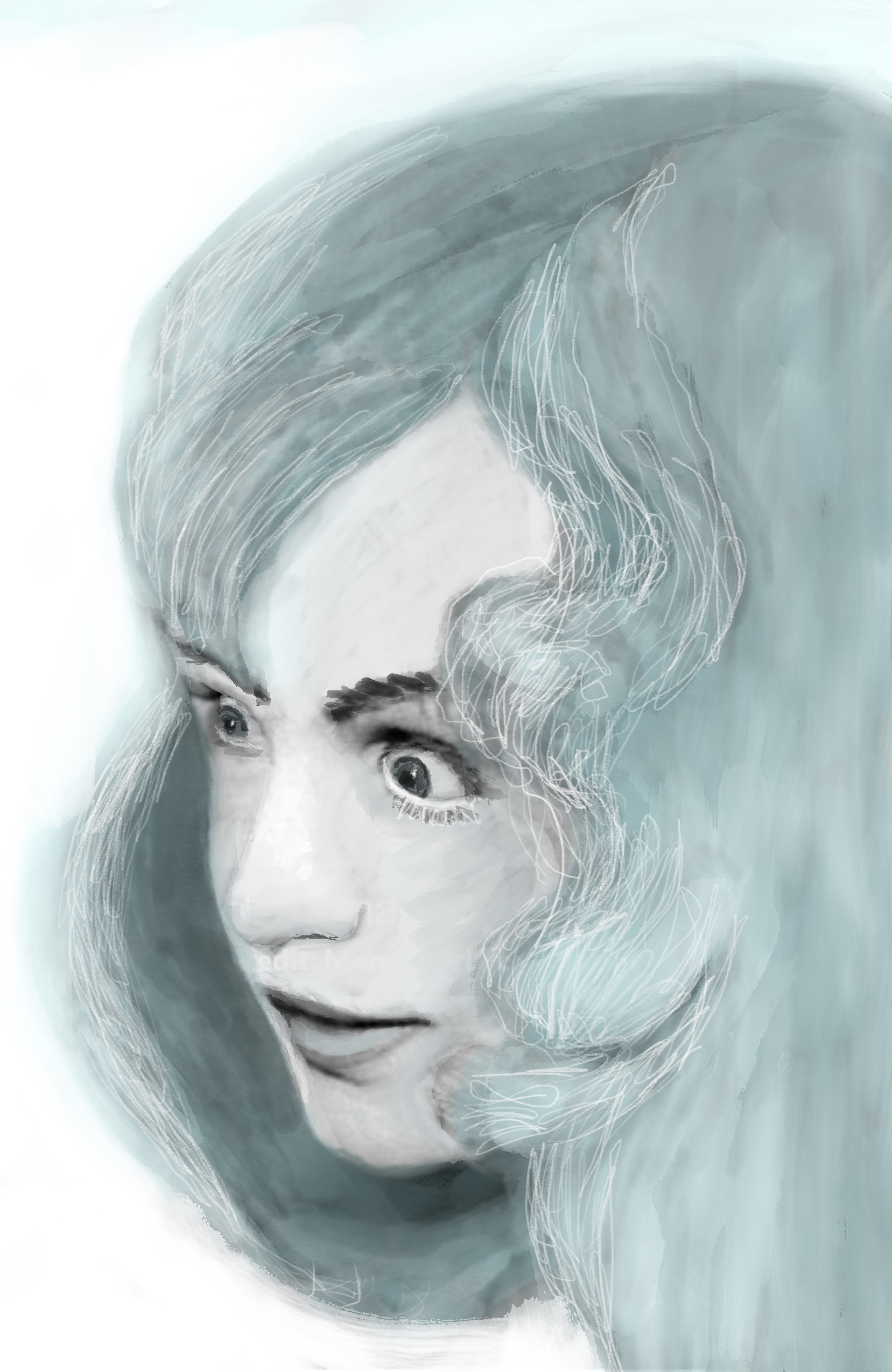
I initially began working on the first strategy till my wife pointed out its lack of dynamism. My only attempt of Kathy in her carer role below:
Once I abandoned that effort, I began creating work ups of Kathy, Tommy and Ruth for the scene in the chapter when Tommy accidentally strikes Kathy after she puts her hand on his arm.
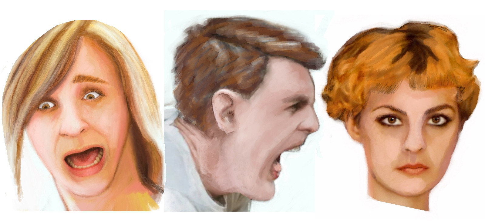
Concerned that I over-exaggerated Kathy’s reaction to Tommy hitting her I prepared a third Kathy with a surprised rather than terrified reaction.
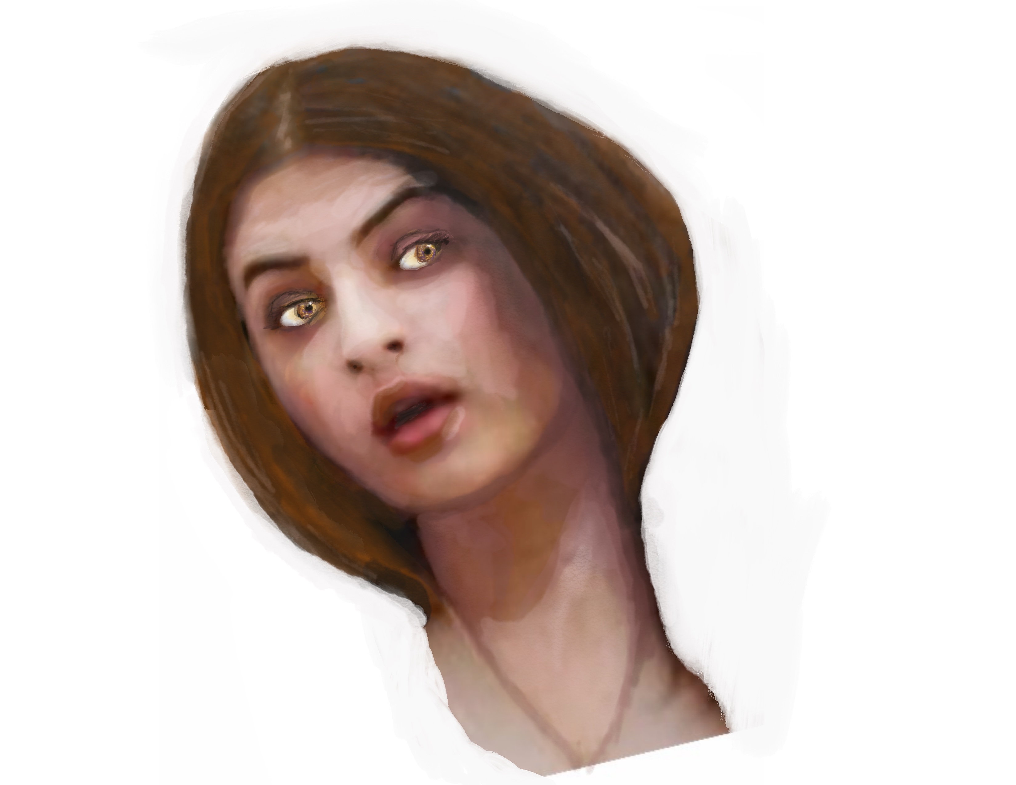
Then I began to work on the visual schema for putting the three of them together in a single, unified image. But I could not even figure out to place two of them in a single frame.
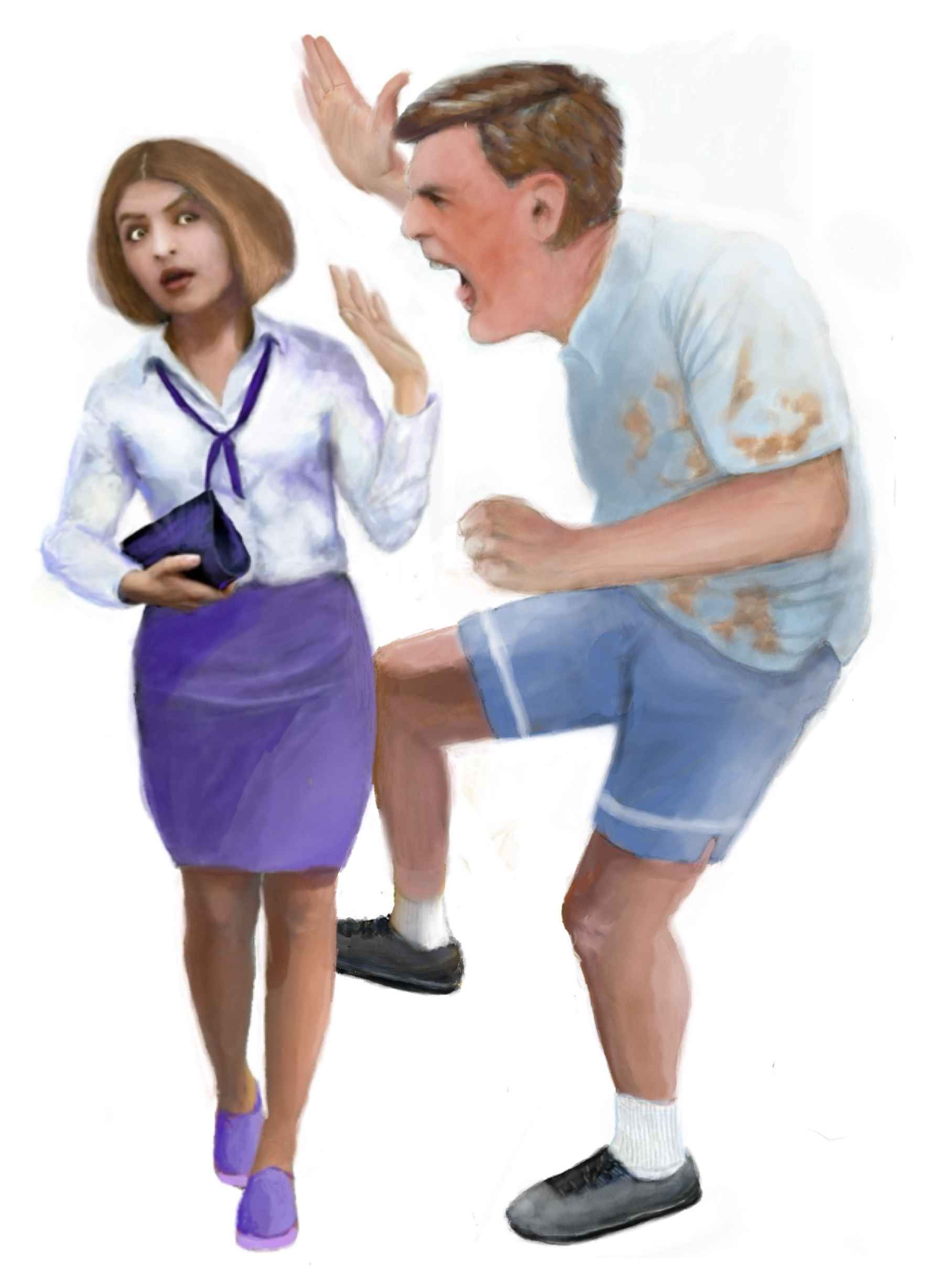
Just look at the travesty that resulted! This is why I need to create the overall visual strategy first. Creating the individual character images and then forcing them into some sort of interaction is like putting together a puzzle where none of the pieces fit.
At that point I decided to reread chapter one and realized in the process that my lack of knowledge of the breakdown of grades in the UK education system had led to children who were too old for Kathy’s remembrances. So I had to start all over from scratch.
Two weeks lost. six weeks remaining.
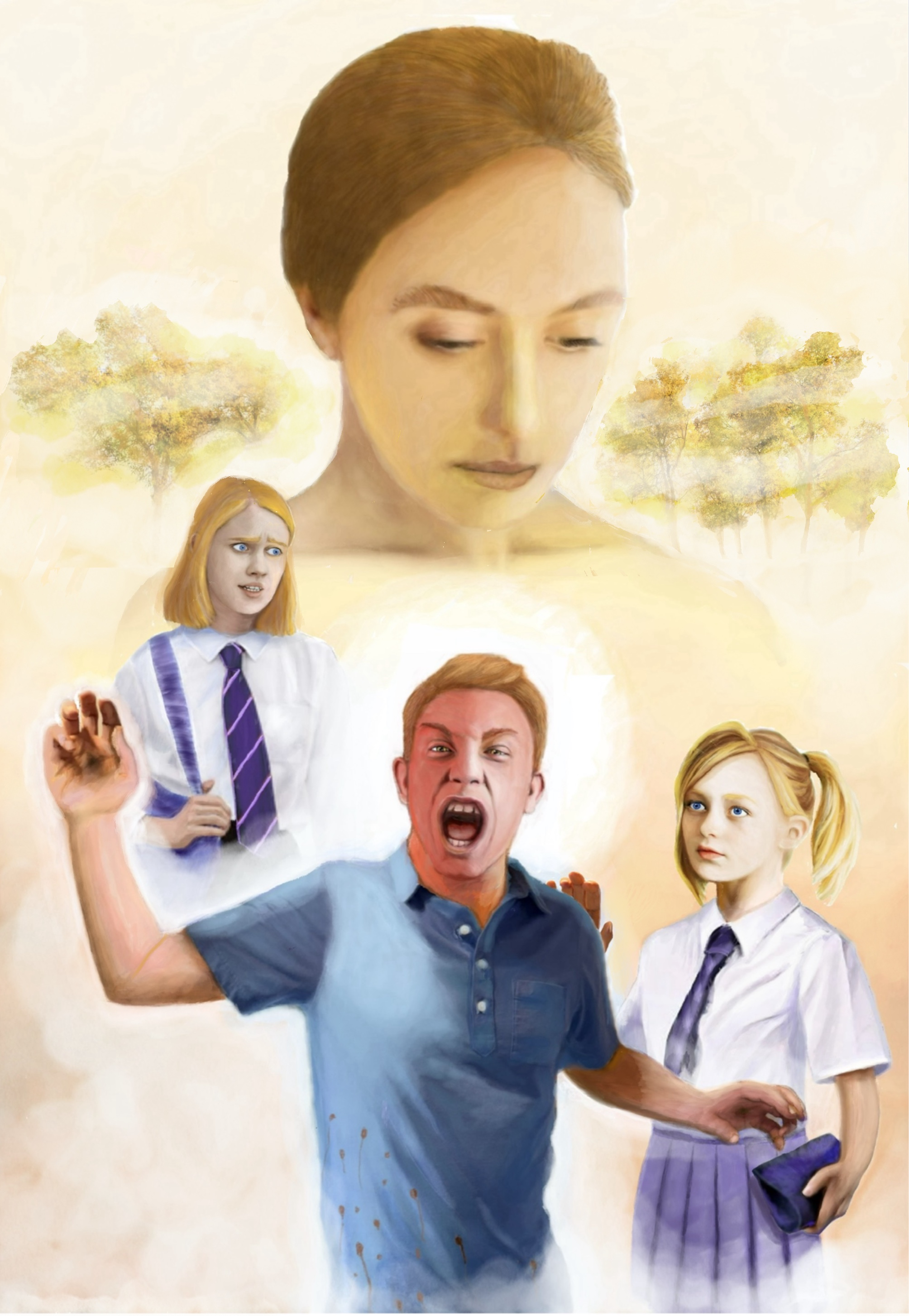
After several more false starts I decided to focus on the illustration of the grown up Kathy first. I was getting desperate. The following image is the first I really liked and ended up using in the final.
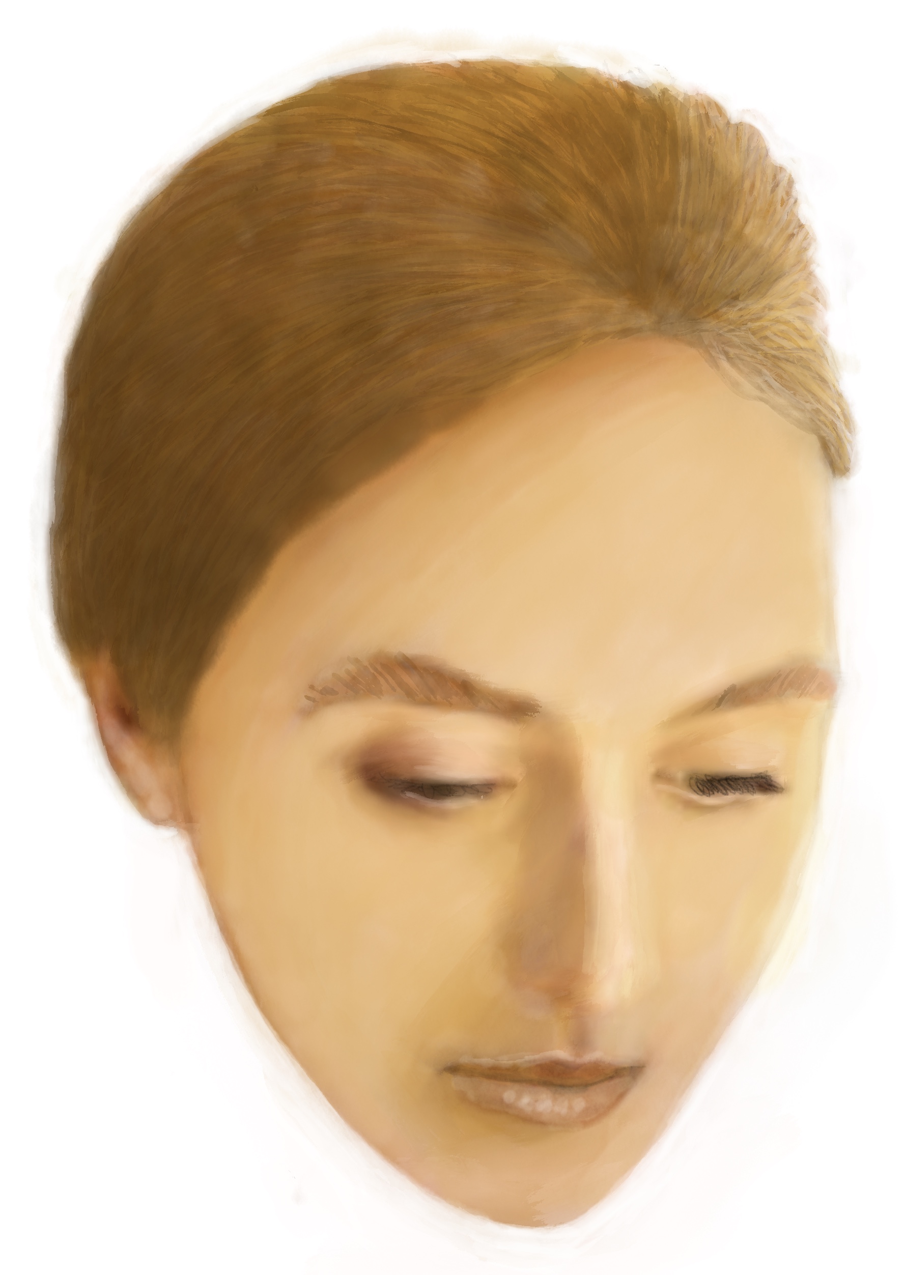
Did you notice the detail in the hair and the eyebrows? To create the appearance of depth in hair, I use layers of washes and then add detail over that. For this illustration I added an additional wash over the detail. I did the same thing with her eyebrows.
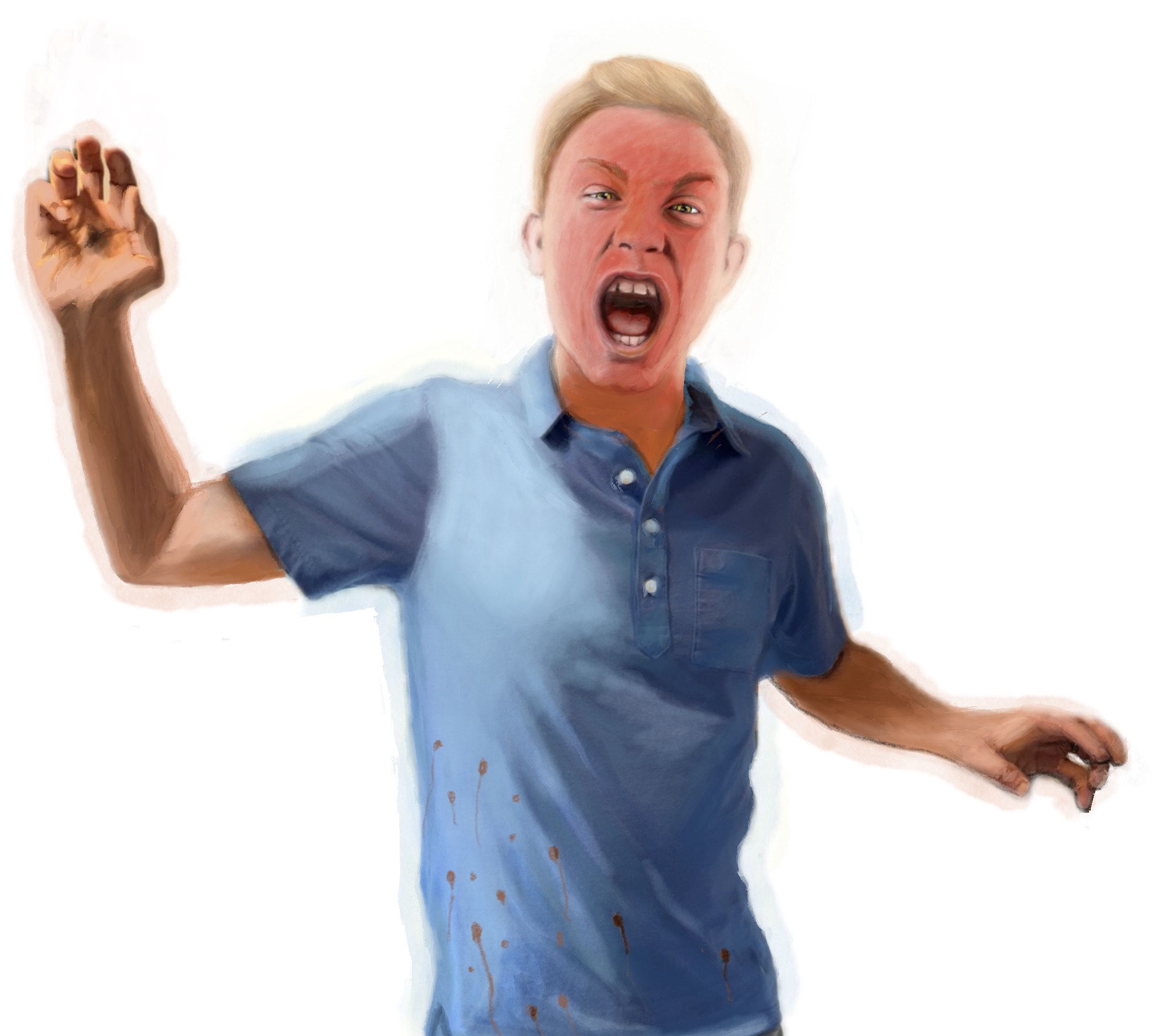
For my new Tommy, I decided having him face forward would make creating a composition with Kathy and Ruth much easier than the awkwardness of having him in profile.
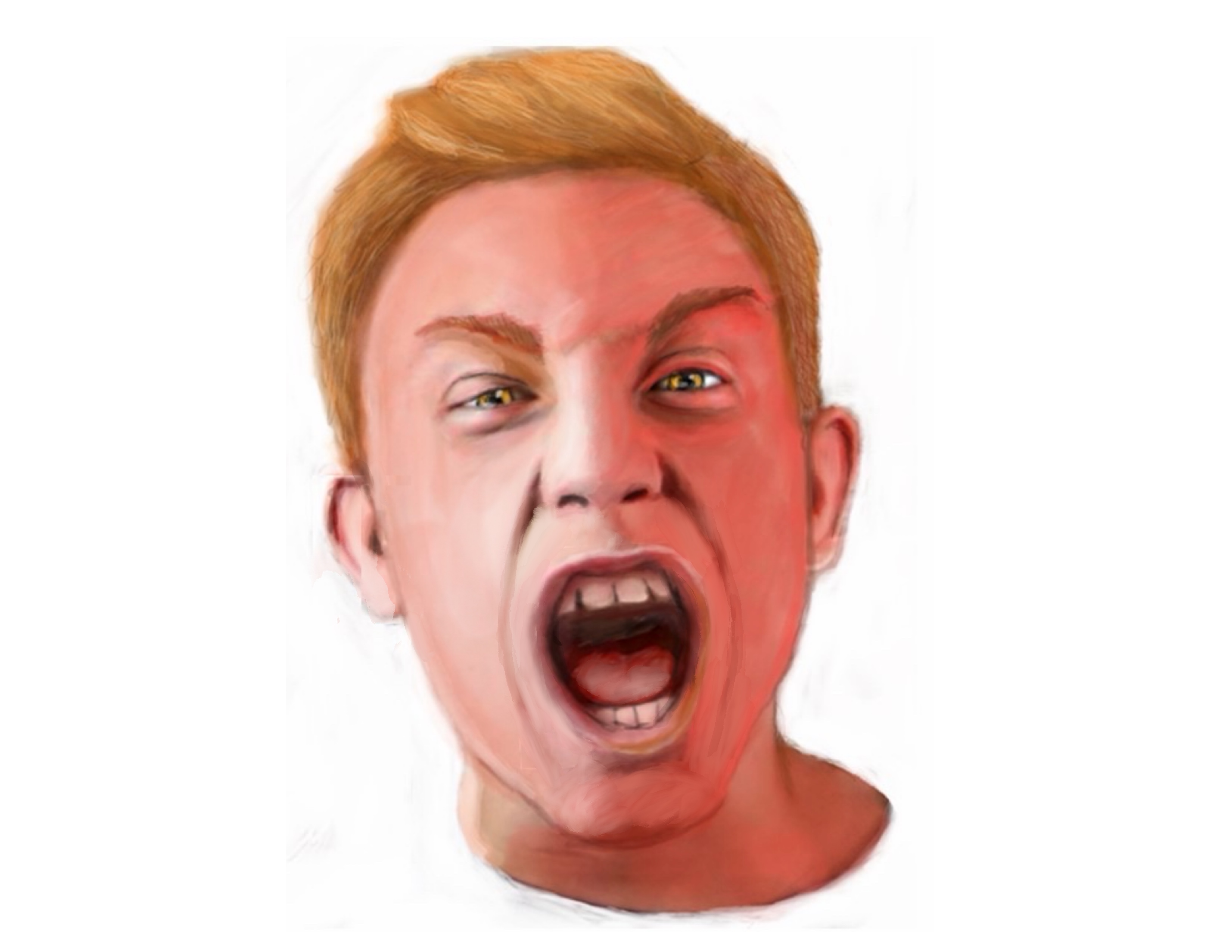
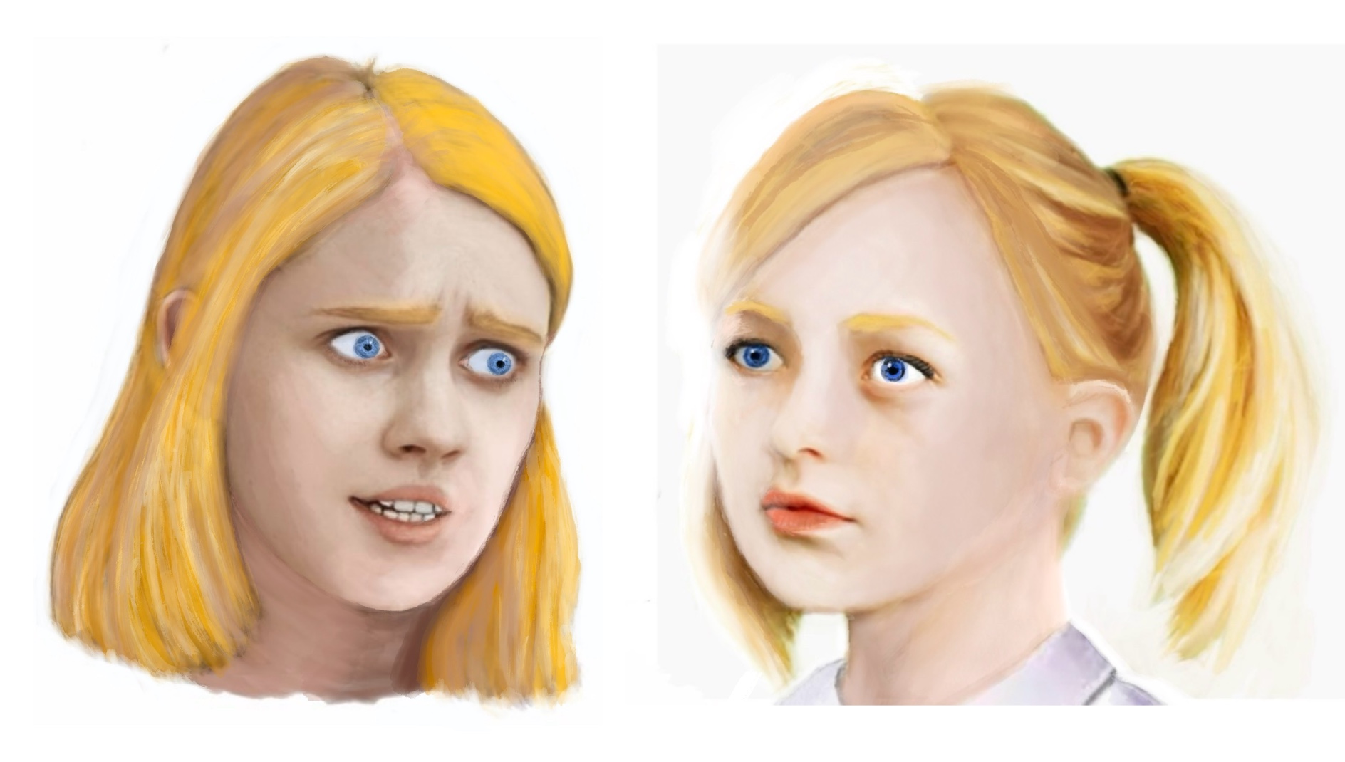
After reading the cliff notes summary for Never Let Me Go and learning that Kathy and all of her fellow students were clones raised specifically for harvesting organs, I elected to reflect this in the art using similar facial features, hair texture and complexions for all three of my principals.
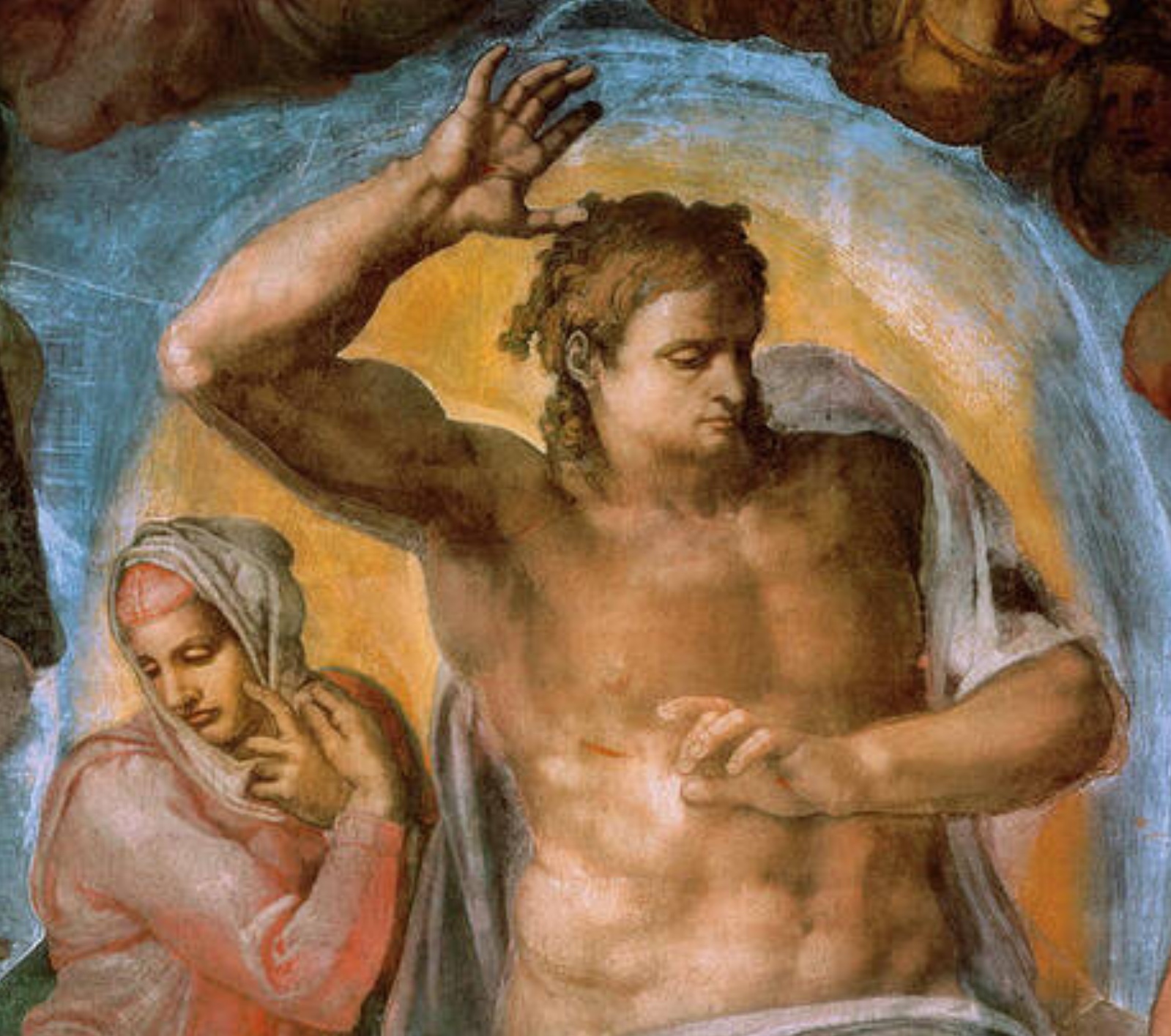
From the beginning of my second attempt on drawing Tommy, I intended to emphasize his rage with redness in his complexion. Later in the process I made him even redder. I also decided to treat his rage symbolically by highlighting it with the aura of a saint and initially planned to show his arms raised as if in crucifixion. To do that, however, would have necessitated making him smaller in the frame and I elected to compromise by somewhat mimicking the figure of Jesus in Michelangelo’s The Last Judgment while still incorporating a partial crucifixion pose with stigmata.
I know, I know…. I overthink everything.
Now I finally began to envision how the final image would appear. My initial background with the adult Kathy and the saintly aura superimposed:
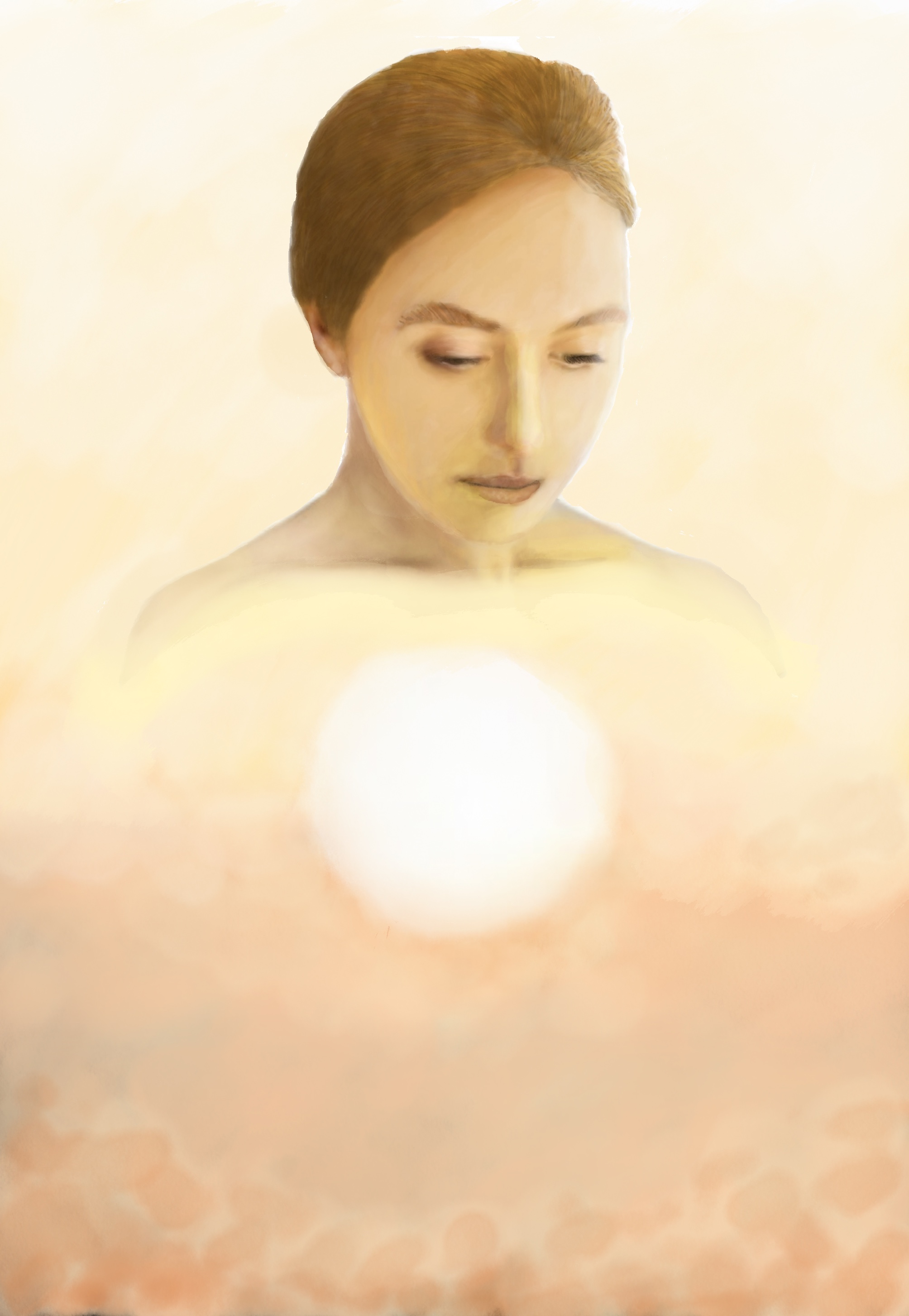
Ironically, my first completed draft of the illustration cohere’s as a whole better than my final. But at the time I was deeply unsatisfied with it. Now I’m left wondering if I had rendered the trio in sepia tones if it would have improved my chances. Next year I will do better!
The winning illustration is below. If you would like to see runner ups, use the arrows on the right of the image:
About the Creator
John Cox
Where would you like to travel? Who would you like to meet? No ticket required, a surprise at every destination guaranteed. Strap on your time travel goggles and bring a compass. It's sometimes bumpy in my imagination, so hold on tight!
Enjoyed the story? Support the Creator.
Subscribe for free to receive all their stories in your feed. You could also become a paid subscriber, letting them know you appreciate their work.
Comments
There are no comments for this story
Be the first to respond and start the conversation.