
What to Fix After Shoppers Reach Your Shopify Store
Getting a shopper to the store is only the first handoff. The ad, search result, creator video, or email made a promise; the landing page now has to honor it.


Getting a shopper to the store is only the first handoff. The ad, search result, creator video, or email made a promise; the landing page now has to honor it. If that first page points to the wrong product, makes the visitor guess about delivery, or loads poorly on a phone, buying more traffic only sends more people into the same friction.
This guide is for store owners who already have visits but are unsure what to fix next. It is not a list of generic “conversion hacks.” The work is to find the stage where shoppers lose confidence or momentum, inspect that stage as a customer, and make one change that has a clear reason. AI Agent Skills can help organize the audit and draft a fix brief; NanoSkill's ecommerce Agent Skills directory offers workflows worth comparing once the store's own evidence is assembled.
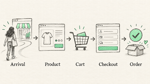
The weakest handoff is often more important than the prettiest page.
Locate the Friction Before Editing a Theme
Shopify's behavior reports can show sessions, cart additions, checkout starts, completed checkouts, landing pages, devices, and search behavior. Start with a consistent date range and compare like with like. A holiday campaign should not be judged against a quiet week without noting the difference in traffic. Segment by entry page, device, and source when the sample permits.
Read the funnel as a clue, not a diagnosis. If people land but rarely view products, navigation or message match may be the problem. If they view products but rarely add to cart, the page may not answer fit, price, or availability questions. If carts are created but checkouts do not complete, look at delivery, payment, form friction, and the total cost. Each pattern has multiple explanations, including tracking errors.
Run a test order and confirm the analytics events before drawing a strong conclusion. Shopify notes that session-based checkout counts and order counts need not be identical; use the platform's definitions rather than treating every number as interchangeable. A small dataset is a reason to prioritize direct observation and customer questions, not to declare a precise uplift opportunity.
Fix the First-Promise Mismatch
Put the entry message beside the page. If a creator demonstrated a compact travel kit, the landing page should show that kit, not a broad homepage category. If an ad promised a comparison, the page should help compare. If an email offers a particular price or bundle, the destination should make the terms clear. This is often a routing or merchandising fix, not a copywriting project.
For high-volume entry pages, review the mobile first screen. Can someone identify the product, price frame, primary benefit, and next action without hunting? A dramatic hero image may be attractive but still obscure the item or push the key information below a long scroll. Do not assume desktop design describes the phone experience; open the page on a real device and tap through it.
An agent can compare the claim in the traffic source with the visible page content and list mismatches. It should not pretend to know which version converts better. Give it the actual URLs, screenshots, audience, and offer terms, then have a person verify each flagged issue.
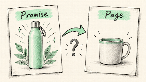
A clear message can fail when the destination quietly changes the offer.
Make the Product Decision Easier
A product page is a decision aid. Show what is included, dimensions or fit, materials, variants, availability, usage, delivery expectations, and returns where those facts matter. The exact list depends on the product. A candle buyer may need scent and burn details; a replacement part buyer needs precise compatibility. Write for the questions that block purchase, not for an arbitrary number of words.
Use images to answer questions the copy cannot. Show scale, details, and realistic use. If an item is sold in multiple sizes, make the selected variant unmistakable. If a bundle image includes props not in the box, state that clearly. Product reviews can help, but they should not be used to conceal missing seller-provided facts. Baymard's ecommerce usability research repeatedly points to product information and shipping or return clarity as important purchase considerations; the practical implication is to inspect these details on the live page.
Search behavior can reveal a different problem. If shoppers search the store for a product that exists but do not find it, review naming, synonyms, filters, and collection structure. If they search for “returns” or “shipping,” make those answers easy to reach. A smarter recommendation widget is not a substitute for basic findability.
Ask support staff which questions recur before purchase. Their answers can reveal a gap that analytics cannot name. If customers repeatedly ask whether a replacement part fits an older model, add a clear compatibility table and test whether the question declines. If they ask when an order will arrive, make the delivery estimate visible at the decision point. A page fix should answer a real question, not merely add more content.
Remove Cart and Checkout Surprises
The cart should confirm the chosen item, quantity, variant, and expected next step. Before checkout, shoppers should have a reasonable way to understand shipping, taxes where applicable, and return terms. If the final total changes unexpectedly, a reminder email is unlikely to repair the trust loss. Test the journey with an address from an important market and with the payment methods your buyers actually use.
Do not add an upsell simply because the app makes it easy. A useful accessory can help when it is relevant and clearly optional. An intrusive offer that changes the total or blocks checkout can reduce confidence. Evaluate cross-sells by completed orders, returns, support contacts, and customer experience, not only by add-on clicks.
Test error states, too. What happens when a discount code is invalid, an item becomes unavailable, or a payment fails? Is the message understandable, and can the shopper recover without starting over? These moments are easy to miss in a screenshot-based audit and easy to find in a real test order.
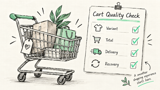
The cart should confirm a decision, not introduce a new set of doubts.
Check Speed Without Chasing a Vanity Score
Store performance matters because slow or unstable pages make basic shopping harder. Shopify's web performance reports track loading speed, interactivity, and visual stability using real-user data, including device views. Look at important page types and real mobile conditions before installing another optimization app. Large media, third-party scripts, theme code, and app additions can affect performance.
Prioritize visible problems. Does the product image appear late? Does the add-to-cart button shift just as someone taps? Does a filter freeze on a phone? A performance report can point to where to investigate, but the fix should preserve the functions that help people buy. Removing a useful size guide solely to improve a score may create a different kind of friction.
Keep a change log when apps or theme code change. Compare real-user performance and shopping outcomes after the change, with enough time for the reporting window to update. One synthetic test can be a useful debugging clue; it is not the whole customer experience.
Give an Agent a Stage-Specific Job
The strongest prompt is narrow: “Review this product page for first-time mobile visitors arriving from this ad. Use only the attached screenshots, current product facts, search queries, and funnel data. List the top three possible purchase blockers, what evidence supports each, what remains unknown, and the smallest way to check it. Do not invent heatmap findings or conversion results.”
Another Skill can turn the chosen issue into an implementation brief: affected page, exact change, acceptance criteria, test cases, analytics event, and rollback condition. That is more valuable to a store team than a page of generic copy suggestions. Require a person to approve any theme edit, app installation, or live automation, and test the changed path before sending paid traffic to it.
Conclusion
Choose the stage with the clearest evidence, reproduce the problem, and make a focused correction. If the leak is before product viewing, start with message match and navigation. If it is on the product page, answer the missing buying question. If it is at checkout, test the real total and recovery path. Use Shopify-focused Agent Skills on NanoSkill to keep the audit repeatable, then judge the change by customer behavior and support signals, not by how quickly the new page was produced.
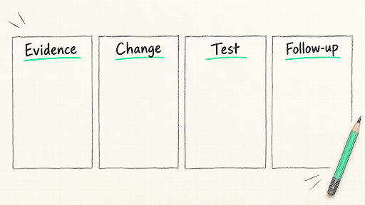
One verified improvement is a better starting point than a sitewide redesign.
About the Creator
Enjoyed the story? Support the Creator.
Subscribe for free to receive all their stories in your feed.
Comments
There are no comments for this story
Be the first to respond and start the conversation.