
Top 9 Illustration Trends In 2022
Illustrations play a crucial role in UI/UX design and branding. Depending on your final goal, you can use popular styles to bring the content or application to a new level. Discover more information about trendy illustration styles here:

Illustrations are an essential part of our life. Every day, we see art used for ads, magazine pages, signs, packages, mobile apps, websites, and whatnot. They have tons of different approaches, and they change with time. In ancient times, people showcased their observations and beliefs through painting. During the Renaissance era, the artists strived to depict reality as it was, placing humans in the center of the world.
In modern times, digital technologies strike down traditional painting and bring creativity to a new level, adding spicy things like AR and VR. In other words, what has been popular in the past might not catch an eye today.
Well-thought use of trends improves brand awareness and attracts more customers to the company. On the contrary, if one avoids implementing visuals in their content, it results in lower user acquisition. People just don’t notice such companies. That is why staying up to date with the new craze is crucial.
In this article, we gathered the top 9 illustration trends of 2022. We selected a few pieces from famous artists to represent the tendencies better. To inspire the designers, our team prepared a few examples showing the trends in real concepts.
Let us see how the tastes have shifted this year!
Corporate art style
This is a timeless classic. Its origins go back to 2017 when a Buck agency developed a similar style for Facebook. Since then, companies have used it in their content so often that people started to recognize the approach at once.
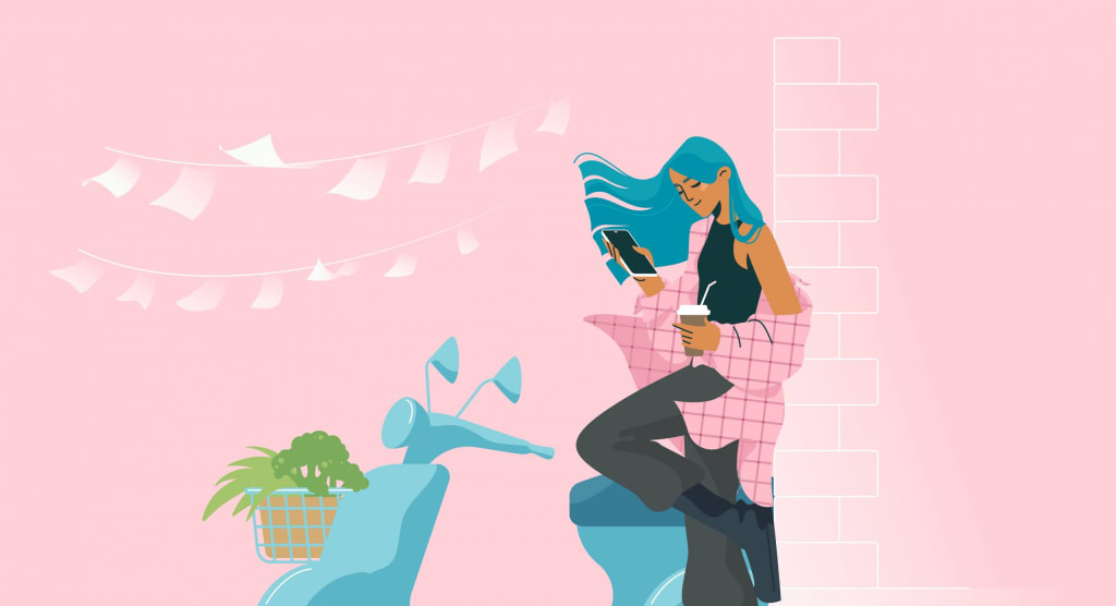
Thanks to simplicity, it suits a variety of situations: business presentations, corporative guides, blogs, websites, mobile applications, etc. Usually, such pieces depict routine situations and characters. The composition is basic, and the color choice gives warm vibes.

One of the main features is rounded shapes and simplified proportions. This helps create a calming atmosphere and draws attention to the theme itself. That’s why lifestyle images are so popular: they showcase the initial concept without overloading the eyesight.
The image above is about life & work balance. Although the topic is serious, the picture looks peaceful. Chubby shapes, rounded lines, and lots of white space around the center don’t bring grim memories about the 5/7 job. On the contrary, you feel excited about what comes next. That is why this approach comes in handy when one needs to water down a serious topic and switch the attention.
“Speaking” lines & shapes
This flat illustration style is similar to corporate; however, it has an interesting feature. It makes the viewer follow the lineart, discovering how the strokes connect with each other and create new shapes. The more you look, the more connections you find, like in a puzzle.
Here, there is no line between the chair and the background. Every stroke has its role; most objects are drawn with simple shapes. Together with intricate body proportions, this approach makes the viewer spellbound.
This means a client will eventually switch attention to the content around the picture and stay focused on the intent. Intricate shapes have become one of the top illustration styles thanks to the popularity of stickers, prints, and pins.
Isometric
For a long time, isometry has been a part of the video and mobile games. However, it is much older than we think and was invented by Professor William Farish in the 19th century. For architects and engineers, isometry was a vital work tool.
Today we see isometric pieces on magazine covers and website banners. People use isometry to express complex objects simply, for example, by showing the integral parts or wholly disassembled. This method lets the viewer quickly grasp the object’s essence and take a closer look at every detail.
Modern companies include isometric visuals in their brand materials and booklets. This piece is a perfect example:

Flat colors serve as a nice base since they do not overload the picture. Moreover, calm fills help the artist separate different levels from each other. Such images become visual anchors in business articles, booklets, or presentations.
Isometry is flexible and mixes with other approaches easily. If the content is closer to entertainment or lifestyle topics, it is better to switch to three-dimensional isometry. It has soft shadows and smooth shapes, so the colors are usually represented with gradients. This style of illustration is more realistic, and it corresponds with objects in real life. In other words, such concepts are familiar to the eyes. For example, take a look at this mini house:

The piece has cartoony vibes. However, it looks believable thanks to the three-dimensional forms and many details. Isometric composition allows the viewer to see the versatility of objects, making the house true to life. This mixed type of art style performs amazingly well in advertisements and magazine or album covers.
Three-dimensional art (3D)
Three-dimensional modeling started its advancement in the 1960s, with the first commercially available Computer Aided Design programs or CAD. Initially, it fitted architecture and scientific purposes, but soon artists spotted great potential in the tool, creating interior designs and ground-breaking concepts.
In 2022, using 3D visuals in UI/UX is still quite popular. The reason is that this approach allows the artists to assemble realistic scenes while still experimenting with render and composition. Such a powerful feature will be in demand for many years to come. However, a wind of changes blows through the trends every now and then. Modern 3D tendencies suggest in-depth work with textures. The shapes are familiar to the eye, but its surface turns out to be absolutely different.

Here, the plain, plastic-like textures provide additional volume to the items. The contrast between soft-edged forms and bright colors keeps the viewer looking at the picture. Despite the striking palette, such pieces appear widely in everyday life, especially in web design.
However, sometimes artists apply more prominent textures, making it hard to resist touching the screen. The items are full of realistic volume, and their surface looks squishable. This approach performs like magic in identity and branding, thanks to eye-pleasing traits. The 3D collage below is an example of when the soft volume sparks a desire to touch a product:

Textured shapes & brushes
Textures are often applied to 2D pictures too. In this case, people add them only to certain areas or simply create a textured brush: pencils, watercolors, rough edges, scratches, etc. This technique helps draw attention to the desired parts of the image, highlight an object or emphasize something. Such creations are go-to options for presentations, website development, and, of course, blogs.

The piece above represents the work with textured brushes. The strokes are similar to traditional pencils, which adds more charm to the visuals. Thanks to this texture, the plain colors begin to sparkle. As a result, the art is simple yet still manages to evoke warm feelings.
When a texture is applied to whole shapes, the picture gains luxurious vibes. Such images are perfect for creating a brand or startup. They will help you attract more clients.

2D & 3D animation
The origins of 2D animation go all the way back to 1908 when Emile Cohl presented “Fantasmagorie.” Later Walt Disney helped the cartoons thrive and made them a favorite entertainment for millions of people. However, flat animation has become a popular art style in digital design just recently. Thanks to intricate movement, characters and objects in a picture look alive. This allows the company to appeal to the users. Also, the animation is great for branded characters: they are more recognizable.

Three-dimensional computer animation was first introduced in the 1960s by William Fetter. Since then, it has continued to conquer people’s hearts. CGI has become common in movies, while simple-looking 3D animations just recently entered the world of web design and mobile applications. The reason for its popularity is not surprising. It allows people to bring complex or abstract things to life. By experimenting with light, render, and textures, people get almost unlimited artistic possibilities.
In terms of scientific education or product presentation, 3D animations are a must-have. One showcases their idea from different angles without taking too much space on a page. Moreover, it will be more effective than a static render.

Сomplex compositions
Complex composition is worth opting for if you want to captivate the viewer immediately. Various shapes overlapping each other make the eyes wander around for more details. A small picture contains tons of little themes that create a solid vision together. As a result, your glance is tied up to the image, untangling the lines and finding objects. Just like in this cover for a movie:

This approach is perfect for covers, website pages, banners, or project concepts. For some products, it can look a bit grim. However, the artists create more reserved versions after experimenting with tones and palettes. This art for an educational project shows how well the white background can enhance simple flats and prominent lineart:

Although the colors are striking, their well-thought usage keeps the picture balanced. The white space brings enough “air” between the objects, and their edges are seen thanks to the black strokes. This type of composition is perfect for product presentations when you need to show everything at once. Also, they fit into e-learning or educational courses to help students grasp the whole idea without disassembling it into separate parts.
Over exaggerated proportions
Exaggeration of size, shapes, or qualities is a trusted way to attract attention. It is widely used in literature and movies. In the illustration, one can too stumble upon over exaggerated object proportions. Such contrast helps the artist to highlight specific areas and hint at certain qualities. You feel the object to be heavy or light, squishy or rock solid.
Usually, this popular art style is applied to characters in a picture. Take a look at this piece:

Here the artist drew the body and hands huge on purpose to show how a pianist bent in half over the instrument and played in that position for a long time. The picture gives chill, relaxing vibes, and your eyes wander between the musician’s enormous hands and small head.
This approach serves different purposes and generally suits lifestyle blogs and web design. Moreover, it is often used to showcase clothes design. That is why you can also complement your fashion blog with such pictures.
Retrowave
Sometimes new is well forgotten old. Retrowave style depicts life from the 70-80s, mixing it with cyberpunk and retrofuturism. Initially, it came from the music industry. There is a genre with the same name, and its album covers resulted in a completely unique approach. Dark color scheme, blinding glares, metallic typefaces, violet and pink tints — are the key features of retrowave.

Retrowave music is having a spike now, and so do the art it has inspired. It is creative and eye-catchy. So, if the designer is eager to draw attention to certain areas of a website, adding such images is a great idea. The nearby content will pop out thanks to the high contrast between the text and picture. However, this advantage might quickly turn into a downside. There are high chances of overloading the design, pushing away potential users. That is why the retrowave is perfect to be a cherry on top, but not the cake batter.
Cartoons and comics
People usually think cartoon art styles suit only children’s movies and books. That assumption is incorrect since most grown-ups are still kids deep inside. Most of us want to break free from our everyday routine and have fun, so this approach has become quite popular.
Adding cartoon characters to a business presentation is an unwise decision. However, UI / UX designers add them to parenting mobile apps, e-learning courses, lifestyle blogs, etc. Such illustrations help break the user’s ice and set up a friendly mood.

The picture above is filled with a warm light. The colors are bright but fit well into the overall composition, bringing a calm mood with a pinch of joy. Accompanied by textured brushes, all elements create a solid illustration. However, the soft lines and warm tones aren’t always a signature of this style. Artists often add thick lineart with oversaturation to make the piece more vibrant and striking to the viewer’s heart.

This piece is an excellent example. At first, the viewer is overwhelmed: tons of little details, prominent lines, gradients, and extremely bright colors. The confusion shifts into excitement in a second — there is so much to see. This type is often used in ads and website content to catch attention quickly. However, just like with the retrowave, one should be careful to place these arts around the content. Too many of them might overload the composition or switch to the wrong mood.
Examples of illustrations in UI/UX
Let’s take a look at the examples showing how these illustration trends work in design:


In conclusion
Different styles of illustration suit specific purposes. Some are more vibrant and attract everyone’s attention in web design. Others are more reserved and fit into a product presentation. With art, you can send a message to your target audience, evoke certain emotions and build the desired user flow. The key lies in well-thought picture placement: a balance between text and images.
Depending on your final goal, you can use popular styles to bring the content or application to a new level. Moreover, experimenting with different content can stimulate your business growth. Contact our team if your project requires illustrations, and you are puzzled about what style to choose. We will pick the ones suitable for the product and create our own if necessary.
About the Creator
Shakuro
We are a web and mobile design and development agency. Making websites and apps, creating brand identities, and launching startups.
How to choose the perfect race walking shoes
Take a look into an avid hiker's closet and you'll likely find a messy pile of shoes. Finding the perfect pair of walking shoes is a difficult task for walkers. It sounds simple, but in reality, finding the right pair of walking shoes is much more difficult.
By Nguyễn Bảo Quốc4 days ago in 01
Exploring the Top Universities in Morocco
Morocco, a land of rich culture, diverse landscapes, and historical significance, is also home to some of the finest educational institutions in the region. From bustling cities to serene coastal towns, Morocco boasts universities that offer a wide array of academic programs and opportunities for both local and international students. In this article, we delve into the best universities in Morocco, highlighting their strengths, contributions to academia, and the unique experiences they offer.
By Steve Johnson2 days ago in 01


Comments
There are no comments for this story
Be the first to respond and start the conversation.