
Style tiles
A UI designers pocket sized cheat sheet.


Style tiles are bite sized design reference sheets, so let's keep this short and sweet.
As you would probably know, a branding style guide aims to share the rules and design strategies used to effectively represent a company in any digital or physical medium. Similar to the branding style guide, the style tile is used to collate the styles and assets used, but in a UI design. Style tiles are great not just for personal reference, but for handing off work to others with the piece-of-mind that they will be creating work consistent with the brand, and yourself.
Style tiles may not necessarily be used for handing-off work though, they can also be a great exercise in visual design and will help you to get to grips with how things like colours, shapes and various other assets mingle together in your designs.
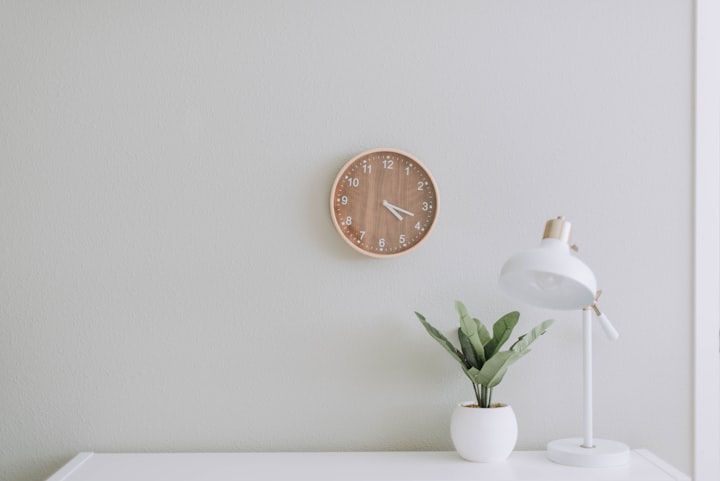
For example, take a look at the style tile above created by JT Grauke on Dribbble. It's a little piece of art in itself, effectively portraying the design elements and styles used in the project. Any designer worth their salt could quite easily design a web page in the same style with only this image as a reference. I personally love this aesthetic, it's letting out some serious Slack vibes.
So what exactly can I put in my style tile?
Well anything really, all the important bits. Don't worry too much about copy or tone of voice though.The main ingredients to stick to include the following:
1. Colour
Include your colour palette in your style tiles, this shouldn't be too hard, even if you opt to display colour using your UI elements rather than outright displaying the colours alone like the example above. This should come naturally. Try stick to the main colour palette. Don't worry too much if your designs utilise 5 different shades of black. If something like this is important though, try think of a compact way to display these shades. Keep it brief.

2. Typography
Include important font weights and display them in the sizes they appear. Font size does as much for your designs personality as anything else, remember that.

3. CTA/Button Styles
Include the button and link styling, generally you would have a consistent style for all of your interactive elements of your UI so you may only need to add one or two examples.

4. Shape and layout
Your style tile does not have to explicitly describe how elements are laid out, rather it should show. Copy your grid and layout strategies within the creation of your style tile to reinforce how elements can be spaced and aligned to each other in your full design.

5. Photography/Illustration
Generally a brand will utilise either photography or illustration for their imagery (sometimes even both). Don't forget how important these are! The style of imagery is just as important to the personality as the subject matter.

6. Iconography
Icons are all treated differently in each company's brand. Depending on that brand they can be a powerful addition to your style tile. Especially if yours have a particular design treatment which sets them from the bunch.

7. Honourable mention - UI component ideas
To add some interesting flair you could even throw snippets of the built UI as a design piece. You can't get much closer to portraying the UI than actually showing it.

There you go! Style tiles. Have fun with them, see what useful ideas you can whip together before starting a new project, after all they are for you and your team.
About the Creator
Rhys Webster
Sydney based designer. Photography, fashion, coffee and gaming enthusiast.
Keep reading
More stories from Rhys Webster and writers in 01 and other communities.
Reframing Minimalism
I found minimalism a little over two years ago, starry eyed and optimistic, I dove right in with the hopes of reaching some level of peak enlightenment, to find myself with zero desire to own an object for materialistic reasons, and transcend past the concept of humanity to a singularity of contentment.
By Rhys Webster2 years ago in Humans
Best Ice Maker To Buy Right Now
Ice makers have become an indispensable appliance in modern kitchens, offices, bars, and beyond, catering to our ever-growing demand for ice. Among the myriad options available, the AGLUCKY Countertop Ice Maker stands out with its innovative features and convenience. With the capacity to produce up to 26.5 pounds of ice in 24 hours and delivering 9 perfectly shaped cubes in just 6 to 8 minutes, this portable ice machine sets a new standard for efficiency and performance. Equipped with self-cleaning capabilities, it ensures not only rapid ice production but also hassle-free maintenance, making it an ideal choice for busy households, bustling offices, vibrant bars, and lively parties. Join us as we explore the evolution, mechanics, applications, and future trends of ice makers, with a spotlight on the AGLUCKY Countertop Ice Maker and its revolutionary features.
By Christian Butz3 days ago in 01
Interview with Ola Electric executives about the new product launch
Ola Electric, a prominent player in the electric vehicle market, has recently made waves with the launch of their new S1 X scooters, starting at an enticing price point of Rs 69,999. This move marks a significant expansion of Ola Electric's product line-up and comes alongside a strategic shift in pricing for their existing models.
By Gopinath.R2 days ago in 01


Comments
There are no comments for this story
Be the first to respond and start the conversation.