
New Spotify Logo Explained: Why Spotify Changed Its Icon to a Disco Ball
From a familiar green icon to a glowing disco ball—Spotify’s anniversary rebrand turns music streaming into a nostalgic celebration of 20 years of listening history.

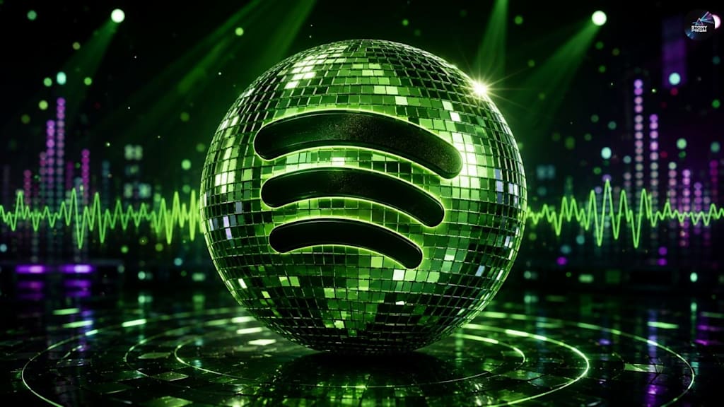
Spotify users around the world recently opened their phones and noticed something different. The familiar green-and-black Spotify icon had transformed into a shiny disco ball, instantly sparking confusion, memes, excitement, and criticism across social media. Many users wondered whether their app had updated incorrectly, while others assumed the music streaming giant was preparing for a complete rebrand.
The truth is much simpler. The new Spotify logo is part of a temporary celebration marking Spotify’s twentieth anniversary. Founded in 2006, Spotify decided to celebrate two decades of music streaming culture with a playful redesign that reflects nostalgia, music history, and personal listening memories.
The disco ball icon is directly connected to Spotify’s latest campaign called “Spotify 20: Your Party of the Year(s).” Unlike Spotify Wrapped, which focuses on a single year of listening habits, this new feature gives users a complete retrospective of their entire Spotify history. It highlights first streamed songs, favorite artists, total listening activity, and even all-time top tracks.
By combining a retro-inspired logo with deeply personal listening data, Spotify has successfully created one of the most talked-about digital branding moments of 2026.
The redesigned icon keeps Spotify’s famous curved soundwave lines in the center but places them inside a sparkling disco ball. The look feels intentionally nostalgic, almost like a throwback to dance clubs, vinyl parties, and classic music culture from previous decades. Instead of introducing a serious corporate redesign, Spotify leaned into celebration and emotion.
That emotional angle is important. Modern tech companies often focus on minimalist branding that feels clean but emotionally distant. Spotify’s temporary disco ball logo moves in the opposite direction. It feels loud, expressive, fun, and designed specifically for social sharing.
The timing also makes sense. Nostalgia marketing has become one of the most effective strategies in entertainment and technology. People enjoy revisiting memories connected to music, movies, games, and internet culture. Spotify already understands this behavior through the massive success of Spotify Wrapped every year.
With “Party of the Year(s),” Spotify expanded that idea beyond annual recaps. Users can now revisit years of listening history, discover forgotten songs, and see statistics that feel surprisingly emotional. Many people online shared screenshots showing the first song they ever streamed or artists they have listened to for more than a decade.
The disco ball logo works perfectly with that strategy because it visually represents celebration and nostalgia at the same time.
Social media reactions to the new Spotify logo have been divided. Some users love the redesign and describe it as refreshing compared to the flat app icons used by most technology companies today. Others dislike the glossy look and believe it appears outdated or distracting on phone screens.
Still, mixed reactions are often a sign that a branding campaign is working. People are talking about Spotify again, posting screenshots, debating the logo, and sharing anniversary statistics online. In digital marketing, visibility and engagement are incredibly valuable.
The logo change also reflects a broader design trend happening across technology and entertainment platforms. After years dominated by flat minimalism, many companies are experimenting with more expressive visuals, including metallic textures, glass effects, gradients, and three-dimensional styling. Spotify’s disco ball icon fits directly into that movement.
Importantly, reports suggest the logo is temporary rather than permanent. Spotify appears to be using the redesign as part of its anniversary celebration instead of replacing its core identity forever. That temporary nature may actually make the campaign more effective because users know they are experiencing a limited-time moment in internet culture.
Spotify also launched the campaign in more than one hundred forty countries and multiple languages, proving how important the anniversary is for the company’s global image. The feature is currently mobile-focused, encouraging users to interact with the app directly and share personalized results online.
Beyond the design itself, the campaign highlights Spotify’s evolution from a startup into one of the world’s biggest entertainment platforms. What started as a music streaming alternative has become a major force in podcasts, digital culture, artist promotion, and personalized algorithms.
The new Spotify logo may disappear eventually, but the conversation around it reveals something larger about modern internet culture. People no longer see apps as simple tools. Music platforms now hold years of memories, emotional experiences, relationships, and personal identity.
By transforming its logo into a disco ball, Spotify turned a simple app icon into a cultural event. Whether users love it or hate it, the redesign achieved exactly what Spotify wanted: attention, nostalgia, conversation, and a reminder that music is deeply connected to memory.
For a temporary logo change, that is an impressive achievement.
About the Creator
Enjoyed the story? Support the Creator.
Subscribe for free to receive all their stories in your feed.
Comments
There are no comments for this story
Be the first to respond and start the conversation.