
How to Build Scalable Product Dashboards
Discover how to build responsive, glanceable dashboards that transform heavy data into actionable insights.

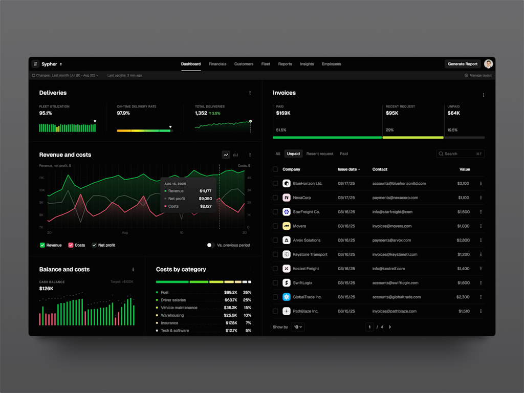
In the modern business landscape, a SaaS dashboard functions as the operational heartbeat of an organization. It is the critical junction where strategy intersects with execution. With financial transactions streaming in, user interaction logs accumulating, and performance indicators updating continuously, having a unified view is essential. Without this consolidated perspective, leadership is effectively navigating without visibility—a precarious position when significant capital is at stake.
Consequently, an increasing number of organizations are developing bespoke dashboard solutions, as disjointed software ecosystems fail to support scalable operations. The goal is to establish a definitive, centralized data repository. This system must correlate billing statuses with live user activity, enabling teams to identify potential customer attrition before a cancellation request is ever submitted.
We will begin by examining the underlying mechanics of SaaS dashboard construction. We will explore the essential structural elements of AI-driven analytics platforms, focusing on the architectural resilience required to handle sudden surges in traffic. Additionally, I will offer insights into the development lifecycle, distinguishing between valuable technological investments and mere industry trends. Naturally, we will also address the inherent obstacles in this process.
Defining the SaaS Dashboard
Definitions vary widely depending on who you ask, but fundamentally, a dashboard serves as a command center. It is a unified interface that synthesizes fragmented data streams into a format that is both comprehensible and actionable.
Think of it as an aggregation engine. Financial information is typically scattered across payment processors, banking institutions, subscription management software, and occasionally, outdated ERP systems that are difficult to maintain. An effective SaaS analytics platform ingests these disparate sources, processes the information, and generates a coherent narrative, effectively converting raw noise into meaningful signals.
When dealing with financial figures, precision is non-negotiable. Approximations are unacceptable when monetary values are involved.
The specific requirements for a dashboard shift significantly based its intended application:
- Trading Platforms: For systems managing high-frequency trades—whether in cryptocurrency, equities, or digital assets—speed is paramount. Latency directly translates to financial loss. The interface must display open orders, execution statuses, and portfolio valuations in near real-time. Data that is even slightly delayed renders the tool ineffective.
- Payment Infrastructure: Here, reliability and transparency are key. Users must instantly identify successful payments, failures, and the reasons behind them. Immediate flagging of declined transactions is crucial, and recurring revenue metrics (such as MRR and ARR) must be precise to the decimal. The dashboard acts as a readable ledger, allowing finance teams to reconcile accounts efficiently without getting bogged down in complex spreadsheet manual labor. Discrepancies between dashboard figures and bank statements indicate a serious systemic issue.
- Risk Management: In this context, the dashboard acts as a sentinel, actively scanning for irregularities. It monitors for unusual usage spikes, suspicious login attempts from unfamiliar IP addresses, transaction patterns indicative of fraud, and other anomalies. The system must highlight these threats before they escalate into major incidents, requiring robust backend processing to sift through vast amounts of log and behavioral data to identify critical issues.
- General Analytics: This provides the broader strategic overview. It tracks user engagement, identifies drop-off points, and highlights features that drive upgrades. This aspect of the dashboard supports high-level decision-making, serving as the primary workspace for product managers. They rely on longitudinal trends, cohort analysis, and retention metrics. While millisecond-level precision is less critical here, data consistency and comprehensiveness are vital.
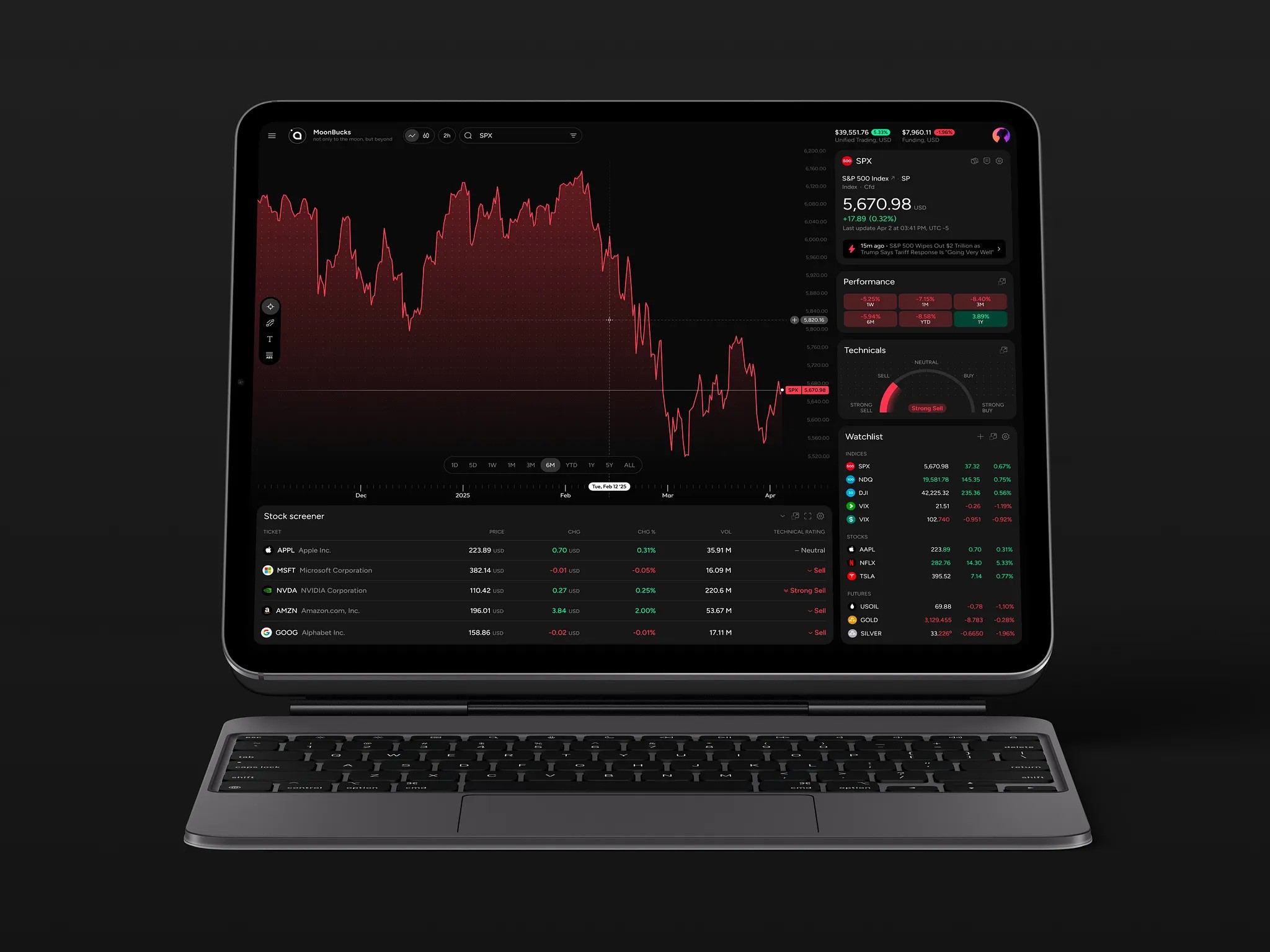
Categories of SaaS Dashboards
It is a common misconception that a real-time SaaS dashboard is a singular, monolithic entity—essentially one massive screen cluttered with charts. In practice, however, these tools are highly varied. Different operational challenges demand specific visualizations. Attempting to create a universal "one-size-fits-all" interface typically results in a chaotic, unusable display that fails to serve any specific purpose effectively.
Based on industry observations, most dashboards can be classified into five distinct categories:
1. Strategic Dashboards
These interfaces provide a high-level overview, designed primarily for executive leadership such as CEOs, Vice Presidents of Sales, or Board members. These stakeholders are not concerned with granular details like individual transaction IDs or server latency. Instead, their focus is on macro-level health indicators: Is the company expanding? Are we generating profit? What does the current quarterly churn rate look like?
The primary objective here is clarity. By aggregating trends and real-time updates, these dashboards allow executives to assess the overall vitality of the business at a glance, quickly identifying whether operations are stable or if critical issues require immediate attention.
2. Operational Dashboards
This category dives into the tactical details, serving the teams responsible for day-to-day functionality, such as customer support, DevOps engineers, and operations managers. These users require data that is current or near-real-time to maintain system stability and service quality.
For support teams, key metrics might include the volume of open tickets and average response times. For engineering teams, the focus shifts to technical performance, such as API latency spikes or service outages. These dashboards are action-oriented; they are designed to trigger immediate responses when metrics deviate from the norm. Consequently, they tend to be more detailed and complex, providing the granularity necessary for rapid troubleshooting.
3. Analytical Dashboards
These tools are the domain of product managers and data analysts, facilitating deep exploration rather than simple monitoring. They enable users to investigate the "why" behind the numbers. For instance, if churn increases in a specific month, an analytical dashboard allows users to determine if this correlates with a particular user cohort or a recent feature update.
Flexibility is the defining characteristic of analytical dashboards. They support advanced filtering, segmentation, and comparison capabilities. Users can start with a broad perspective on engagement and progressively narrow their focus to specific behaviors or features, using the data to hypothesize and validate insights.
4. Transactional Dashboards
While more specialized, these dashboards are critical for fintech and e-commerce platforms. They focus exclusively on the status of financial transactions and goods, tracking elements such as payment completion, invoice generation, and subscription states.
Accuracy and state verification are paramount in this context. Users must be able to trust implicitly that the data reflects reality: Has the payment been processed? Was the invoice delivered? Is the subscription active or on hold? These systems provide a precise snapshot of individual entities, ensuring that financial records are exact and reliable.
5. Hybrid Dashboards
Most contemporary SaaS products utilize a combination of the above types. A typical implementation might feature a primary homepage displaying strategic, high-level metrics, with additional tabs or sections that allow users to drill down into operational or analytical details.
The key to successful hybrid design is information hierarchy. By layering data, developers can prevent user overwhelm. The interface should present a summarized view initially, offering the option to explore deeper levels of detail only when necessary.
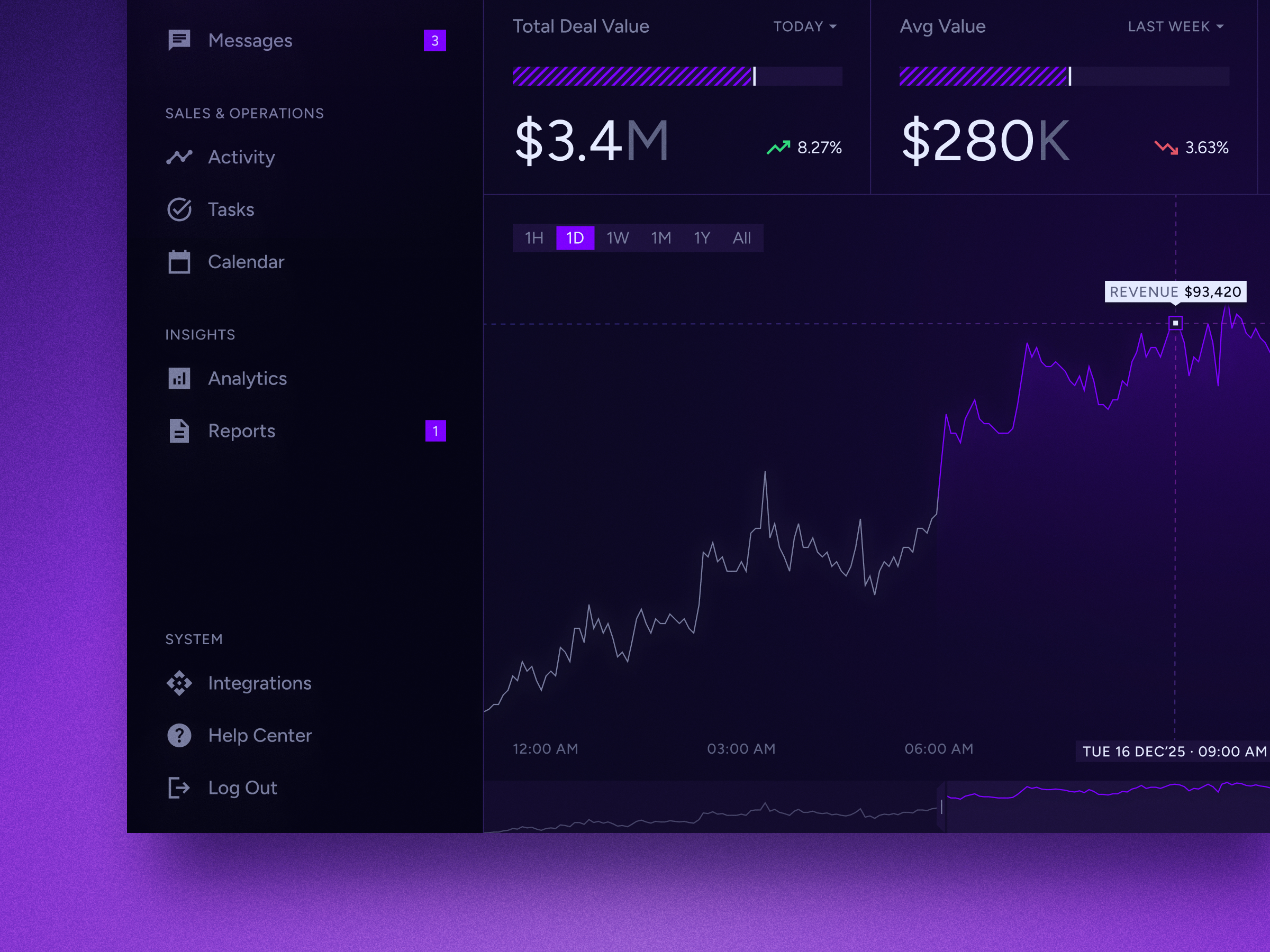
Essential Architectural Components
1. Data Sources (The Origin Points)
The process begins with raw data generation. Information originates from various touchpoints, including your core application, payment gateways (such as Stripe or Braintree), Customer Relationship Management (CRM) systems, and external third-party APIs.
These inputs are inherently heterogeneous, often utilizing different formats like JSON, XML, or CSV files stored in cloud buckets. The primary challenge for a real-time dashboard is simply locating and identifying these disparate sources. While this may seem straightforward, managing schema evolution across multiple services is a complex, ongoing task that requires constant vigilance.
2. Ingestion and Processing Pipeline (The Infrastructure)
Directly querying a production database for every dashboard request is a critical anti-pattern that can severely degrade application performance. Instead, a robust mechanism is required to extract data from source systems and convert it into an analysis-ready format.
This is achieved through ETL (Extract, Transform, Load) or ELT pipelines. These processes clean, standardize, and transfer data into a repository optimized for read operations. Simple SQL queries are insufficient at scale; when dealing with millions of records, pre-aggregation is essential. Calculating sums, averages, and counts on the fly for each user request leads to unacceptable latency. Therefore, data must be processed and aggregated beforehand to ensure responsiveness.
3. Storage Engine (The Data Warehouse)
Once cleaned, data should not reside in primary transactional databases like PostgreSQL or MySQL, which are ill-suited for heavy analytical workloads. Instead specialized data warehouses such as Snowflake, BigQuery, Redshift, or ClickHouse are employed.
These systems are designed for high-speed scanning of large datasets using columnar storage structures. They excel at executing aggregate queries (e.g., total monthly revenue), though they are less efficient for single-record updates. The choice of warehouse depends on factors like scale, budget, and existing infrastructure. For instance, ClickHouse is renowned for real-time capabilities, while BigQuery integrates seamlessly with Google Cloud services.
4. API Layer (The Interface Bridge)
To deliver warehouse data to the frontend, a dedicated API layer is necessary. Standard REST endpoints often lack the flexibility required for complex analytics. Technologies like GraphQL are frequently preferred, allowing the frontend to request specific data structures—such as "revenue by country for the last 30 days"—which the API then translates into optimized warehouse queries.
Security is paramount at this stage. Implementing row-level security ensures that users can only access their own data. Neglecting this early in development can lead to significant refactoring efforts later, making it a critical foundational requirement.
5. Frontend Visualization (The User Interface)
This is the visible component of the dashboard, typically built using libraries like Recharts, Chart.js, D3.js, or embedded solutions like Tableau.
However, the visualization library itself is the least challenging aspect. The true complexity lies in state management: handling loading indicators, error messages, and empty states gracefully. Developers must decide how to manage long-running queries (e.g., using skeleton screens vs. spinners) and implement client-side caching to avoid redundant data fetching when users navigate between tabs.
Additionally, responsive design is crucial. Dashboards must render effectively not only on large desktop monitors but also on laptops and mobile devices, requiring careful layout planning to maintain usability across all screen sizes.
6. Caching Layer (Performance Optimization)
Caching is a distinct and vital component for maintaining speed. Even with efficient data warehouses, repeated complex queries can introduce latency. Tools like Redis or Memcached are used to store frequently accessed results.
For example, if multiple users request the same "Monthly Revenue" metric, the system should compute it once, cache the result for a defined period, and serve the cached version to subsequent requests. This approach reduces computational costs and enhances perceived performance. However, a balance must be struck between data freshness and speed; determining acceptable data staleness is a product decision that impacts user experience.
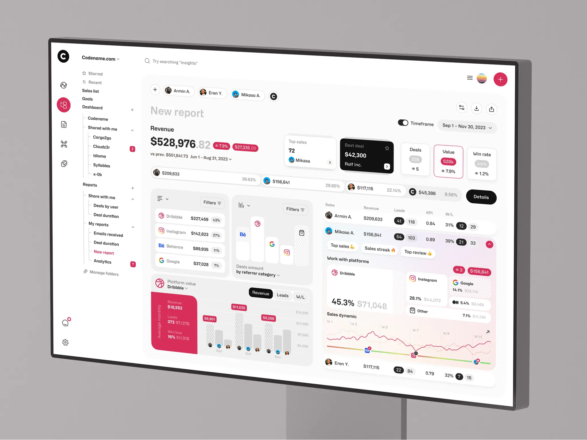
Essential Features of Modern SaaS Dashboards
1. Real-Time or Near-Real-Time Data Refresh
In 2026, manual refresh buttons are considered obsolete. Users expect a continuous, fluid stream of information. When a transaction occurs, the corresponding metrics should update instantly. While true real-time synchronization is technically demanding—particularly when using WebSockets to push updates to thousands of concurrent clients—it is often unnecessary.
For many use cases, "near real-time" suffices. Strategies such as polling at short intervals (e.g., every 30 seconds) or utilizing Server-Sent Events (SSE) offer a lighter, more scalable alternative. The critical factor is perceived responsiveness. Incorporating subtle animations during data updates creates a sense of vitality, whereas static displays can lead users to suspect system failures.
2. Interactive Drill-Down Capabilities
Static visualizations offer limited value. Effective SaaS analytics platforms prioritize interactivity, allowing users to investigate anomalies directly. For instance, if a churn spike is detected, users should be able to click through to identify the root cause—whether it stems from a specific subscription plan, geographic region, or user cohort.
This functionality requires sophisticated frontend state management to navigate hierarchical data structures (from summary metrics to granular details) seamlessly. Smooth transitions and animations are essential; any lag or jankiness disrupts the user’s analytical flow and diminishes the perceived quality of the product.
3. Customization and Personalization
A universal layout rarely satisfies diverse user needs. Executive leaders require different key performance indicators than support managers, and individual preferences vary regarding display modes (e.g., dark mode) and layout density.
Empowering users to customize their interface—by dragging and dropping widgets, hiding irrelevant charts, or saving personalized views—significantly enhances engagement. This investment of time fosters a sense of ownership and reduces cognitive load by ensuring that only pertinent data is visible.
4. Advanced Filtering and Segmentation
Raw data lacks context without robust filtering mechanisms. Beyond standard date ranges (e.g., last 7 days, year-to-date), users need the ability segment data by variables such as user cohort, subscription tier, location, or device type.
Crucially, filter states should persist across navigation. If a user selects “Enterprise Plan” and switches tabs, that filter must remain active. Requiring users to reapply filters after every menu change creates friction and signals poor UX design. Maintaining context throughout the workflow demonstrates a deep understanding of user needs.
5. Export and Reporting Functionality
Despite the shift toward digital dashboards, external reporting remains essential. Finance teams often require spreadsheet formats, while marketing departments may prefer PDF summaries.
SaaS dashboards must support seamless data extraction, including CSV exports, generated PDF reports, and potentially scheduled email digests. Consistency is paramount: exported data must exactly match the figures displayed on the screen. Discrepancies between the dashboard and export files erode trust immediately. Therefore, export logic should rely on the same underlying queries used for visualization.
6. Proactive Alerts and Notifications
Users should not need to monitor screens continuously for issues. Instead, the system should proactively notify them of significant events. For example, a sudden drop in revenue or a spike in server latency should trigger alerts via Slack or email.
However, avoiding alert fatigue is critical. Constant notifications for minor fluctuations lead users to ignore or mute alerts. Intelligent thresholding and anomaly detection ensure that notifications are reserved for genuinely impactful events, maintaining their relevance and urgency.
7. Performance Optimization and Loading States
Speed is non-negotiable; a sluggish dashboard is effectively useless. To manage latency, employ skeleton screens or progress indicators during data loading, rather than displaying blank spaces. This provides visual feedback that the system is working.
Backend optimization is equally important. Complex queries should be pre-aggregated, and off-screen components can be lazy-loaded to reduce initial load times. Ultimately, perceived performance matters as much as actual speed. A responsive, well-designed UI can make minor data-fetching delays feel acceptable to the user.
The SaaS Dashboard Development Lifecycle
1. Establish Purpose and Audience
Before initiating any technical work, engage in deep discovery sessions with stakeholders. The primary objective is to define the specific decisions the dashboard will support. Vague goals like "monitoring everything" lead to cluttered, ineffective tools. Instead, narrow the focus to specific outcomes, such as health monitoring or sales trend analysis.
Simultaneously, identify the primary user personas. A CTO’s requirements (latency, error rates) differ significantly from those of a Head of Sales (MRR, churn). Attempting to serve both audiences with a single interface often results in compromise. It is more effective to create distinct views or separate dashboards tailored to each role’s specific needs.
2. Conduct a Data Source Audit
This phase involves mapping the location and accessibility of all relevant data. Determine whether information resides in primary databases (e.g., PostgreSQL), third-party services (e.g., Stripe, Mixpanel), or other APIs. Assess potential constraints, such as API rate limits or access permissions.
Crucially, evaluate data quality. Identify issues like null values, inconsistent formatting, or missing records. Since dashboard accuracy is directly dependent on input quality, addressing these discrepancies early prevents the "garbage in, garbage out" scenario that undermines credibility.
3. Design the Data Model and Schema
With data sources and requirements defined, structure the data for optimal performance. Directly querying raw transactional tables is inefficient; instead, create aggregated tables (e.g., daily revenue summaries or user activity logs).
Define the granularity of the data carefully. While second-by-second precision offers detail, it demands significant storage and processing resources. Balance the need for accuracy with system performance. Additionally, standardize metric definitions early—for example, clearly defining what constitutes "churn." Changing these definitions later requires recalculating historical data, a complex and error-prone process.
4. Prototype UI/UX Design
Prior to coding, create visual prototypes using tools like Figma or even sketching. Layout hierarchy is critical: place high-priority metrics in the top-left corner, where users’ eyes naturally land first. Group related visualizations to maintain context, avoiding the scattering of connected metrics across multiple tabs.
Map out user interactions, such as drill-down behaviors. If a user clicks a chart element, does it filter the entire view or open a detailed modal? Validate these designs with actual users to ensure clarity. Terminology should be intuitive; ambiguous terms like ARR or MRR may confuse non-financial stakeholders, so clarity is key.
5. Construct the Backend Pipeline
Begin development by building the data infrastructure. Implement ETL/ELT processes to extract data from sources, transform it according to the designed schema, and load it into the data warehouse.
Develop secure API endpoints to serve this data to the frontend. For multi-tenant SaaS applications, enforce row-level security to prevent data leakage between clients. Performance testing is essential; simulate large datasets to identify bottlenecks. Optimize slow queries through indexing, pre-aggregation, or caching strategies. Common backend technologies include Node.js and Python (FastAPI), with PostgreSQL and MongoDB serving as frequent database choices. Docker and Kubernetes are often utilized for containerization and orchestration.
6. Develop the Frontend Interface
Implement the user-facing layer using frameworks like React or Vue, which facilitate responsive design. Select visualization libraries that prioritize clarity over complexity; avoid unnecessary 3D effects unless they provide genuine analytical value.
Ensure the interface adapts seamlessly to various screen sizes. Implement interactive features such as filters, tooltips, and drill-down capabilities. Additionally, design robust handling for edge cases, including empty states (no data available) and error states (API failures). These scenarios are integral to a polished user experience.
7. Test, Iterate, and Launch
Validate the dashboard using real production data, as staging environments rarely replicate the complexity and volume of live systems. Conduct user testing with a small group to observe interactions and identify friction points.
Expect to refine the product post-launch. Some charts may prove redundant, while others may lack necessary detail. Dashboards are dynamic tools that must evolve alongside the business. Finally, maintain comprehensive documentation, such as a "data dictionary," that defines each metric, its calculation method, and its source. This resource minimizes confusion and reduces debugging time when discrepancies arise.
Frequent Obstacles in SaaS Dashboard Engineering
1. The Illusion of Real-Time Necessity
There is a pervasive demand for "live" data, with stakeholders often requesting instant updates and real-time insights. However, true real-time functionality is both costly and technically demanding. Streaming updates via WebSockets to thousands of concurrent users can cause infrastructure costs to escalate rapidly. Furthermore, if the underlying data sources (such as legacy databases or third-party payment processors) only refresh intermittently, claiming "real-time" accuracy is misleading.
Many engineering teams waste significant resources building complex pipelines for metrics that change infrequently. It is crucial to assess actual latency requirements honestly. In many cases, a slight delay (e.g., five minutes) is acceptable and significantly reduces technical complexity and cost.
2. Data Consistency and Trust Issues
Discrepancies between dashboard figures and internal records (such as finance spreadsheets) can erode user confidence instantly. For example, if a dashboard reports $100,000 in revenue while finance reports $98,500, stakeholders may question the system’s validity.
These conflicts usually stem from ambiguous metric definitions. Does "revenue" include taxes? Are refunds deducted immediately or upon processing? Is revenue recognized at invoicing or upon payment clearance? Without rigorous, agreed-upon definitions established early on, teams spend excessive time debating data accuracy rather than acting on insights. Once trust is compromised, users often revert to manual spreadsheets, rendering the dashboard obsolete. Establishing a centralized "data dictionary" and adhering to it strictly is essential for maintaining credibility.
3. Scaling Performance Challenges
A dashboard may perform adequately with small datasets but fail under increased load. Queries that execute in milliseconds with 1,000 users can take seconds with 10,000, leading to timeouts, loading spinners, and user abandonment.
This degradation typically occurs due to poor data modeling, such as querying raw transactional rows instead of pre-aggregated summaries, missing database indexes, or inadequate caching strategies. Scaling requires more than just adding server capacity; it demands intelligent architectural planning. Engineers must anticipate how query performance will degrade as data volume grows by orders of magnitude. Failure to plan for this results in urgent, high-pressure refactoring while customer satisfaction declines.
4. Multi-Tenancy and Security Risks
SaaS dashboards serve multiple distinct organizations (tenants) from a single codebase. Ensuring strict data isolation—preventing Company A from accessing Company B’s information—is paramount.
While this requirement seems straightforward, implementation is complex. It requires robust row-level security within the database and the consistent propagation of tenant identifiers through every layer of the application stack, from frontend requests to backend APIs and SQL queries. A single oversight can lead to data leaks, legal liabilities, and reputational damage. This necessitates comprehensive automated testing to verify isolation, adding significant complexity to the development process.
5. UI Clutter and Cognitive Overload
The ability to display numerous charts does not imply they should all be visible. Overloading the interface with data leads to "analysis paralysis," where users struggle to identify key insights.
Effective SaaS dashboard design prioritizes subtraction over addition. Designers must determine the most critical information and present it hierarchically: high-level KPIs at the top, detailed visualizations below, and contextual filters on the side. If every element competes for attention, none stand out. The goal is to guide the user’s focus, not to dump raw data onto the screen.
The Strategic Value of Partnering with a SaaS Dashboard Specialist
You have an capable internal engineering team that knows your codebase intimately. Handing over development to an external agency can feel like relinquishing control, and for many core product features, keeping work in-house is indeed the right choice. However dashboard development presents unique challenges that often justify external expertise.
1. Proven Expertise and Pattern Recognition
Specialized dashboard firms have constructed dozens, if not hundreds, of similar systems. They possess deep institutional knowledge of common pitfalls and architectural best practices. For instance, they know how to design data pipelines that remain stable during traffic spikes, such as Black Friday sales events.
While your internal team may be encountering these challenges for the first time, a specialist brings this experience from day one. You avoid paying for their learning curve. Issues like managing real-time WebSocket connections or optimizing complex queries are problems they have already solved for multiple clients, ensuring a more robust and reliable outcome.
2. Accelerated Time-to-Market
Agencies leverage pre-built components, standardized templates, and established workflows to significantly reduce development time. A project that might take an internal team three months to architect and build from scratch can often be delivered by a specialized firm in four weeks.
In the competitive SaaS landscape, speed is a critical asset. Deploying a polished, functional dashboard quickly can be the deciding factor in securing enterprise contracts, especially when competitors offer more refined analytics experiences.
3. Objective Product Perspective
Internal teams are often too close to the product to evaluate it objectively. Engineers may prioritize metrics simply because they built the underlying feature, regardless of its actual user value.
An external partner provides fresh eyes and acts as a product consultant. They challenge assumptions, asking critical questions like, “Is this metric truly useful?” or “Why is this data point prominent?” This objectivity helps prevent the development of unused features and ensures the dashboard aligns with genuine user needs.
4. Protecting Core Engineering Resources
Your senior engineers should focus on building the core innovations that differentiate your product. Diverting them to debug caching issues for charts or manage frontend visualization libraries is an inefficient use of high-value talent.
By outsourcing dashboard development, you minimize context switching for your internal team, allowing them to stay focused on the primary product roadmap. This ensures that core development milestones are met without distraction.
5. Enhanced Maintainability and Scalability
Professional firms build with long-term maintenance in mind. They implement rigorous documentation, proper CI/CD pipelines for data updates, and scalable architectures. In contrast, internal “side projects” often lack this discipline, resulting in fragile, hard-to-maintain codebases (“spaghetti code”) that become difficult to update or debug over time.
A professionally built dashboard provides a clean, structured foundation. Whether your internal team takes over maintenance later or you retain the agency for ongoing support, the system is designed for stability and ease of management.
Concluding Insights
At its core, a dashboard is an instrument of trust and clarity. It transforms uncertainty into actionable knowledge. When users can log in and immediately grasp the status of their business, you are delivering more than just data—you are providing confidence and peace of mind.
If you are embarking on SaaS dashboard development, avoid improvisation. Instead, adhere to this streamlined strategic framework:
- Define the Purpose: Do not build features for the sake of it; focus on solving specific problems. Clearly identify your target user and the critical decisions they need to make.
- Prioritize Data Integrity: Treat data with respect. Audit your sources, refine your pipelines, and establish rigorous metric definitions. If the underlying data is inaccurate, the most sophisticated interface is worthless.
- Engineer for Scalability: Avoid querying production databases directly. Utilize data warehouses, implement early aggregation, and employ aggressive caching strategies. Always design with future growth in mind, anticipating how the system will perform when data volume increases tenfold.
- Emphasize Visual Clarity: Adopt a minimalist approach. Establish a clear visual hierarchy and ensure interactivity enhances rather than clutters the experience. Less is often more.
- Adopt an Iterative Approach: Launch a Minimum Viable Product (MVP), gather user feedback, and resolve issues promptly. Introduce complexity only when it adds genuine value.
Whether you choose to develop the solution internally with a dedicated team or partner with specialists to accelerate the process, the most important step is to begin. Start small, validate your assumptions, and build from there.
About the Creator
Shakuro
We are a web and mobile design and development agency. Making websites and apps, creating brand identities, and launching startups.
Enjoyed the story? Support the Creator.
Subscribe for free to receive all their stories in your feed.
Comments
There are no comments for this story
Be the first to respond and start the conversation.