
Google Logo & Workspace Icons Redesign: Before vs After Explained (2026 Update)
Big Tech branding including Google is shifting toward “AI-native” design language.

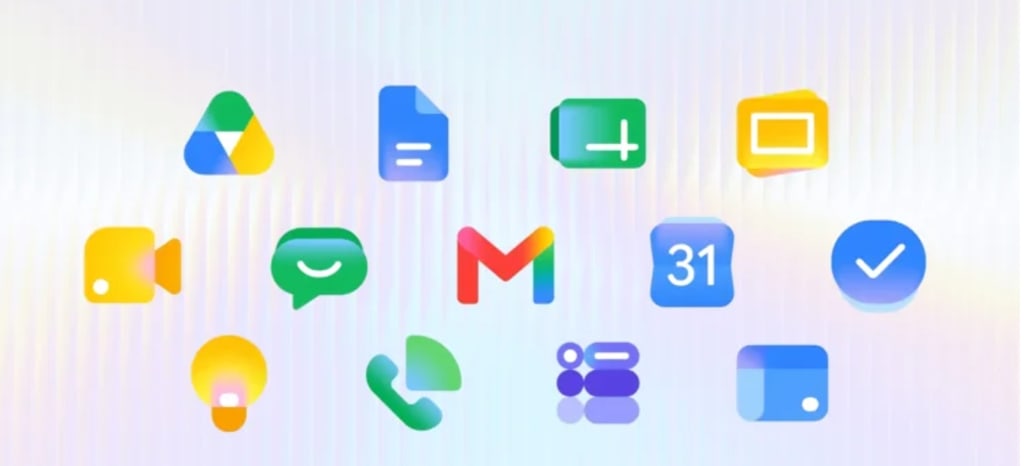
Google has quietly rolled out a visual refresh across its ecosystem — from the iconic multicolor “G” logo to core Workspace apps like Gmail, Drive, Docs, Sheets, and Calendar.
The change is subtle at first glance, but once you notice it, it’s everywhere: smoother gradients, softer transitions, and a more unified AI-era design language.
In this article, we break down what changed, why it matters, and how users are reacting to the redesign.
What Changed in Google’s Logo Design?
Google has shifted from flat, segmented colors to a fluid gradient-based design system.
Key design changes:
- Flat blocks → smooth gradient blending
- Sharp edges → softer rounded transitions
- Separate app identities → unified visual system
- Classic “G” → modern AI-inspired gradient version
This redesign aligns with Google’s broader push into AI-first products like Gemini.
Apps affected in the redesign:
- Gmail
- Google Drive
- Google Docs
- Google Sheets
- Google Slides
- Google Calendar
- Google Meet
- Google Chat
- Google Forms
- Google Keep
- Google Maps
- Google Forms
- Google Feeds
- Google Earth
- Google Vids
- Google Sites
- Google Voice
Looks like the entire Workspace suite now follows a consistent gradient-based visual identity.
Why Google Changed Its Logo System?
This isn’t just a cosmetic update — it’s a strategic branding shift.
1. AI-First Identity
Google is heavily integrating AI across products (Gemini, AI Workspace tools). The new gradients reflect fluidity and intelligence.
2. Cross-Product Consistency
Previously, icons felt slightly disconnected. Now, everything feels part of one ecosystem.
3. Modern UI Trends
- Big tech companies are moving toward:
- gradient aesthetics
- soft shadows
- adaptive color blending
4. Scale and Complexity
With billions of users across web, desktop, and mobile platforms, even a small UI change must be tested across thousands of device configurations. A sudden global update could introduce unexpected inconsistencies or visual glitches.
Google is aligning with this global design direction.
The Design Philosophy Behind the Gradient Shift
This icon refresh is not just a cosmetic update—it reflects a broader evolution in Google’s design philosophy.
The move toward gradients suggests a shift away from rigid flat design toward something more dynamic and expressive. It introduces subtle depth, making icons feel more tactile and modern without overwhelming simplicity.
Across services like Gmail and Google Drive, this approach helps unify the ecosystem under a more cohesive visual identity. Instead of each product feeling like a separate utility, they begin to feel like interconnected parts of a single workspace.
This is particularly important in productivity tools where users constantly switch between apps. A unified visual system reduces friction and improves cognitive continuity.
Ditching the Four-Color Rule
When Google initially unified the Workspace icons a few years ago, the biggest complaint across the board was that they all looked entirely too similar. By forcing the four company colors into almost every logo, it became a bit of a chore to quickly click the right app.
I’ve confused Drive and Home for years, along with Chat and Meet. It was a poor decision in hindsight
User Reactions: Love It or Hate It?
The internet is divided.
👍 Positive reactions:
“Looks modern and futuristic”
“Feels more premium and AI-driven”
“Better consistency across apps”
👎 Negative reactions:
“Old icons were easier to recognize”
“Too similar colors, harder to distinguish”
“Unnecessary redesign”
Like most major UI changes, familiarity plays a big role in user preference.
Google’s Staged Icon Rollout: A Subtle Visual Shift Reshaping Everyday Workflows
When a tech giant like Google updates something as familiar as app icons, it rarely happens all at once. Instead, changes are often introduced gradually, almost quietly, across different surfaces and platforms. The latest gradient-inspired icon refresh is a perfect example of this strategy—a staged rollout that feels more like a slow transformation than a sudden redesign.
At first glance, the new icons look polished, modern, and visually consistent. They appear most prominently in the app launcher and on individual app pages, where users get their first glimpse of the updated identity. But beneath that surface-level refresh lies a more complex and incomplete transition that is still unfolding across the ecosystem.
The Incomplete Transition: Where Things Stand Now
Despite the polished appearance in some areas, the rollout is far from complete.
The actual document editing interfaces inside tools like Google Docs and Google Sheets still retain older design elements. Similarly, browser favicons—the small icons displayed in tabs—have not yet fully adopted the new gradient style.
This creates a noticeable visual split:
- The app launcher shows the new design language
- The core editing environments still reflect the older visual system
- Browser tabs remain partially outdated
- Mobile applications on Android and iOS have not fully transitioned yet
This kind of inconsistency is typical during staged rollouts. It ensures stability while allowing teams to test compatibility across different platforms before committing to a full global update.
What to Expect Next?
As the rollout continues, users can expect:
- Updated favicons across all browser tabs
- Fully refreshed in-editor interfaces
- Mobile app icon updates on Android and iOS
- Greater visual consistency across all Google services
- Gradual replacement of older design elements in legacy interfaces
The transtion will likely happen quietly, with no major announcements—just incremental updates that slowly reshape the experience
About the Creator
Daniel Reid
Technical & Finance Writer| Casual Trader| Web Content Strategist
X: https://x.com/DReid43887 IG: https://www.instagram.com/danielreidtsc/
Enjoyed the story? Support the Creator.
Subscribe for free to receive all their stories in your feed.
Comments
There are no comments for this story
Be the first to respond and start the conversation.