
Do colors affect our behavior?
Yes, colors can affect our behavior. Colors have the ability to evoke certain emotions, influence our perceptions, and impact our decisions. For example, warm colors like red, orange, and yellow can create feelings of excitement and energy, while cool colors like blue and green can promote calmness and relaxation. The color of our surroundings can also impact our productivity and focus. Colors can also influence our appetite and affect how much we eat, as well as our purchasing decisions, as certain colors can make products appear more attractive or of higher quality. Overall, colors can have a subtle but significant impact on our behavior and experiences.


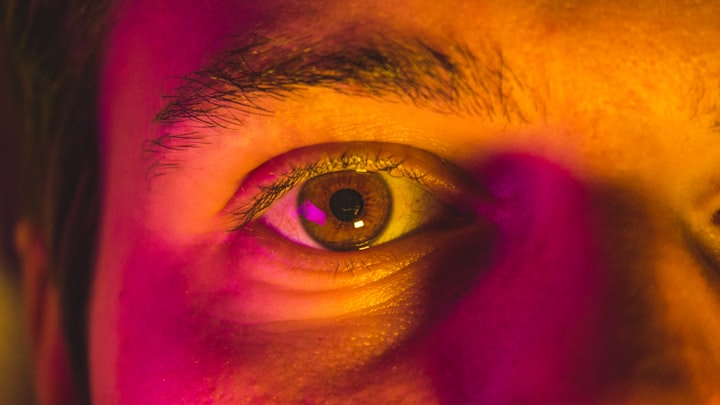
Colors can influence our mood

Colors can have a significant impact on our mood and emotions. Different colors can evoke different feelings and affect our overall well-being, from promoting calmness and relaxation to increasing energy and excitement.
Warm colors like red, orange, and yellow are often associated with feelings of warmth, energy, and happiness. These colors can stimulate our senses and create a sense of excitement and vibrancy. However, they can also be overwhelming if used in excess, so it's important to use them carefully and in moderation.
Cool colors like blue, green, and purple are often associated with feelings of calmness, tranquility, and relaxation. These colors can have a soothing effect on our mood and can promote feelings of peace and harmony. However, too much of these colors can create a sense of coldness or detachment, so it's important to balance them with warm colors when decorating a space.
Bright, bold colors like pink, orange, and yellow can be stimulating and energizing, making them a great choice for spaces where you want to encourage creativity and productivity. These colors can also create a sense of playfulness and fun.
Muted or pastel colors like light blue, lavender, and pale green can have a calming and soothing effect on our mood. These colors are often used in spaces where relaxation and tranquility are desired, such as bedrooms or meditation rooms.
It's important to note that the effects of color on mood can vary from person to person and can also depend on cultural and personal associations with different colors. For example, some cultures may associate red with luck and prosperity, while others may associate it with danger and warning signs.
Overall, colors can have a subtle but significant impact on our mood and emotions. When decorating a space, it's important to consider the desired mood and choose colors accordingly, balancing warm and cool colors and using them in moderation to create a sense of harmony and balance.
Colors can impact our perception

Colors can have a significant impact on our perception of the world around us. Different colors can create different impressions and affect the way we see and interpret objects and environments.
For example, red is often associated with passion and excitement, but it can also be associated with danger and warning signs. This is because our brains have evolved to recognize red as a signal for caution or alertness, such as when seeing a stop sign or a warning label.
Green is often associated with nature and growth, as well as with money and wealth. This is because green is the color of many plants and trees, and is also the color of U.S. currency. When we see green, our brains may associate it with feelings of freshness and vitality, as well as with financial success and prosperity.
Blue is often associated with calmness and serenity, as well as with trust and reliability. This is because blue is the color of the sky and the ocean, and is often used in logos and branding for businesses that want to convey a sense of trustworthiness and professionalism.
Yellow is often associated with happiness and joy, as well as with caution and warning. This is because yellow is a bright, bold color that can create a sense of energy and excitement, but can also be used to signal caution, such as in caution signs and warning labels.
Colors can also affect our perception of taste and flavor. For example, red and orange are often used in food branding because they can stimulate our appetite and make food appear more appetizing, while blue and green can be used to create a sense of freshness and healthiness.
Overall, colors can have a powerful impact on our perception of the world around us. When designing or branding a product or space, it's important to consider the desired perception and choose colors accordingly, taking into account cultural and personal associations with different colors.
Colors can affect our productivity

Colors can have a significant impact on our productivity and focus. Different colors can create different moods and affect our mental and physical energy levels, which in turn can impact our ability to work and be productive.
Warm colors like red, orange, and yellow can create a sense of excitement and energy, but can also be overwhelming if used in excess. These colors are best used in spaces where creativity and productivity are desired, such as in design studios or workspaces where brainstorming and collaboration are important.
Cool colors like blue and green can promote calmness and relaxation, which can be beneficial for tasks that require sustained focus and concentration. These colors are often used in offices and workspaces where workers need to stay focused for extended periods of time.
Neutral colors like beige, gray, and white can create a sense of professionalism and sophistication, but can also be bland and unstimulating. These colors are often used in corporate settings or in spaces where a neutral backdrop is needed to showcase other elements of the environment.
Bright, bold colors like pink, purple, and orange can be stimulating and energizing, making them a good choice for spaces where creativity and innovation are desired. However, it's important to use these colors in moderation and balance them with more neutral tones to avoid overwhelming the senses.
In addition to affecting our mood and energy levels, colors can also impact our perception of space and depth. Lighter colors can make a space feel larger and more open, while darker colors can make a space feel smaller and more intimate. This can be important to consider when designing a workspace, as the size and layout of a space can also affect productivity and focus.
Overall, colors can have a significant impact on our productivity and work environment. When designing a workspace, it's important to consider the desired mood and energy level, as well as the size and layout of the space, and choose colors accordingly to create a balanced and stimulating environment.
Colors can influence our appetite

Colors can play a significant role in our perception of food and appetite. Different colors can stimulate our appetite and create associations with certain flavors and types of food, which in turn can impact our eating habits and food choices.
Warm colors like red, orange, and yellow are often associated with energy and excitement, and can stimulate our appetite and create a sense of hunger. This is because these colors are often found in foods that are high in calories, such as fast food and sugary snacks. These colors can also create a sense of comfort and familiarity, making us more likely to choose foods that are visually appealing and familiar.
Cool colors like blue and green are often associated with freshness and healthiness, and can create a sense of calmness and relaxation. This can be beneficial for those trying to make healthier food choices, as these colors can help to reduce cravings and create a sense of satisfaction with healthier options.
Colors can also influence our perception of taste and flavor. For example, red and orange are often associated with sweet and savory flavors, while green and blue are associated with more bitter and tart flavors. This can impact our food choices and preferences, as we may be more likely to choose foods that match our color-based expectations of taste.
Color can also impact the way we perceive portion sizes and serving sizes. Larger plates and bowls can make us feel like we are eating less, while smaller plates and bowls can make us feel like we are eating more. This can be important to consider when designing a food presentation, as it can impact how much food people choose to eat.
Overall, colors can have a significant impact on our appetite and food choices. When designing food presentations or restaurant environments, it's important to consider the desired perception and choose colors accordingly, taking into account cultural and personal associations with different colors. This can help to create a more satisfying and enjoyable dining experience for customers.
Colors can affect our purchasing decisions

Colors can have a significant impact on our purchasing decisions, as they can influence our emotions and perceptions of products and brands. Different colors can create different moods and associations, which in turn can impact our likelihood of making a purchase.
Warm colors like red, orange, and yellow are often associated with excitement, energy, and urgency, and can be effective at grabbing attention and stimulating impulse purchases. These colors are often used in sales and clearance signage, as well as in advertising for fast food and entertainment products.
Cool colors like blue and green are often associated with calmness, trust, and reliability, and can be effective at creating a sense of security and safety for customers. These colors are often used in healthcare and financial advertising, as well as in products that are intended to promote relaxation and well-being.
Neutral colors like black, white, and gray are often associated with sophistication and timelessness, and can be effective at creating a sense of luxury and exclusivity. These colors are often used in high-end fashion and jewelry branding, as well as in technology and automotive products that are marketed based on their design and aesthetics.
Colors can also impact our perception of product quality and value. Bright and bold colors can create a sense of excitement and uniqueness, while more subdued colors can create a sense of understated elegance and quality. This can be important to consider when designing product packaging and branding, as the colors used can impact how consumers perceive the product's value and quality.
Overall, colors can have a significant impact on our purchasing decisions and our perception of products and brands. When designing marketing materials and branding strategies, it's important to consider the desired emotional response and association with the product or brand, and choose colors accordingly to create a strong and effective visual message.
About the Creator
Furkan Ceylan
Freelancer Architect, Interior Designer, NFT producer, Speaker, Content Writer
Reader insights
Nice work
Very well written. Keep up the good work!
Top insights
Compelling and original writing
Creative use of language & vocab
Eye opening
Niche topic & fresh perspectives
Masterful proofreading
Zero grammar & spelling mistakes
Expert insights and opinions
Arguments were carefully researched and presented
On-point and relevant
Writing reflected the title & theme
Heartfelt and relatable
The story invoked strong personal emotions
Easy to read and follow
Well-structured & engaging content
Excellent storytelling
Original narrative & well developed characters
Keep reading
More stories from Furkan Ceylan and writers in 01 and other communities.
Will the food industry rely on insects in the future?
Here are some reasons why the food industry may increasingly turn to insects in the future: Sustainability: Insects require much less land, water, and feed to produce the same amount of protein as traditional livestock such as cows, pigs, and chickens. This makes them a highly sustainable and eco-friendly source of protein.
By Furkan Ceylanabout a year ago in 01
Top Android app development Trends To Watch in 2024
The mobile app industry is upscaling with the advent of contemporary technologies and is accelerating the creation of mobile apps. The global mobile app market size was valued at USD 228.98 billion and is anticipated to grow at a CAGR of 14.3% from 2024 to 2030.
By Shirleyeva6 days ago in 01


Comments (2)
Nice Work!
Nice