7 Web Designs as Inspiration using Pantone Color of the Year 2021
The Pantone color of the year 2021 this year forms the ensemble of “Pantone 17-5104 Ultimate Gray” and “Pantone 13-0647 Illuminating”. The colors should stand for strength and hope.
In a time of persistent uncertainty, mankind needs clarity, hope, and strength. The energetic shades of Pantone colors of the year 2021 fit best as it stands for courage and joie de vivre.
The "Pantone 13-0647 Illuminating" is a bright and happy yellow that radiates liveliness and stands for the power of the sun. While Pantone 17-5104 Ultimate Gray as opposed to Pantone 13-0647, is a symbol of the firm reliability of an indestructible, secure foundation. The calming gray creates a feeling of serenity, consistency, and resilience.
Why Ultimate Gray & Illuminating?
Pantone Color of the Year 2021 is voted for by color experts. Every year, the color experts at the Pantone Color Institute keep an eye out for global color influences before they vote for "Pantone Color of the Year". The analysis takes into account, among other things, color trends in the entertainment and film industries, in art collections and works by new artists, in fashion, in all areas of design, in popular travel destinations as well as in new life and play styles and in the socio-economic environment.
The Pantone Color of the Year’s influences reaches many aspects of the industry, including product development and purchasing decisions. This also includes fashion, furniture, and industrial design, as well as product, packaging, and graphic design.
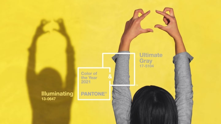
Two opposites that attract and complement each other at the same time. The grounding, energizing charisma of gray and the warming, energy-giving aura of sunny yellow - two-color moods that we all absolutely need at the moment.
Ultimate Gray
This soft gray is associated with the color of the pebbles on the beach, the rocks, and stones that have been around for millions of years. This color is also associated with security and security, but at the same time with steadfastness and resilience. We currently need inner strength all the more to withstand global uncertainty. A stable base that is transformed from visual to psychological.
Illuminating Yellow
At the same time as a contrast, but actually much more than an indispensable companion, the bright yellow is added. Like the omnipresent sunshine or the longed-for light at the end of the tunnel, this wonderful color brings hope, optimism, and positivity with it. It immediately lifts the mood and lets the soul fly joyfully. With "Illuminating" we will get exactly the right amount of confidence and energy in the next year to be more optimistic about the path of life in this turbulent and controversial time.
7 Web Designs as Inspiration using Color of the Year
Let us now take a look at 7 different websites and see how they use the Pantone Colours of The Year.
1. Lordz Dance Academy
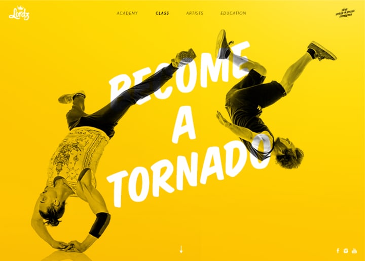
The Lordz Dance Academy offers the widest range of courses in Switzerland for hip hop, urban, and street styles. The vibrancy of Illuminating Yellow as a screen before the dancers with the white font displaying the words “Become A Tornado” shows the movement of the dancers and the words without it being distracting.
They have isolated the subjects (breakdancers) and make the color gray to create contrast against the solid yellow background. This makes the subject stand out and become the focal point to support its message in context.
Tip: To remove background from image easily, you can use Removal.AI - a free automatic AI background remover tool. This way you can save more time doing image clipping and masking using Photoshop or other online photo editor to change background.
2. Sounds UI Good
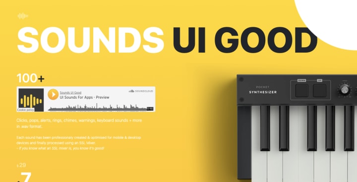
Sounds UI Good is a website that offers hundreds of UI sounds for your websites and apps. They use a lighter shade of Illuminating Yellow and mix white and black fonts. However, the smaller white fonts on the upper part of the page may be a bit straining to the eyes. They then use the Ultimate Gray shade for the font at the bottom part against a white background.
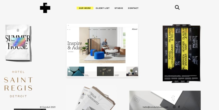
3. Conduit Studio
This website is designed uniquely, using yellow to highlight its links. Conduit Studio is a Brand and Graphic design studio. The way this website is animated to display its products is beautifully done. The items in the drop-down menu are in a black font that is then highlighted in yellow as soon as you drag your mouse over them.
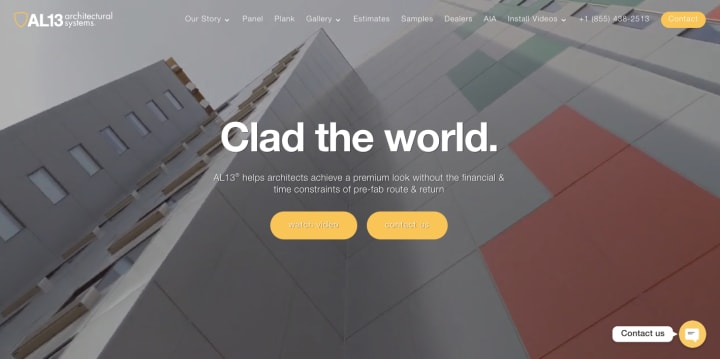
4. AL13
AL13 is a Canada based architectural systems group that offers advice and help to architects all over. Their website does the opposite of what Conduit Studios does, in that they have their link highlighted in Illuminating Yellow with a barely visible white font, and when you hover over the buttons/links, they remove the yellow and make the white font more visible as it is against a darker background.
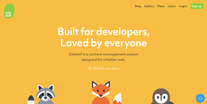
5. Siteleaf
Siteleaf is a Content Management Systems designer. Siteleaf’s use of the colors of the year takes a very cute turn, using cartoony caricatures to present their featured services. The use of Ultimate Gray against the white and yellow background really projects their texts well in a way that isn’t straining to the eyes.
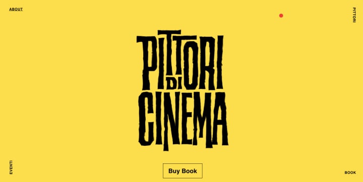
6. Pittori di Cinema
Pittori di Cinema is a brilliant website about a book with the same name. It’s about Italian films and the posters and the artists behind them. The website’s masterful use of Illuminating Yellow and scrolling animation highlights the glory and mastery behind the art of Italian cinema.
7. Yellow Marshmallow
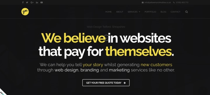
Yellow Marshmallow is a company that offers web design and marketing services. Their websites use Ultimate Gray as a shade for a photo background to highlight the Illuminating Yellow and white text for the main page is eye-catching. Paired with the scrolling animation and the spinning animation when your mouse hovers over an icon makes this website highly creative and quirky!
Your Turn…
For 20 years now, the "Pantone Color of the Year" has had a huge impact and influence on web design trends, product development, and purchasing decisions in a variety of industries. From fashion to interior design to industrial design and product packaging, the Pantone color of 2021 will be a huge inspiration.
These two different colors have been combined to show how different elements can be connected and strengthen each other. Ultimate Gray, a solid and reliable shade, is paired with the warming and optimistic Illuminating to create a feeling of happiness that is supported by strength.




Comments
There are no comments for this story
Be the first to respond and start the conversation.