
Ultimate Guide on How to Read Stock Charts
Understanding how to read stock charts is vital if you want to invest in the stock market. Here's how to get started.


If you have any interest in attempting to tackle investing in the complex but rewarding world that is the stock market, you'll need more than one of the best investing apps in 2018, you must make sure you can understand the parlance as well as the unique charting tools used by stock market brokerages and investors. The best way to get a handle on this multi-faceted industry is to dive right in. All you need to get started are some general skills like knowing how to read stock charts and understanding market commentary and trends. I've put together a guide to help you understand how to decipher the information in your standard stock charts and graphs. The data provided in these charts is crucial to your future success as an investor, and can help you avoid terrible mistakes people make when investing, so learning their layout is not optional.
What are stock charts?

Stock charts and graphs can take many forms, from familiar visuals like bar graphs and line graphs to those more specialized for displaying stock information. These specialized charts include point and figure charts as well as candlestick charts. All of these charting tools can be used to convey information about a particular stock's development over time, but the candlestick chart is the industry standard, so that is what I will be using to teach you how to read stock charts and hopefully, one day, have you ready to take on the S&P 500.
In many ways, stock market investors have it much easier today than they did before the advent of the internet. There are endless resources for amateur investors to access, making it possible for just about anyone to learn how to intelligently invest in the stock market. Among these resources are the countless interactive stock charts available online, often for free. Websites like Google Finance, TradingView.com, and the aptly named StockCharts.com provide charting tools and market commentary that you can access from your phone or computer. These resources also allow you to interact with the data provided, adjusting the scale or even the type of graph depending on what is easiest for you to read or most appropriate for a particular set of data.
How to Read Stock Charts
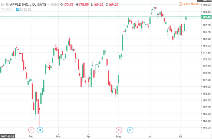
Chart courtesy of tradingview.com
If you've never used a candlestick chart before, it can look quite daunting. Take a minute to study it and soak it in, and we'll go through every aspect of the graph. At the top, you'll see that this is the stock chart for Apple Inc. You may also see corporations referred to by an abbreviation known as a stock symbol or a ticker symbol. In Apple's case, the stock symbol is AAPL on the NASDAQ index.
Looking at the graph itself, you'll notice that this is a yearly graph, or rather a YTD (year-to-date) graph. This sort of graph allows you to follow monthly trends to see how a stock has been performing over the course of the year. A graph from a previous year will display twelve months from January to December, while a graph from the current year will display everything from January of this year to whatever day it currently is. In this case, the chart was made in mid-July 2018, so everything from January 2018 through the first part of July 2018 is visible.
In addition to yearly views, charts can be made to display growth on a larger or smaller scale. With today's online-based charting tools, this data can be accessed at the touch of a button. One of the most common charts is a daily graph, which gives you the fluctuations in a stock on an hourly basis. Depending on which chart you access, you may see the hourly fluctuations updated on a minute-to-minute basis, or perhaps every 15 minutes. On the other end of the scale, multi-year charts can also be accessed. The TradingView graph I accessed even had an option to see Apple's full history on the stock exchange, seeing its full development from its entrance in 1981 to its present-day status.
An important part of making investments is knowing how to read stock charts so you can study the history of growth and decline of a particular stock, which can change in an instant. Understanding the short-term fluctuations as well as the long-term trends of the market is vital to making informed investments.
Discerning Information from a Candlestick Chart

Chart courtesy of tradingview.com
The best way to understand how to read stock charts is to learn how to discern information from a candlestick chart. This graph displays Apple Inc.'s daily growth and decline on NASDAQ for the month of June 2018. The first trait you'll notice is that it's color coded. All candlestick charts use two different colors, but these colors aren't standardized. Blue, green, white, black, and red are all common. I prefer the red and green of this chart because there is no question which one is "good" and which is "bad." When it comes to the stock market, "good" means the value of a stock is going up, while "bad" obviously means the value is going down during a certain period of time.
Each "candle" on this graph represents the growth or decline of Apple's stock for one full business day. The top and bottom of each candle correspond with the opening and closing value of the stock for each day. If the candle is green, that means the stock ended the day at a higher value than it began with. The opposite is true for red candles. In stock market parlance, green candles are "bullish" and red candles are "bearish," indicating whether investors are willing (bullish) or unwilling (bearish) to buy stock in a particular company at a particular time.
For an example, let's take June 1st. The candle for June 1st is green, which means Apple's value grew that day. The bottom of the candle is at $188.00 and the top is just north of $190.00—let's call it $190.20. Since we know the stock grew that day, that means Apple opened at $188.00 on June 1st and closed at $190.20.
For contrast, look at June 25th. The ends of the candle are at $182.20 and $183.40. However, June 25th's candle is red, which means Apple's value decreased that day. This means that the top of the candle, $183.40, is what Apple opened at, and they ended at $182.20.
Wicks
As you look at these charts, you'll notice a thin line protruding from either end of each candle, known colloquially as the "wick." The wick provides information on the peaks and valleys of a stock's value in a given time period. Looking back at June 25th, we already determined that Apple's stock opened at $182.20 and closed at $183.40. However, take a look at the wicks and see how much the stock fluctuated just within that one day. At some point during June 25th, Apple's value dipped as low as $180.80, but it also reached as high as $184.90 in that same day.
The exact values provided by the wick are not as important as the opening and closing values displayed on the candle, but they allow investors and brokers to get an idea of how mercurial the stock was on a particular day. Because of the extreme high and low values compared to the opening and closing price of Apple's stock on June 25th, we can discern that the market was relatively volatile that day for whatever reason, meaning you should probably learn the ways investors deal with market volatility after figuring out how to read stock charts. In contrast, the stock's growth on June 1st was relatively consistent, as evidenced by the short wicks. In fact, there is no wick at all on the top of the candle for June 21st, meaning Apple's closing value was the highest of the day.
About the Creator
Joseph D. N. Kendrick
Writer of words. Haver of cats. joeykendrick.com
Keep reading
More stories from Joseph D. N. Kendrick and writers in Trader and other communities.
What Is Social Impact Investing?
The world of investing is complex and can seem nearly insurmountable if you are just entering it. By understanding the basic principles of investment readiness, however, you will open up a whole world of opportunities. A relatively recent phenomenon in the investment world is environmental and social impact investing. If you are interested in using your money to make efforts toward world conservation and the betterment of mankind, an understanding of impact investing will allow you to directly support the causes you hold most dear while also opening up the opportunity for you to improve your own financial situation.
By Joseph D. N. Kendrick6 years ago in Trader
THE GRAPHICS CARD WILL MEET ALL YOUR DEMANDS ON YOUR PC
In the dynamic realm of computing, few components command as much attention and admiration as the graphics card. These technological powerhouses, often referred to simply as GPUs (Graphics Processing Units), serve as the beating heart of visual processing in modern computers, enabling everything from immersive gaming experiences to complex visual simulations and professional content creation. Among the latest contenders in this arena stands the ASUS Dual GeForce RTX 4070 Super OC Edition Graphics Card, a formidable specimen boasting cutting-edge features and unrivaled performance.
By Kim Long Nguyệt Ngữ6 days ago in Trader
Valve Supplier in Nigeria
African Valve is the top Valve Supplier in Nigeria. African Valve stands as the premier supplier and manufacturer of valves across Africa with a commitment to excellence, we ensure top-notch products and services. We proudly serve clients across Africa, including Nigeria, Kenya, Algeria, Ghana, Tanzania, Sudan, and Ethiopia, ensuring reliable access to top-tier valve solutions continent-wide. As a reputed valve supplier we provide different types of valves available in different sizes and classes made with high standard material quality to meet the needs of various industries.
By african valveabout 22 hours ago in Trader


Comments
There are no comments for this story
Be the first to respond and start the conversation.