
Chart Types for Technical Analysis and Stock Trading
Price movements of different types of securities, commodities, currency, Derivatives, analyzed by using charts. Different chart types are essential for technical analysis.


Price movements of different types of securities, commodities, currency, Derivatives, analyzed by using charts. Different chart types are essential for technical analysis. It plays a vital role in analyzing vast amounts of data in a single frame and providing a summary. Charts have a price on the Y-axis and Time on the X-axis. Historical data plots are based on different time frames along with volumes. We cannot imagine technical analysis without the help of the charts, which helps us to make proper decisions on trading. It helps us analyze market moments in a real time frame with large amounts of data, which will be impossible without these charts. Because it assists traders to make proper decisions on when to take entry or exit, is the market going to reverse or continue its trend.
Chart types
Charts types differ according to the data that a chartist or technical analyst required. There are multiple types of charts, like a bar chart candlestick, Renko, etc. It displays information about price moments but all of them have their features on what information they avail based on price moments. On these charts, you can decide what type you want, either logarithmic or arithmetic. Log scale gives importance to more recent data, whereas the arithmetic scale grants importance to all data equally, but usually, analysts prefer an arithmetic scale.
What are bar chart Types?

Vertical lines represent a bar chart, with data such as open, high, low, close (OHLC). Bull and Bear price moments are shown by the color coder line in green when the current price is higher than the previous close and Red when the current price is lower than the last candle close. Opening prices are on the left side of the line, and closing prices are on the right side of the line. High and low prices for that time frame are at the top and bottom of the line. The time frame for analysis will vary like 5min, 15min, 1hr, etc., according to the type of trade we are taking, either intraday, Swing, positional.
How does Bar Chart work?
Bar charts indicate price moments of high, low, open close. This information tells us the details of the market moment.
- When the bar is too long, it signals the bullish and bearish sentiment.
- If the bar is too short and open, close at the same point, it indicates indecision.
- When Red or Green bar Bar charts indicate price moments of high, low, open close. This information tells us the details of the market moment.
- continuously moving in one direction, it specifies a trend.
- It helps to spot trend reversal & volatility by variation in its bar attributes
Pros & Cons of Bar Charts
- It is easy to use and can get a clear indication of trends
- Help to cut noises of price volatility
- Almost similar to Candlesticks with variation in main body structure
- It is less efficient than Candlesticks charts due to its thin body structure.
Candlesticks Charts V.s Bar Charts
- There are many similarities between bar and candlestick charts, but they differ in their main body structure.
- Body in candlesticks represented as open and close.
- The Open and closing prices are above and below the body instead of the left and right sides.
- A thin line called the leg of the body represents high and low, and it is too slim as compared to the whole body.

What are the Point and Figure chart Types?

Most of the charts are two-dimensional charts with the price on the y axis and time on the x-axis. A Point and Figure chart is a one-dimensional chart that considers just price moments where prices are in the vertical line. It is one of the oldest charting methods and still in use.
How Point and Figure Charts works
When the price moves up, we draw X, and when it moves down, we draw O. These X and O have separate columns. Each column is split into boxes. And the value of the box is based on price moment, and it depends on the chartist. Say if one can decide that he will only mark X if the price only moves by five units, not less than that, and O only if the price moves below by five units, not less than that. There is variation in actual market price, and the price shown in Point & Figure charts. Because charts only move if the price will cross a definite range. X will continue to move in the same column until the price moves up. If the price drops below and crosses our set range of 5 units downward drop, then we will draw O in the adjacent column.
Pros and Cons of Point and Figure Charts
- Point & Figure help traders to cut noises by eliminating false breakouts and providing a clear indication of trends, but we totally can’t obliterate the possibility of false breakouts.
- Because the chart prices are different from the actual one, there is a possibility of missing out on price moments.
- Traders should not only depend on this chart to make decisions as we will not get to know the big price moments until it happens there is a possibility to incur huge losses

What is Line Chart Type

Line charts are simple Price V.s. Time two-dimensional charts with prices on Y-axis and time on the X-axis. Closing prices determines the value of the charts. Line charts are the simplest of all chart types, and it helps to identify, price trend, support, and resistance. But like candlesticks, it doesn’t provide much detail about the emotion of the market. Open, close high and lows are missing due to that we miss much of the details here.
How to Line chart Works
- Line charts assist traders or chartist to determine trends.
- We can vary the time from 1 minute to even multiple years.
- Line chart structure is just dependent on the closing price of a stock and will vary accordingly.
Pros and Cons of line charts
- The beauty of this chart is its simplicity.
- Unlike other charts, like a candlestick, which is a little bit advanced, line charts are good for beginner traders who are new to the market.
- It cut out noises, confusion, and indicated price moments.
- Professional traders will prefer to use more advanced charts like candlesticks and Point & Figure to know more details about the price moment instead of just the closing prices.
What is Renko Chart Types

Renko charts theoretically are just copies of Point & Figure charts but along with some features of Candlesticks and developed by Japanese like candlesticks. Here Instead of X & O, bars are used, like candlesticks showing opening and closing price but without High & Lows. In Japanese, Renko means Bricks.
How Renko Charts Works
In Renko Charts, Green bricks for Bullish moments and Red for bearish. Here it depends on us, and we determine the size of bricks based on price units. Assume that the current price is 100 units then green Bricks will only form if the price crosses five units means above 105 till then-new brick will not get formed, and the same for red brick until the price falls below 95 Redbrick will not get created. In Renko, each brick is created in a different column, while in Point & Figure, all X were in one column and all O in the adjacent column.
Pros and Cons of Renko Charts
- It eliminates market noise.
- This chart pattern assists traders or chartist to predict trends as it doesn’t provide many details regarding market emotions like candlesticks.
- There will be a difference in real-time price and that on charts due to constraining on the brick moment after a certain price range.
- Traders and Technical Analysts use Renko charts to predict reversal and trends.
What are Japanese Candlesticks Chart Types?

Munehisa Homma, a Japanese rice trader developed candlesticks in the 18th century in Japan. There are times When we have no clue about how the market or stock is going to perform in the future or the next possible upcoming movement, candlesticks help us to predict the next possible move of the market. Unlike fundamental analysis, where it’s different for different securities, technical analysis works in the same way on every security.
Types of Candlestick Patterns
There are multiple types of candlestick patterns, these can form from just one Single candlestick, two candlesticks, or even three candlesticks. These patterns can be bifurcated as, Bullish, Neutral & Bearish patterns.
Some of the important candlestick patterns are:
- Engulfing (2 candles pattern)
- Harami (2 candles pattern)
- Dark Cloud Cover & Rising Sun (2 candles pattern)
- Hammer (Single Candle pattern)
- Doji (Single candle pattern)
How Candlesticks chart works
- Candlesticks provide details about price such as it’s open, close, high, low.
- It has similarities to Bar Charts but it differs in its main body structure.
- We can use candlesticks to study market emotion and can predict future price movements or reversal based on that.
- Candlesticks are used either in groups like 3 candlesticks patterns to even just single candle patterns.
- These combinations of patterns can tell us much more detail about the past and future price movements, compared to all the charts, where the details we get were minimum.
Conclusion
As compared to all other charts, the candlestick is the most widely used chart by technical analysts and traders. In candlesticks, you will have all the details like open, close, high low with a much more visible body than Bar Charts. Candle Sticks have various chart patterns that can give ideas about market sentiment without the help of any other indicators. Candlestick such as Pin bar and Engulfing, Doji are some of the well known and widely applied patterns which we can’t get in any other charts.
Money Making Trading Course (MMTC) by Tushar Ghone and Amruta Ghone is committed to providing an Advance level Technical Analysis course with 50hrs training at a nominal price. Our main aim is to enhance student’s financial knowledge and teach them profitable trading strategies. We also provide training for the next 6months along with daily Equity and options Analysis on our telegram Channel. https://telegram.me/MMTC123
We at Tstock Mantra Investments by Amruta Tushar Ghone provide complete Financial Planning for an individual i.e., Mutual Funds, Insurance planning, Retirement planning, and so on.
For more information about trading and stock market visit our blog page.
About the Creator
Keep reading
More stories from Tushar Ghone and writers in Trader and other communities.
Physical Gold Vs. Gold Fund
Retail investors perspective In today’s time due to wide internet reach and easy Demat account people are getting serious about investments. But most of them are still confused about their investment strategy. One such perplexity is an investment decision between physical gold and gold funds. In India, people have a special attachment to gold.
By Tushar Ghone3 years ago in Trader
THE GRAPHICS CARD WILL MEET ALL YOUR DEMANDS ON YOUR PC
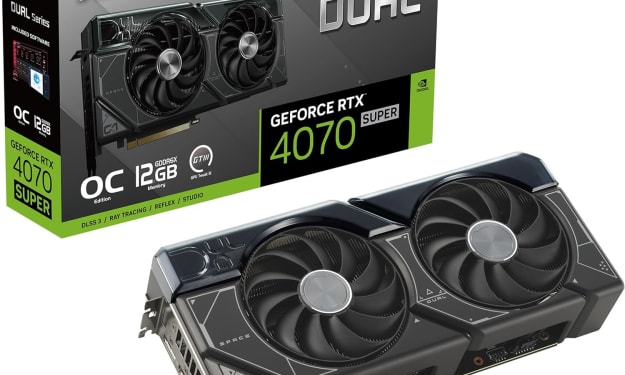
In the dynamic realm of computing, few components command as much attention and admiration as the graphics card. These technological powerhouses, often referred to simply as GPUs (Graphics Processing Units), serve as the beating heart of visual processing in modern computers, enabling everything from immersive gaming experiences to complex visual simulations and professional content creation. Among the latest contenders in this arena stands the ASUS Dual GeForce RTX 4070 Super OC Edition Graphics Card, a formidable specimen boasting cutting-edge features and unrivaled performance.
By Kim Long Nguyệt Ngữabout 14 hours ago in Trader


Comments
There are no comments for this story
Be the first to respond and start the conversation.