
The Wow Factor - Mastering the Art of Picture Edits on Your Phone
So, VSCO?

For as long as I can remember taking pictures has been my joyful hobby. At one point in my life, I even considered becoming a professional photographer. I chose a different path, but photography remains a very significant part of my life.
I mostly take pictures with my phone (iPhone 8 Plus) and use VSCO as my go-to app for picture edits. With the present quality of phone cameras, we can take striking pictures effortlessly with pleasing effects. But how can we elevate good to great? One of the ways to achieve the wow factor is to edit images in the VSCO app. Let me take you on a little photo journey and show precisely how to use VSCO's full potential to achieve the best possible photo results. I'm the author of all the pictures used in this story.
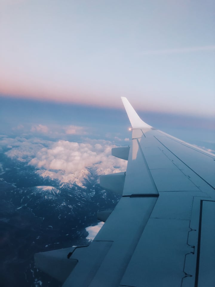
Every unforgettable journey starts with a picture taken from a plane. I took this particular photo when we were flying over the Alps in April 2018. It was a breathtaking experience. Often, when we take a picture of something that takes our breath away, we are unsatisfied with how the photo turns out. It is because what we see before us is much more magnificent than what the camera lens captures. But luckily, thanks to VSCO, we can deliver the wow effect needed. Here's how to do it:
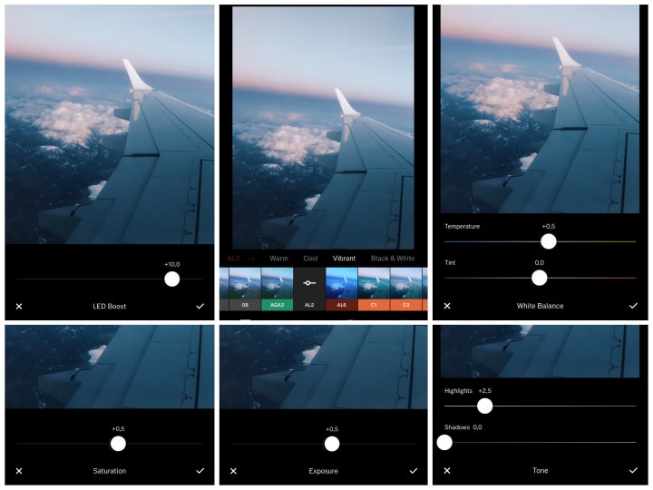
1. I chose the AL2 effect (LED Boost) and adjusted it to +10.0.
2. I added +0,5 temperature change and +2,5 of highlights.
3. I adjusted both the saturation and exposure to +0,5.
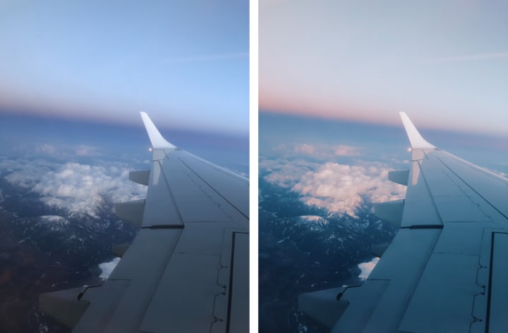
Before and after:
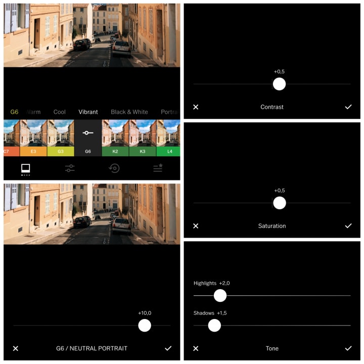
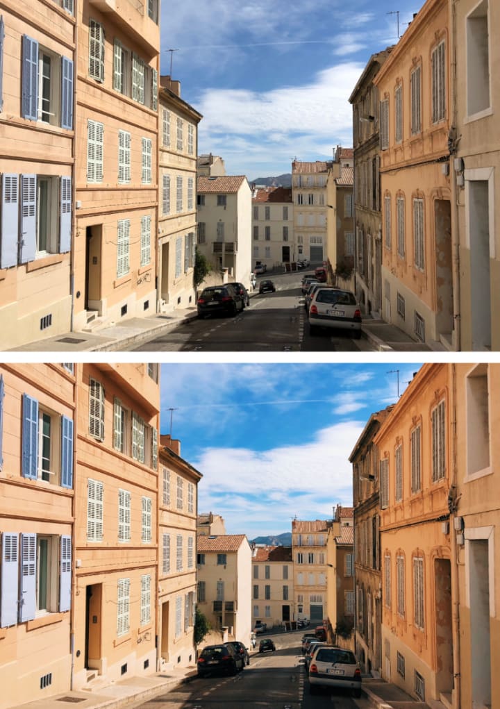
The South of France
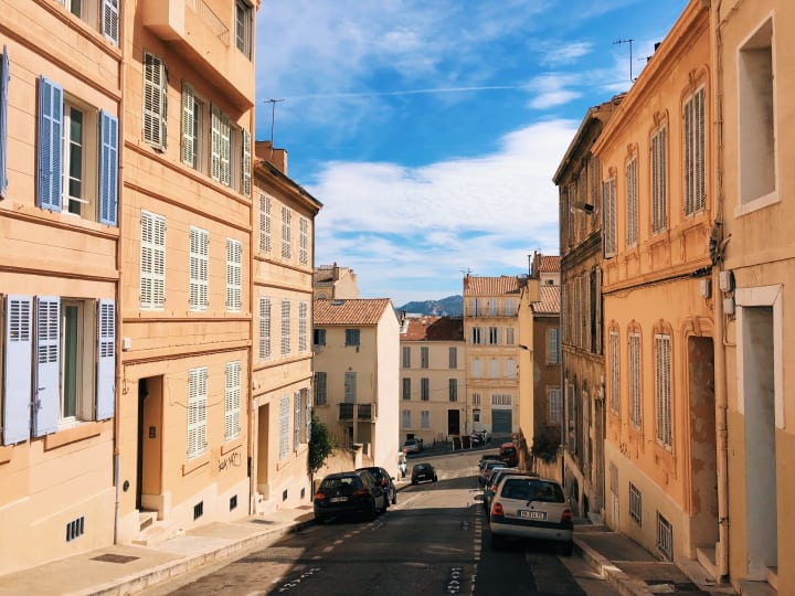
1. The G6 effect (Neutral Portrait) is the one I went for here. I adjusted it to +10,0.
2. I added +0,5 for both contrast and saturation. When the picture naturally has striking colors, it is important not to overpower its qualities.
3. I adjusted the highlights to +2,0 and shadows to +1,5.
Before and after:
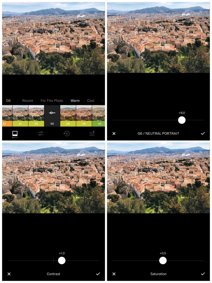
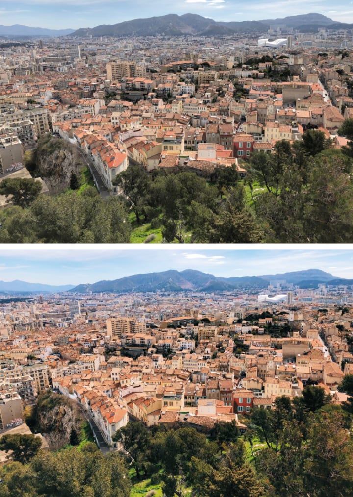
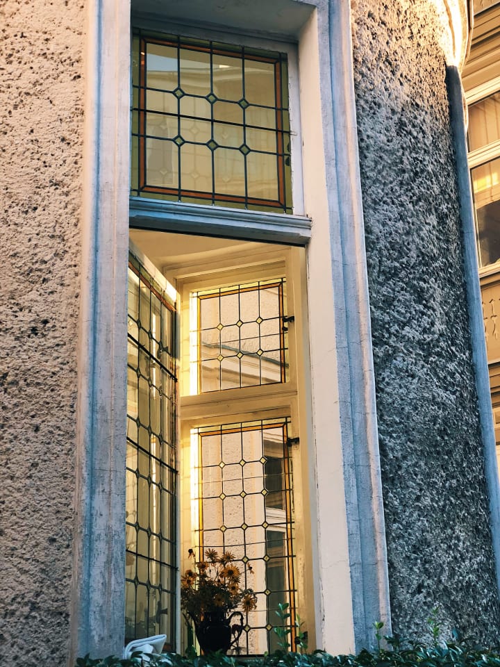
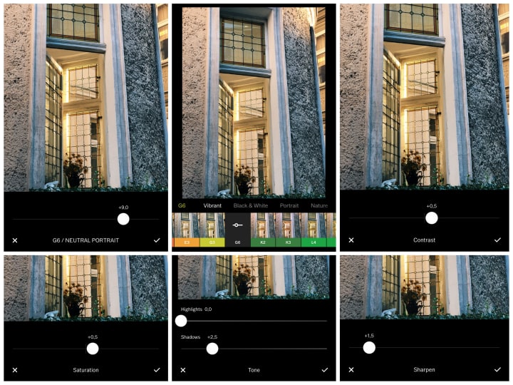
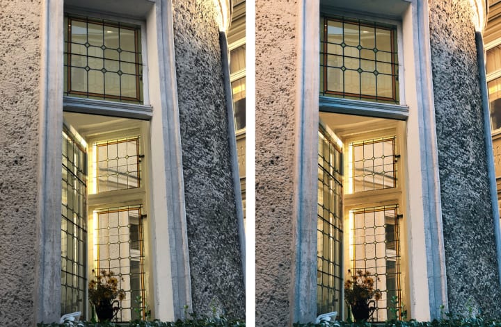
The views from Notre Dame de la Garde in Marseille call for majestic colors. With such landscapes, it is crucial to make sure that all parts of it look equally gorgeous.
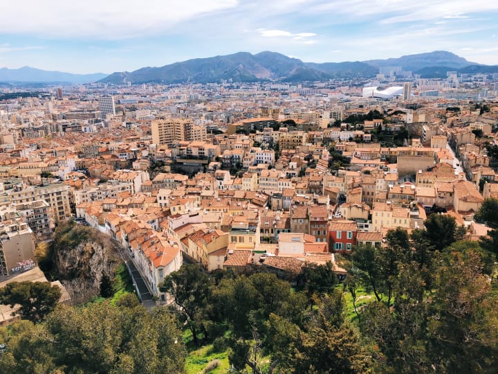
1. The G6 (Natural Portrait), adjusted to +9,0, is once again a winner here. The greenery in the front is vivid. The buildings strike with an orange and pink palette. The hills and the sky in the back cool the photo down with lovely blue colors.
2. For an extra touch, I adjusted the contrast to +1,0 and saturation to +0,5.
Before and after:
Cape Town
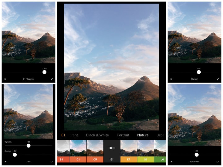
After the South of France, we move to Cape Town. It is one of the most stunning places I have ever visited. When I was there in 2017, I still had my old iPhone (iPhone 6s), but you'll be amazed how sublime the pictures turned out. With a little help from the VSCO app, I managed to bring out the right color palette and the incredible energy present in South Africa.
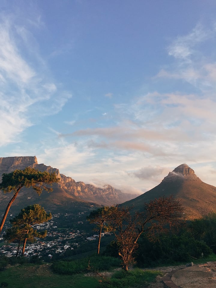
1. For this photo, I used the E1 (Essence) effect adjusted to +10,0.
2. I added +6,0 of highlights and +2,5 of shadows.
3. Sharpening is on +7,0 and saturation on +0,5.
Before and after:
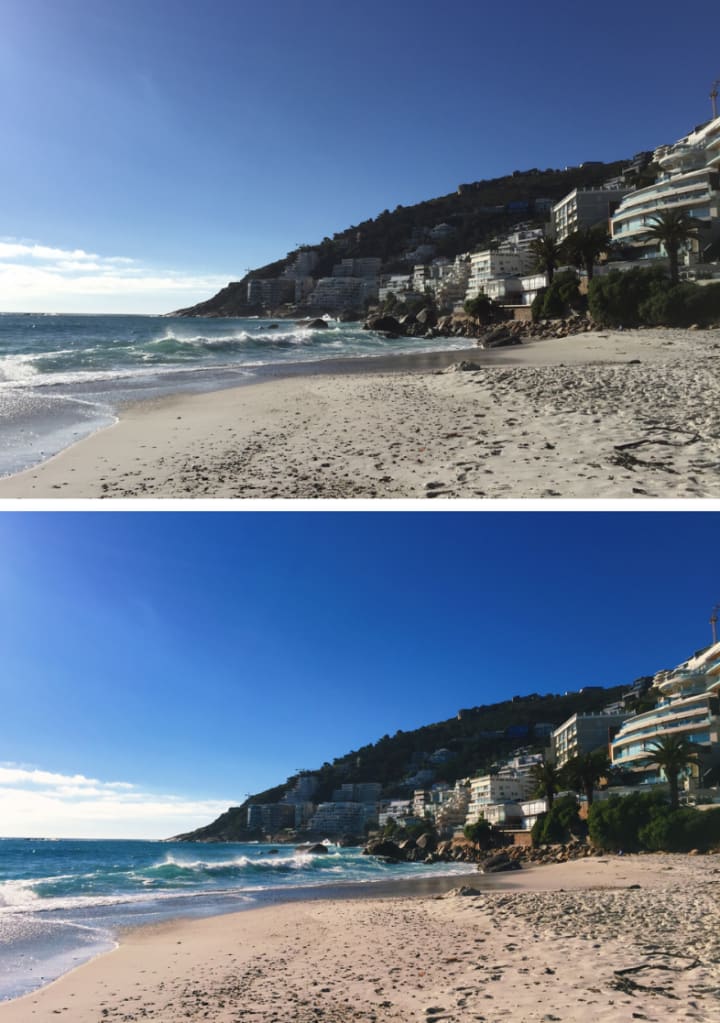
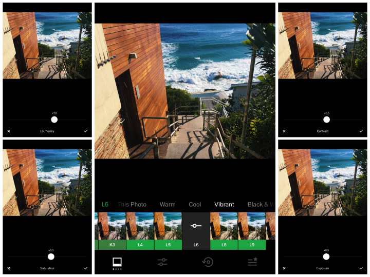
For the daytime pictures of Clifton Beach, I used effects that enhance the shades and bring out the vibrancy. I love when pictures beam with colors.
Before and after:
Edits:
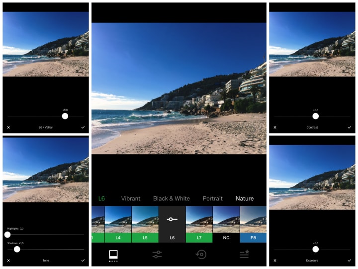
1. I used the L6 effect (Valley) adjusted to +9,0.
2. With +1,5 shadows for just the right amount of sunlight.
3. I added +0,5 of both contrast and exposure.
Before and after:
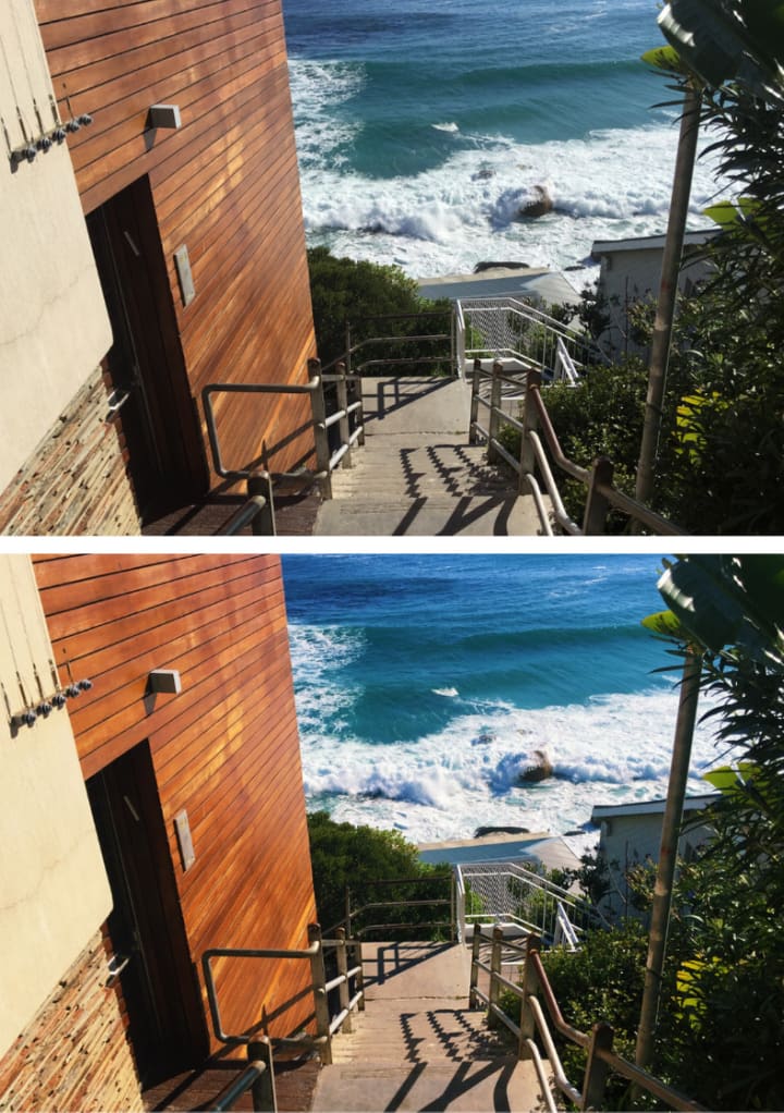
Edits:
1. I used the L6 effect (Valley) adjusted to +7,0.
2. The contrast, saturation, and exposure are all on +0,5.
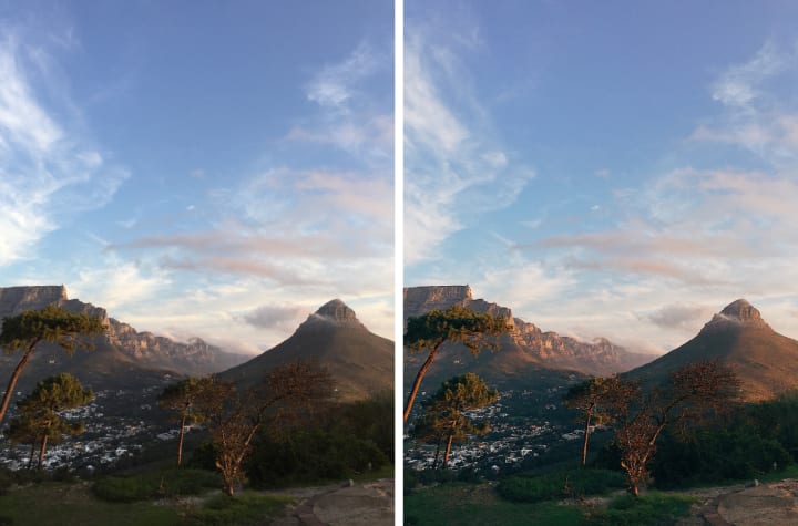
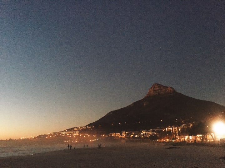
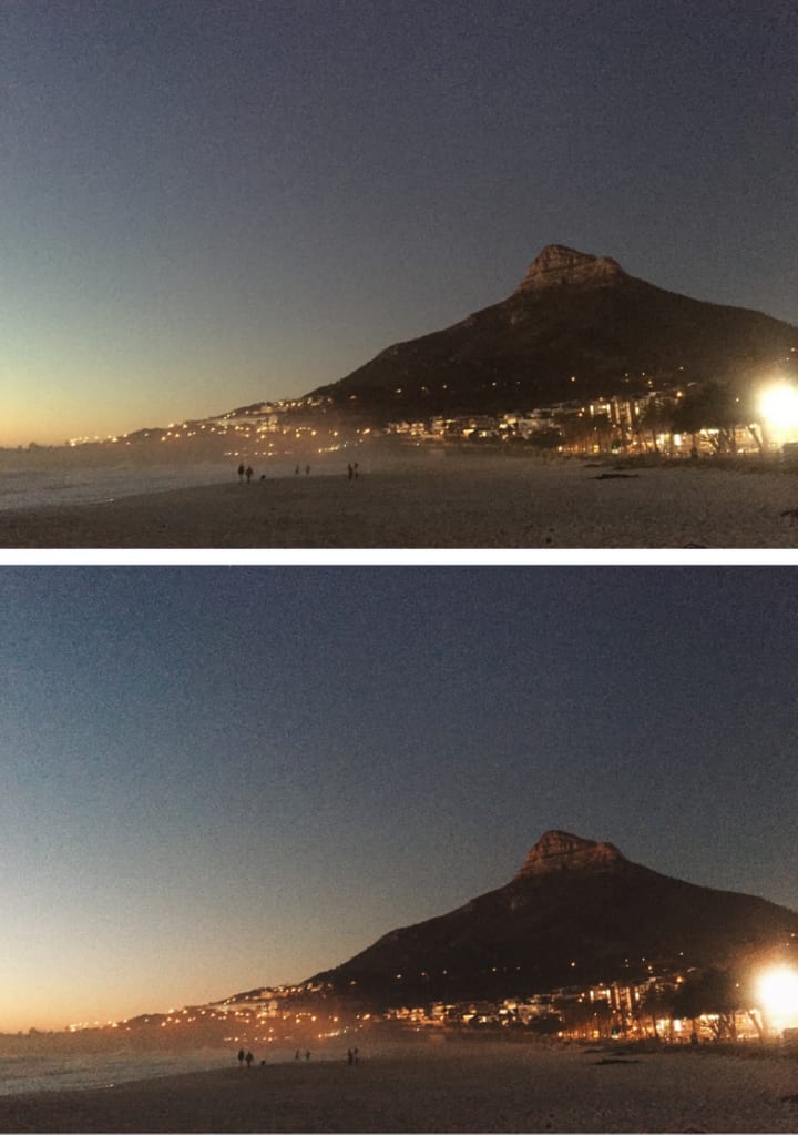
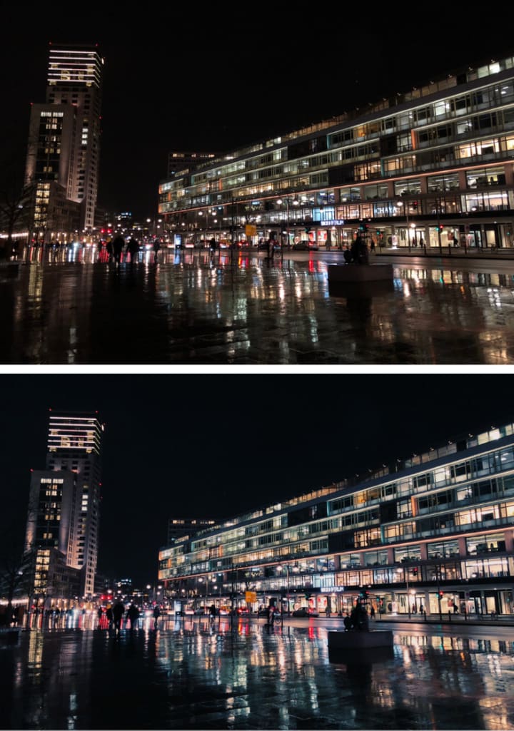
There's nothing like Cape Town by night, and so for the next picture, I wanted to make sure it calls attention to its charm. There is something unique and mysterious about it. Now, let's see how we can bring it out on the picture:
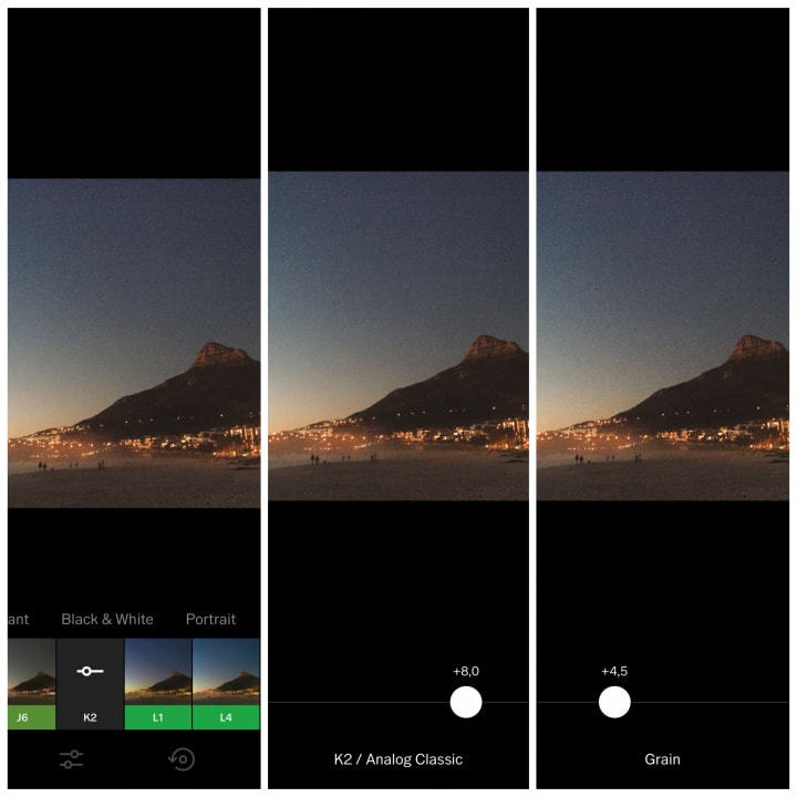
1. I used the K2 (Analog Classic) effect and adjusted it to +8,0.
2. For the mystique qualities, I also grained the picture to +4,5.
Before and after:
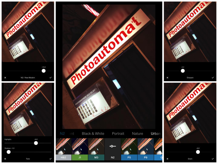
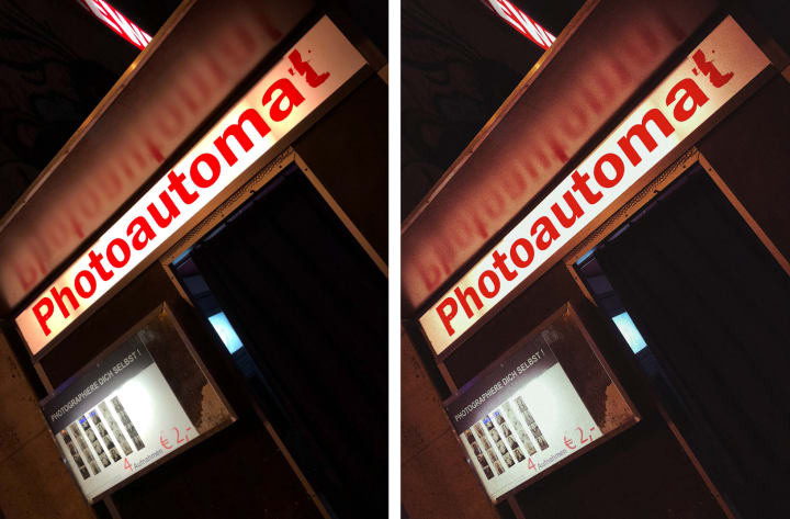
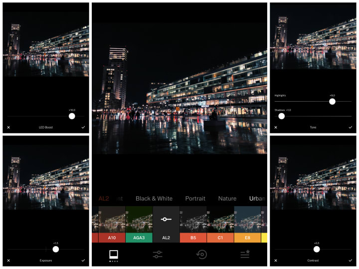
Berlin
It's time for Berlin. It is a remarkable place to be for any photographer. When I think of Berlin, I see retro, vintage in its trendiest form.
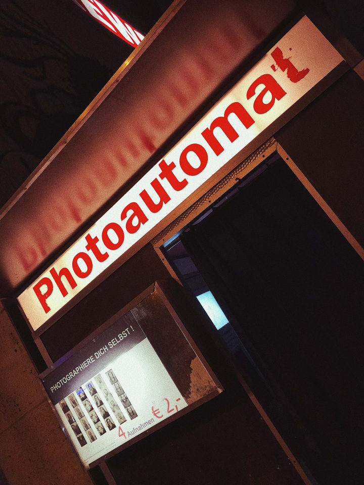
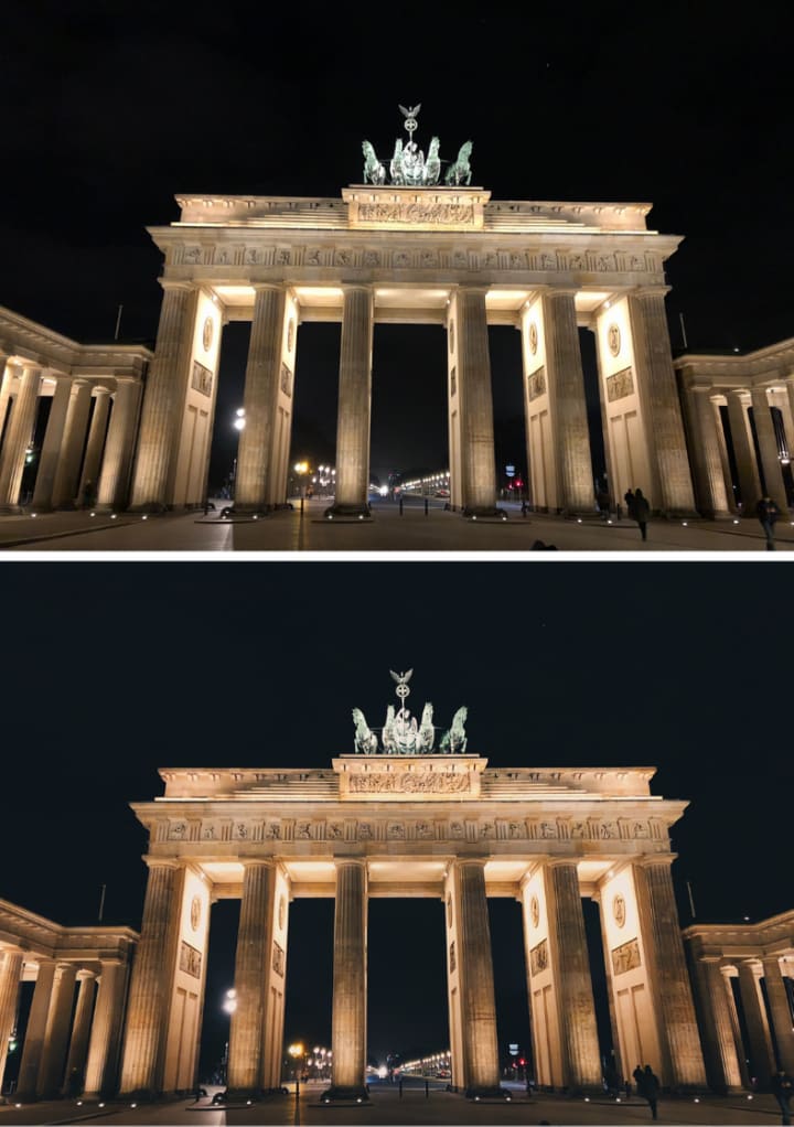
1. For this picture, I chose the N2 (New Modern) effect and adjusted it to +10,0.
2. I fixed the highlights to +8,0 and shadows to +1,0.
3. I sharpened it up to +4,1, and for the vintage outcome, I used +8,0 of graining.
Before and after:
The next picture was naturally captivating, so I just wanted to make sure that the colors take it to the next level.
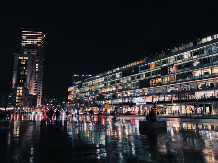
1. Here I went for the AL2 (Led Boost) effected adjusted to +10,0.
2. I added +1,5 of exposure and +0,5 of contrast.
3. Tone-wise, I added +9,0 of highlights and shadows to +1,0.
Before and after:
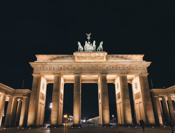
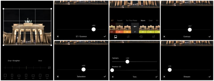
Pariser Platz in Berlin calls for glorious colors and just the right amount of highlights. The next picture proves how a simple edit can change a picture's entire tone:
1. First of all, I cropped the photo and straightened it.
2. Then, I used the E7 (Essence) effect and adjusted it to +9,0.
3. I added +0,5 of saturation to enhance the colors and +4,0 of the highlights for that extra twinkle.
4. I finished it off with +1,5 of sharpening to make it more distinct.
Before and after:
London
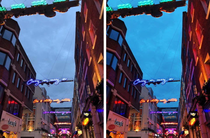
It's time to get London in the spotlight. London is where I live for the past three years. One of its most famous places is Carnaby Street that shines every year with different garlands and neon signs. With such a colorful and vivid place, you want to make sure that the photograph does it justice.
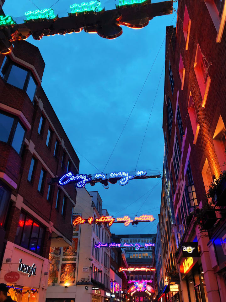
1. I chose the U5 (Sunset) effect adjusted to +9,0.
2. The saturation is on +0,7. I also added +0,5 of exposure.
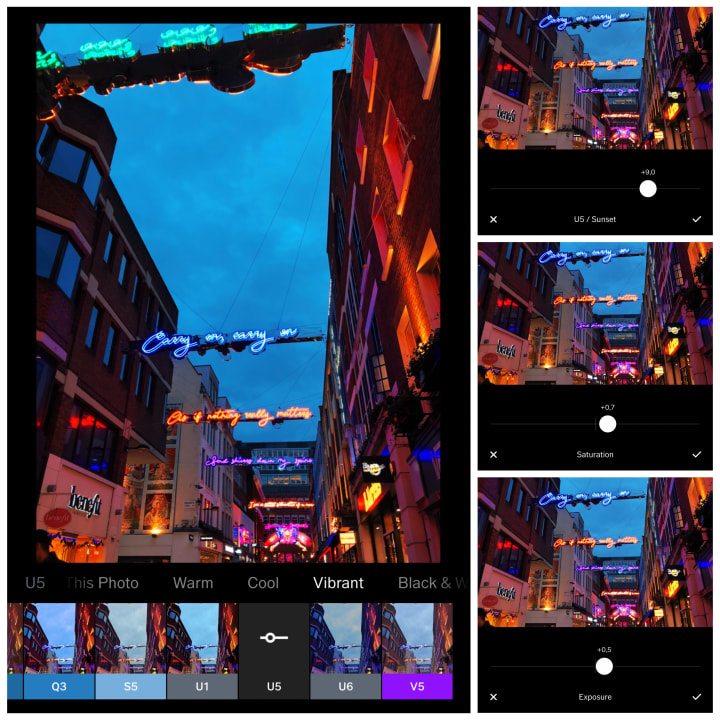
Before and after:
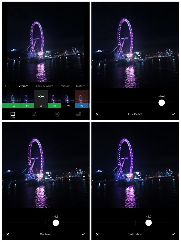
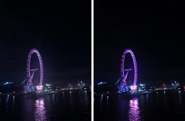
London wouldn't be the same without the famous London Eye. Probably the best time to take a picture of it, though, is nighttime.
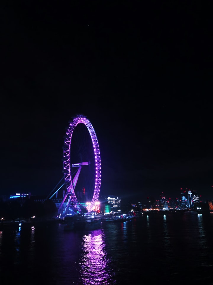
1. I used the L8 (Beach) effect adjusted to +10,0.
2. I added +1,5 of contrast to enhance dark colors and +2,0 of saturation to intensify the purple.
Before and after:
Food
Food lovers, are you here?
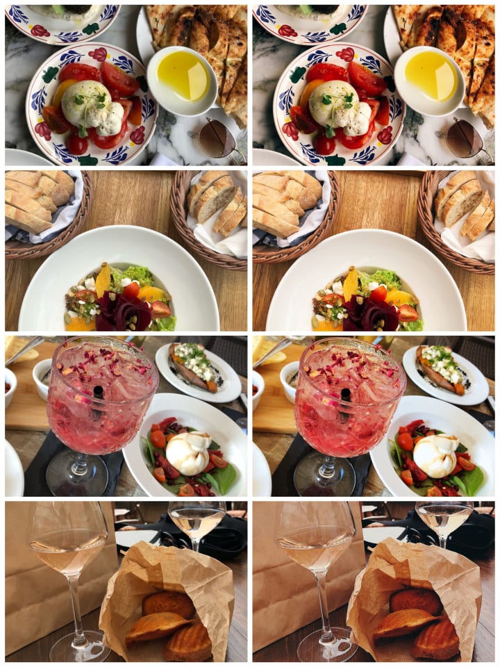
1. For the food pictures, I always recommend going for vibrant/warm effects. Colors that boost your appetite and complement the dishes work best.
2. Contrast, saturation, and warmth are crucial here. Always adjust it to make sure you elevate the colors and overall ambiance of the photo.
3. When the lighting is not great, make sure to adjust the highlights and brightness while editing your picture. If you're not happy with what surrounds your plate, just put the focus on your serving and blur the rest of the photo to about +7,0 in the Blur option on VSCO.
Gdańsk
Writing about food made me miss my hometown, so let's take a moment to appreciate the beauty of Gdańsk! I will start with a very aesthetic picture that I've taken once on a walk in my city.
1. I used the G6 (Neutral Portrait) effect adjusted to +9,0.
2. I added +0,5 of contrast and +1,5 of sharpening.
3. I decided to use +0,5 of saturation.
4. To finish off, I changed the shadows to +2,5.
Before and after:
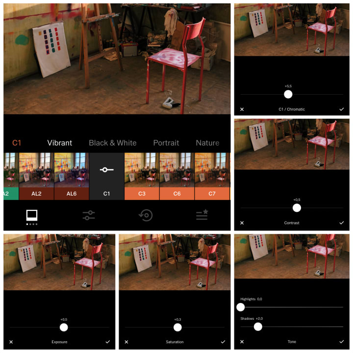
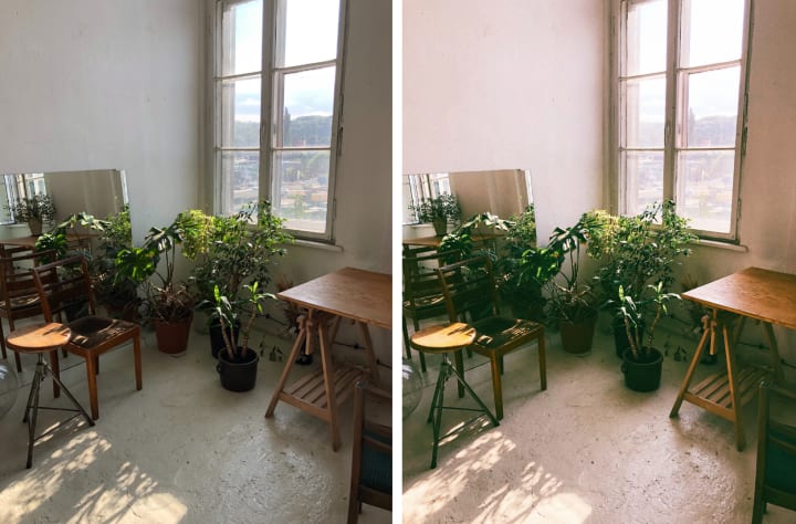
At the old shipyard in Gdańsk, you can currently rent rooms for artistic purposes such as art and photography studios. I captured one of the art corners in the picture below. I was amazed by the natural light and radiant colors.
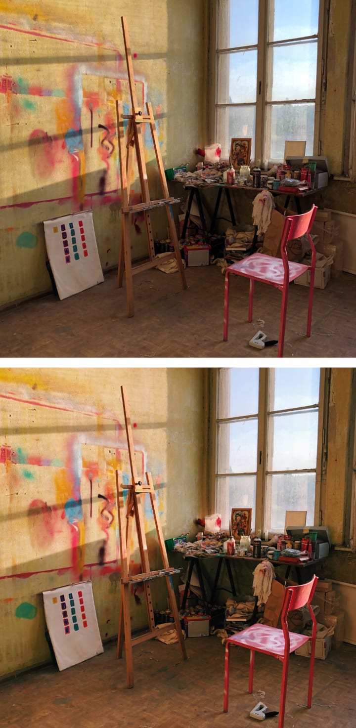
1. The effect I went for here is C1 (Chromatic) adjusted to +5,5.
2. I changed the picture's exposure to +0,5 and saturation to +0,3.
3. The contrast is on +0,5, and I added +2,0 of shadows.
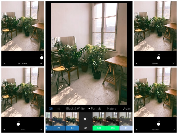
At the same place, another picture tells a whole different story. This photo I took in the other room:
1. I used the Q8 (Alchemy) effect adjusted to 12,0.
2. Both contrast and saturation are on +1,0.
3. To lift the picture's ambiance, I added +4,5 of graining.
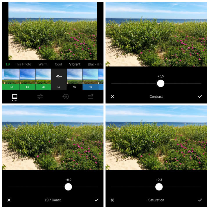
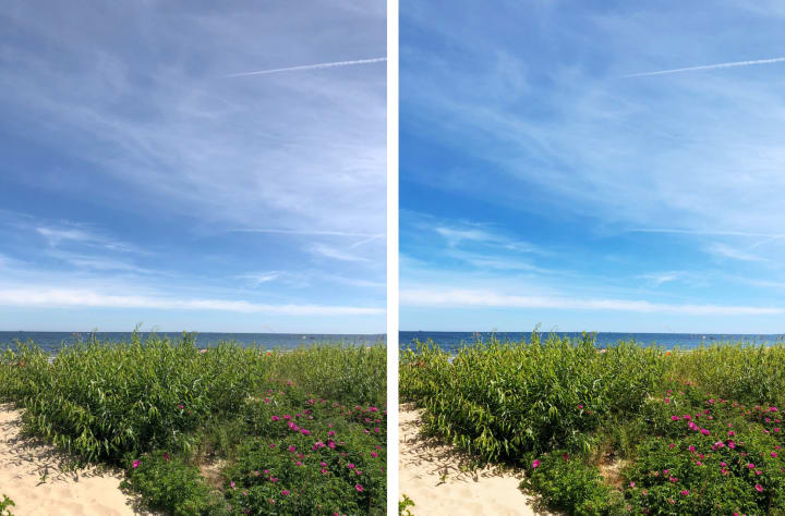
My favorite childhood spot is the beach. This gorgeous location deserves happy colors and spot-on saturation.
1. For my hometown's beach picture, I chose the L9 (Coast) effect adjusted to +8,0.
2. There was only a bit of contrast needed, so I changed it to +0,5.
3. +0,3 of saturation was more than enough for this naturally colorful and sunny picture.
Before and after:
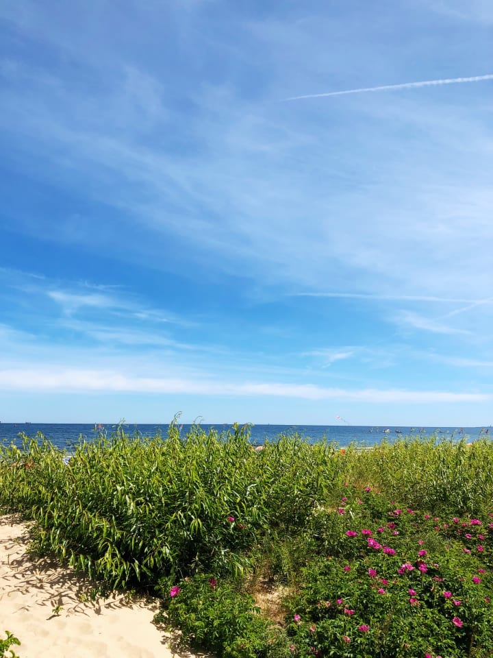
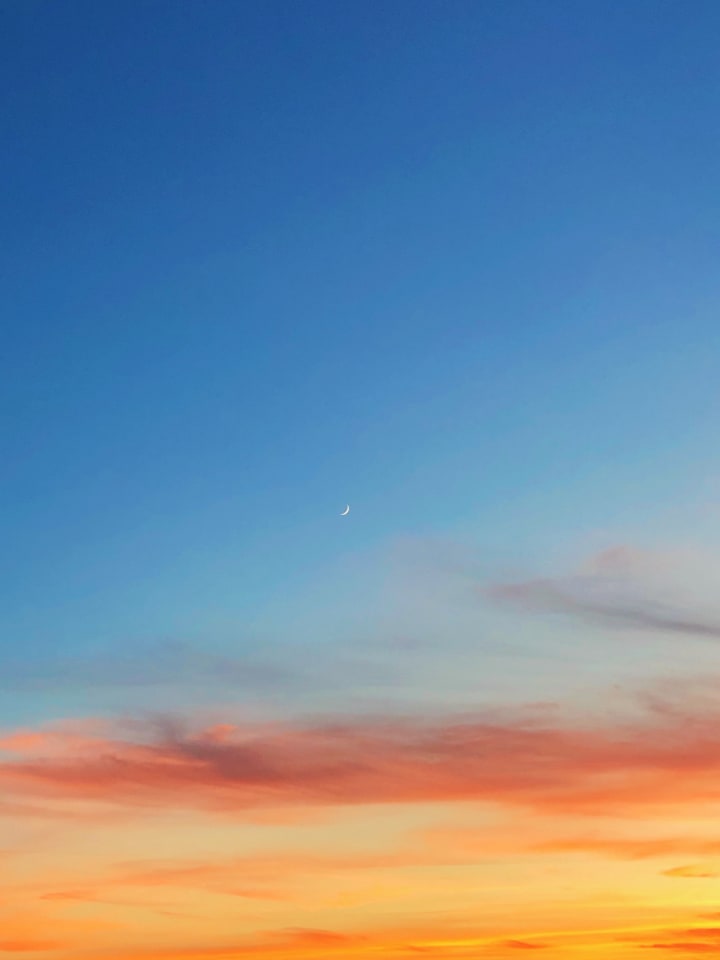
The Sky
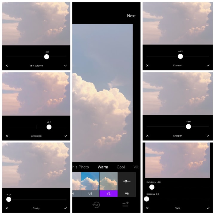
I will now go to the last two pictures. I shamelessly represent sky lovers. I never get tired of taking photos of sunset (less often sunrise). There's just something so majestic and sublime about it.
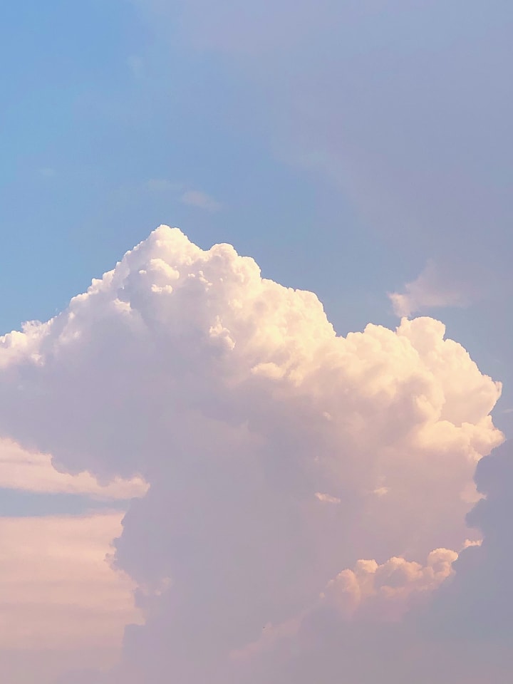
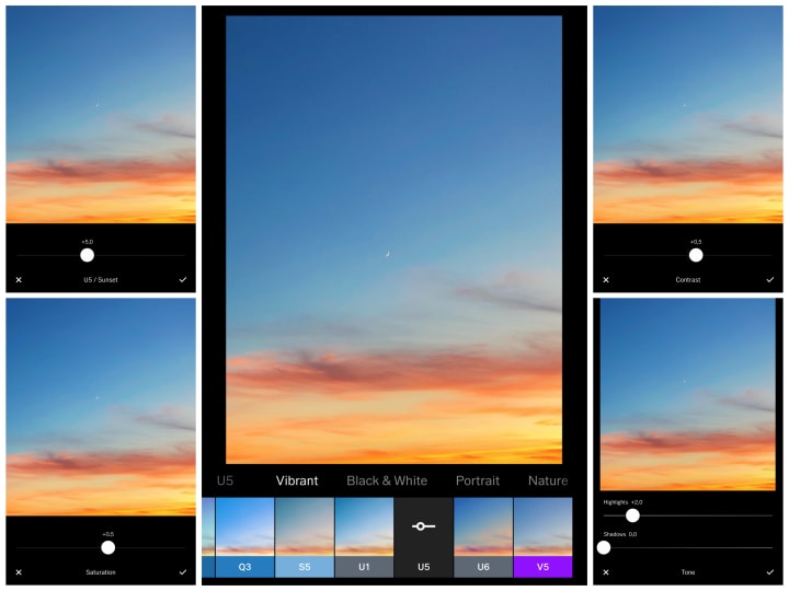
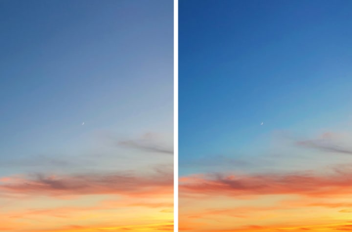
1. I went for the V8 (Valence) effect adjusted to +8,0.
2. The saturation is on +2,5 and contrast on +0,5.
3. To make the picture clearer and elevate its uniqueness, I added +0,5 of clarity and +8,0 of sharpening.
4. I finished it off with +1,0 of highlights.
Before and after:
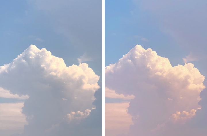
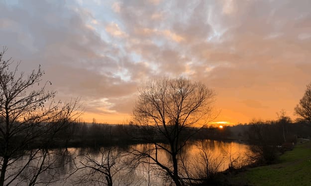
Last but not least, my favorite quarantine sunset of 2020. The picture was naturally so appealing that it only needed some minor tweaks.
1. I used the U5 (Sunset) effect adjusted to +5,0.
2. Saturation and contrast are both on +0,5.
3. To give it extra sparkle, I added +2,5 highlights.
Before and after:
VSCO is an exceptional app and, on top of that, super easy to use. With the wide range of photo effects and tools, the app guarantees marvelous results. My favorite part about VSCO is that it does not overcomplicate the process of photo editing and is very user-friendly. You can select your best-loved effects and keep them saved handy. Whenever I finish my edits, I can save all the pictures to the camera roll within seconds.
Pictures can be real works of art. They bring back memories and bring out emotions. It was a pleasure to share some of my usual behind-the-scenes methods of photo editing.
___________________________________________________
Thank you so much for reading! If you enjoyed this article, please leave a like :) Any tips are always appreciated.
Until next time,
Marcel x
About the Creator
Marcel Grabowiecki
Look at you doing what you once thought you couldn't do.
Actor / Writer
@marcelgrabowiecki on Instagram
Keep reading
More stories from Marcel Grabowiecki and writers in Photography and other communities.
Keeping up With the Stars
I was born on June 9th, 1999. I know, a pretty cool date. You have to provide the exact time of your birth to check your rising sign. I had no idea about that. I also had no clue what the ascendant sign was. I didn't know what time I was born either, so I called my Dad, "I'm pretty sure you were born at 1:30 pm. Call mom." That was not a very confident answer, so I got on facetime with mommy, "You were born at 5:15 pm. Just on time for the evening news." Thanks, mom. That's really helpful for my zodiac investigation.
By Marcel Grabowiecki 3 years ago in Futurism
Capturing Magic
In the world of photography, timing is the key to everything. While skilled compositions and technical proficiency are undoubtedly crucial, the perfect lighting can create the perfect photo. Nowadays, we can determine any light ourselves and are no longer dependent on any natural light source, thanks to the developed technology. We can turn every day into a night by using the right filters. And we can illuminate every night to be seen as a day. A typical process, especially in the film industry.
By Krishan Mubashar6 days ago in Photography
Offbeat Places in Malaysia: Travel Secrets
Malaysia is most popular for stunning urban areas like Kuala Lumpur and George Town. In any case, there are such countless odd spots in Malaysia anticipating nature sweethearts and travelers. We've assembled a rundown of 10 mystery objections that make us need to book a pass to Malaysia this exact instant!
By prashant soni2 days ago in Photography
Diabolical Dealing
Charlene Lind found herself at the home of her therapist, Dr. Alexandra Vech, who she had been seeing for a week. What was supposed to be a session ended up becoming a desperate plea of help from Charlene as she was suddenly losing consciousness. She was cognizant enough to know that she had only a minute left until she would be out like a light.
By Clyde E. Dawkins5 days ago in Fiction


Comments
There are no comments for this story
Be the first to respond and start the conversation.