
Things You Can Learn From Popular Fonts of The World
Popular Fonts

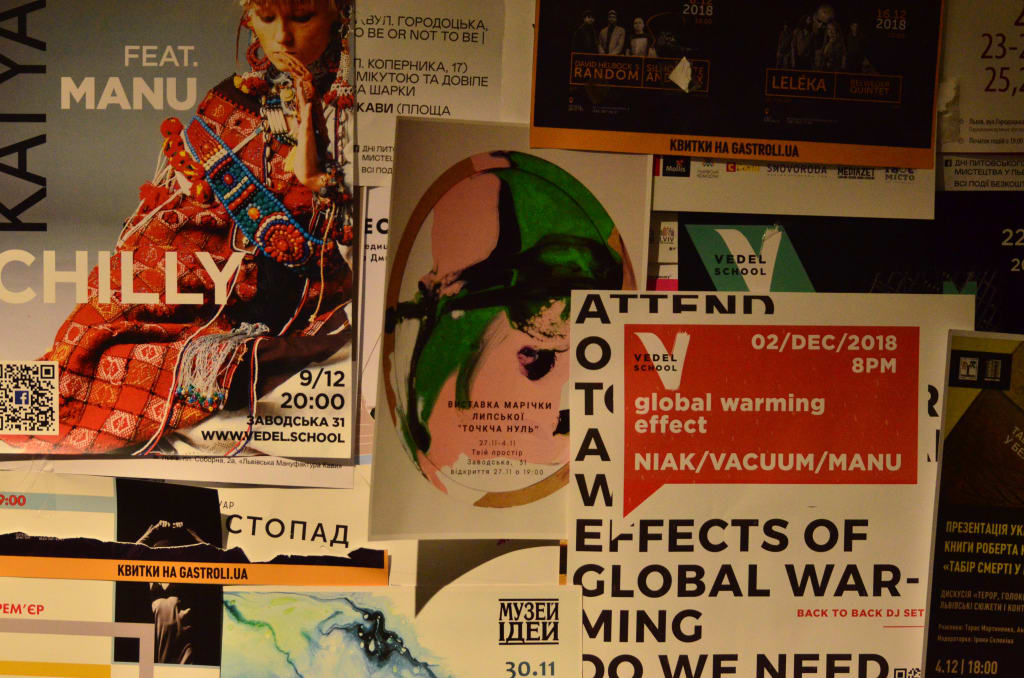
These two fonts aren’t just very popular and widely used around the world, they also have interesting stories. Let’s get to know them better and perhaps learn a thing or two.
The Font That Used To Be A Monster
First up is Roboto, this is a font developed for the Android operating system to replace the previous font called Droid.
Roboto was first released in 2011, the brainchild of Christian Robertson at Google. It was said that Roboto was designed to look good on multiple screen sizes, from a small smartwatch to a large tablet.
If you want to get technical, Roboto is actually a neo-grotesque typeface, the same kind as Helvetica. And indeed, Roboto nowadays can be considered as one of the alternatives to Helvetica.
Just like other neo-grotesque typefaces, Roboto has straight-sided capitals and rounded letters in a sort of racetrack shape. One of the unique things about Roboto is that the size of each letter is designed to take as much space, to increase legibility and comfortable reading experience.
Although it was developed in 2011, Robertson — Roboto’s designer — actually called this a living design. That’s because it has subsequently been updated many times since its inception.
Its first release in 2011 was not welcomed with an open hand by the typography community. It was even called a “Frankenfont”. Due to the impression that Roboto had taken elements from other typefaces and assembled them together, much like Frankenstein’s monster.
In 2011, Stephen Coles wrote in Typographica how Roboto used elements from Helvetica, Myriad, Univers, FF Din, and Ronnia.
Here’s a paragraph from Cole’s original article:
I’m all for the strategy of developing a unique identity typeface, and I commend Google for employing type designers in house, but this is an unwieldy mishmash. Roboto indeed has a mixed heritage, but that mix doesn’t have anything to do with the gibberish from the press release. Its parents are a Grotesk sans (like a slightly condensed Helvetica) and a Humanist sans (like Frutiger or Myriad). There’s nothing wrong with combining elements of these two styles to create something new. The crime is in the way they were combined: grabbing ideas from the Grotesk model, along with a Univers-inspired ‘a’ and ‘G’, welding them to letters from the Humanist model, and then bolting on three straight-sided caps à la DIN.
Cole goes on to say that some words, when created using Roboto, can have a very different feeling. The word “fudge” he noted, looked casual and contemporary, while the word “Marshmallow” became rigid and classical. “This is not a typeface. It’s a tossed salad. Or a four-headed Frankenstein. You never know which personality you’ll get,” he wrote.
Robertson actually tries to answer this controversy by, at first, explaining some of his decision. Cole published Robertson’s explanation on Typographica, embedded in his original post.
Of the “four-headed” monster that Cole objected to, Robertson addresses two. And the other two, he deemed not a big enough problem. “Note that there are still some bugs in the font that has been extracted from the SDK. Many of these have been corrected already, and you can expect to see some fixes to minor kerning issues and some diacritical misalignments,” said Robertson.
And indeed, Roboto was updated multiple times across its lifetime. In 2014, Roboto seem to address some of the criticism. This was also the year that the font came alive and start to be accepted by the typography community.
In a video for Google I/O in 2015, Robertson highlights some of the changes they made. “One of the unique things about designing for a digital environment is that you can update the types. And, we really see Roboto as a living typeface,” said Robertson.
Roboto is available on Google Fonts.
The Font for The Future
Next up is Futura, this is a font that originated in Germany previous to World War II. This font was famously used on a plaque that NASA’s astronauts left on the moon. Douglas Thomas actually was invited to give a speech at TED Talk to talk about Futura.
“This plaque is a beautiful object and one that I want to talk to you a little bit about. First, you might notice that there are two globes, representing all of the earth. And then there’s this beautiful statement: “We came in peace for all mankind.” Now, at first, this is just nice poetic language, but it’s also set in a typeface that’s perfect for this moment. It seems industrial, it seems engineered. It also is the best possible name you could come up with for something on the moon: Futura,” said Thomas in his TED Talk.
Futura was created by Paul Renner in 1927, at the Bauer Type Foundry, as part of the New Frankfurt Project. As Thomas noted in his talk, the design of Futura is based on simple geometries.
Thomas called it an embodiment of the aphorism of modernism: “Less Is More”. Modernism focuses on the essentials, on the basic shapes and geometry. “You might notice that the shapes inherent in Futura have circles, squares, and triangles. Some of the shapes are all based on circles, like the O, D, and C, or others have this pointed apex of the triangle. Others just look like they might have been made with a ruler or a compass. They feel geometric, they feel mathematic, precise. In fact, this whole system carries through with the way that the typeface was designed. To not look like it was made like other typefaces, to be something new,” Thomas said.
Margaret Penney on Sessions.edu also commented that Renner was probably inspired by the Bauhaus style. “Renner was not part of Bauhaus but he shared their beliefs regarding fonts as expressions of modernity. Renner rejected the font styles of the past, the grotesques, their narrowness, and the lack of a consistent system for their weights and shape forms. The design of Futura helped usher in a new Modern age and was emblematic of the era,” Penney wrote.
Thomas noted that in America, during World War II, the typeface was copied and called many other names. “For most people, they didn’t even learn the new names, they just still called it all Futura. So America took this typeface in, conquered it, and made it its own. So by the time World War II finishes, Americans are using this on everything, whether it be catalogs, or atlases, or encyclopedias or charts and graphs, or calendars, or even political material,” Thomas said.
And that was how, after the War, the American government and military keep using Futura on many official documents. Including, the Mercury Program and eventually the Apollo Program that brought people to the moon. “In fact, the very first or last thing an astronaut might have seen when they were entering or exiting the spacecraft would have been in Futura,” said Thomas.
Thomas considers the story of the Futura typeface as one about assimilation. “And that’s one of the best and worst things America does, is we take things into our culture and we spit them out back again and claim them our own,” he said.
If you want to use something similar to Futura, how about this font named after the creator of Futura? Renner* is available on FreebiesBug.
Lessons Learned
We hope you enjoyed the story of Roboto and Futura and can learn a thing or two. Here are some things we learn from it:
- If you believe in something, it can pay off to keep iterating and improving. Just like how Roboto evolved from a so-called “frankenfont” into a respectable and widely used typeface.
- Going back to basics can help you show the foundation of your design, the way Futura uses basic geometric shapes in creating a timeless typeface.
Creatype Studio
Type Designer & Lettering
About the Creator
Creatype Studio
Type Designer & Lettering to design a font. Visit to www.creatypestudio.co
Keep reading
More stories from Creatype Studio and writers in Lifehack and other communities.
AI Arts, Where Do We Go From Here?
The robot uprising may still be far away in the future, but AI is beginning to look scary for some of us. The advancement in Artificial Intelligence technology has led to some interesting development, on the way to developing a general purpose A.I researchers have come up with a tool known as an image generator.
By Creatype Studio2 years ago in Journal
The history of Lawn mower
The invention of the lawn mower stands as a pivotal moment in the annals of technological innovation, reshaping not only the landscape of gardens but also the fabric of daily life. Its significance reverberates through history, heralding a transformation in lawn care practices, liberating homeowners from the arduous labor that once defined the upkeep of grassy expanses.
By GardeningTools4 days ago in Lifehack
Rugs and Carpets: Stepping Up Your Decor Game
Rugs and carpets are the unsung heroes of interior design. They are more than just floor coverings; they are powerful tools that can transform a space. According to a 2023 survey by the American Society of Interior Designers, a whopping 78% of design professionals believe a well-chosen rug can significantly elevate a room's aesthetics. Rugs can define areas (think visually separating open-plan living areas) and add a touch of personality through bold patterns, vibrant colors, or unique textures.
By Shahla Khan7 days ago in Lifehack


Comments
There are no comments for this story
Be the first to respond and start the conversation.