
A Typeface Is Not A Font, Here’s Why
Typeface Is Not A Font

Today, a design project always requires an understanding of fonts. You have to know which font to use in your project and how to deliver that to your client.
But wait, you just heard somewhere that you are using the wrong typeface for the project. What does that mean? Doesn’t that person really mean font?
Well, not exactly. I mean, in some context, yes it’s true that font and typeface can be used interchangeably. But it’s good to actually know the difference for that time when it actually matters. And anyway, as a designer, you need to always upgrade and expand your knowledge right?
Okay, so in this post, we are going to look at the difference between fonts and typefaces. And maybe dive a little bit into the history also.
What Is The Difference?
If you want to understand it quickly, just think of the typeface as a family. While a font is a member of that family, you know like the father, the son, or the holy mother of god. Well, maybe not exactly like that. But that could be the first start.
So, yeah, we could say the difference between a font and a typeface is that a font is part of a typeface while a typeface consists of several fonts. It is that easy. Well, sometimes.
If you look at Helvetica, you often heard it referred to as a font, right? People say it all the time, I mean like in a conversation at a cafe while getting your latte with extra pumpkin spice in October or something. Right? No? Okay, I digress.
Anyway, some people refer to Helvetica as a font when some say that it is actually a typeface. Helvetica is a family of fonts in the san serif style. All the fonts in that family have a certain sense of design, a similarity that makes it clear they’re all part of the same family.
Differences between fonts in a typeface family can be in weight, style, and size or even how they are more or less condensed than one another, sometimes there is an italics member of the family. We can tell each member of the family apart by their names, words like light, regular, medium, semi bold, bold, and extra bold are often used to distinguish between fonts in the same family.
I hope that really clears it up for you. Because basically, that is all the difference between fonts and typefaces. One is part of the other.
But wait, you said, what if a font doesn’t have a family? Are they called an orphan?
Actually, a font without a family is still part of a family. It’s just a family of one. We could call it an orphan if you’d like, but that is not the standard. We could call it sad, but fonts don’t actually have feelings and this metaphor of fonts being part of a family is starting to conjure images of an Italian migrant family trying to make it in New York in the forties but ending up creating an organized crime empire. “I’ll make him an offer he can’t refuse.”
When Does It Matter?
Anyway, I’m here to tell you that the difference actually matters. So, for example, you are doing a design project as part of a larger team. And the project manager or creative lead or someone important asks you: Hey, kid, what font are you using here?
Now, your answer better not be something like: It’s Helvetica, Boss, forget about it, will ya? Because that is actually the typeface. You need to be very specific and name the exact font, something like: It’s actually Helvetica Regular, at 11 points for the body text, why Boss?
Knowing the exact font can be important for making sure the same one is used across multiple designs. Even more important when it’s for an app design and that font needs to be coded in and the developer may need to code in different font for a different display or something.
So, yeah, it can matter. It should be on your documentation, what specific fonts were used, and from what typeface.
The Historical Bit
Ah, yes, the history lesson. If you find this boring you could just skip t the next part. But it might be cool to know a little bit of history in the stuff that you are working with all the time.
So fonts and typefaces have their roots in printing history. Did you know that font actually derived from the Middle French word ‘Fonte’? If you do, good for you. If not, well, here comes the history lesson.
So back in the days of early printing, words are created on blocks to be printed on paper. Printing machines used what is called movable type, meaning each letter is created on a single block. This is usually made of metal.
Now, the word fonte actually means ‘to cast in mental’. Back then, printers (the people, not the machine) cast complete sets of letters from metal to make up a font. Interesting, right?
They separate those fonts with a common design to create a typeface. These were usually kept in a box consisting of two cases. Get this: the case on the top usually contains all capital letters, hence the word uppercase to describe capitalized letters. And lowercase to describe uncapitalized letters. Don’t you just love history?
When A Typeface Is Not A Family
Okay, back to the present. We’ve been understanding typeface as a family of fonts. In reality, there are cases when saying a typeface can refer to something a bit more general. This is like referring to someone as belonging to a certain lineage or heritage.
For example, Don Corleone is an individual part of the Corleone family. But he can also be called a part of a larger group of people known of Sicilian descent.
The same thing can be said for a font. Helvetica Regular is a font in the Helvetica typeface, but we could also say that Helvetica Regular is a sans serif typeface.
Are you confused? Hope not.
So, remember that a Helvetica typeface has some defining characteristics? It has similar design features within the family that each font shares.
Well, a typeface actually can be used to refer to the similarity in a wider sense. For example, a serif typeface is all fonts that have little ‘tails’ at the end. While a sans serif typeface refers to all fonts that do not have those tails.
Here are some common typefaces that you may hear:
- Serif — Fonts with little “tails” (called serifs) at the end of their lines. Famous ones include Times New Roman and Garamond.
- Sans Serif — Fonts that have no serifs. For example Helvetica or Arial.
- Decorative — These are fun fonts that are used mainly for decoration. You may have heard some like Chiller, Outlaw, or Nightmare.
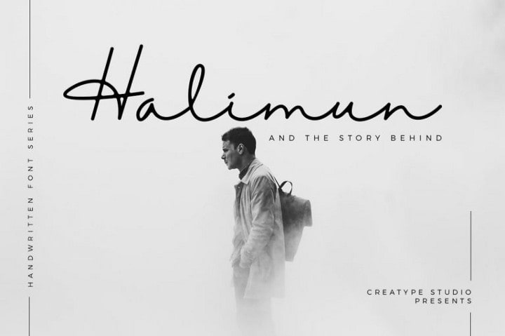
- Script — These are beautiful fonts that mimic handwriting styles. You can check out some fonts like Karllina or the infamous Halimun.
- Brush — Similar to the script, but these are fonts that mimic brush strokes. There is one called Brush Script, also you might want to check out Southwell.
- Display — Generally refers to fonts that are more suitable for large headings. Display typeface can be decorative but can also be less flashy but still better suited for use in large sizes than for body text or subheadings.
Which One Do I Use?
On a design project, what really matters is the specificity. Knowing the exact font and being able to communicate that exact font is important. So whenever the question of font arises, always use the exact specific font, even down to the size. As mentioned earlier.
You can use font family or typeface to communicate the exact typeface, i.e. Helvetica. This is often used in general discussion before the design is actually created. And used words like font category or type to refer to the more general typeface like serif or sans serif.
Of course, all of that depends on the context of your project and the consensus of your design team. Don’t be so tough on semantics when talking generally, but do have to know the difference when talking specifically.
Wait, What About Typography?
Once you know and understand the difference between fonts and typefaces, you may come across the word typography and starts to get confused again. Maybe you won’t, but let’s clarify.
Typography refers to a whole different thing. This is actually an act of arranging text on the page, or whatever surface your design is created on.
A typographic work means testing out and designing how the text will fit on the design pleasantly and be able to communicate legibly. Although you must remember David Carson once famously said legibility does not equal communicability.
In typography, you are not designing the letters but you are working with existing fonts and typefaces. You choose which to use, in what size and tweaks the little things, you know like the spacing, capitalization et cetera.
Conclusion
If you can understand the difference between fonts and typeface by context, you don’t really have to use the ‘correct’ word for it. But you could use that difference to communicate clearly.
For example say you want a certain typeface can free up the designers to be creative within that scope, choosing the right font for the job. But saying a specific font can be useful for clarity. Use what you need, when you need it, and always try to make sure the other party understands what you are trying to communicate.
Creatype Studio
Type Designer & Lettering
About the Creator
Creatype Studio
Type Designer & Lettering to design a font. Visit to www.creatypestudio.co
Keep reading
More stories from Creatype Studio and writers in Education and other communities.
Social Media Marketing & Copywriting: A Dynamic Duo for Online Success
In the bustling digital marketplace, having a fantastic product or service isn't enough. You need to capture attention, spark conversations, and build relationships – all while navigating the ever-evolving landscape of social media. This is where the powerful partnership of social media marketing and copywriting comes in.
By James Moody4 days ago in Education


Comments
There are no comments for this story
Be the first to respond and start the conversation.